Tuesday, 17 January 2017

OUGD405 - Studio Brief 01 - Wayfinding Proposal

Leeds International Film Festival (LIFF) is one of the largest film festivals in England. Usually held every November, many independent, commercial and short films from all over the world are shown at various venues throughout Leeds, West Yorkshire. The festival was founded in 1987 with the first event being held at Hyde Park Picture House, an independent cinema and Grade II listed building for being of architectural and historic interest.

There is currently no wayfinding system in place for the festival. By proposing a new wayfinding solution for this festival, this will allow the thousands of visitors who attend the festival each year to navigate their way to the various venues in Leeds.

The system will make use of some of the main themes from Leeds 30th International Film Festival, which included light, shadow and reflections. It will make use of supergraphics produced from vinyl so that it is suitable for use outdoors, to provide a fixed shadow for directional purposes, overcoming the problem that shadows change depending on the time of day. These will be accompanied with wall fixtures that represent each specific venue.

The system will also have cultural references to some of the films showing at the festival, which links it to the themes of light and shadow. This includes some the first films to be shot in Leeds, such as that by director Louis Le Prince, as well as 'Their Only Son' and 'An Englishman's House' which were the first films to be shown at Hyde Park Picture House. The colour scheme of this wayfinding system will be mainly greyscale to continue referencing the first films ever produced, which were shot in black and white.

There are a total of 29 venues that hold events for LIFF, however the ones I have chosen to work with for this specific wayfinding system are:

  • Hyde Park Picture House.
  • The Tetley.
  • Leeds College of Music.
  • Leeds Dock (including Leeds Bridge and Leeds Dock water taxi).
  • Left Bank, Leeds.

Monday, 16 January 2017

OUGD405 - Studio Brief 01 - Developed Concept

Based on feedback from our first crit session, I decided to broaden my wayfinding system to aid with direction around the November event, Leeds International Film Festival, of which Hyde Park Picture House is a part of as a venue to exhibit art show films. The event also began at the Picture House in 1987 and includes a total of 28 other venues, including The Tetley, Leeds College of Music, Left Bank and Leeds Bridge.

Leeds International Film Festival is the largest film festival held in the United Kingdom outside of London and has shown over 300 films from around the world, including shorts, features, independent and commercial films.

One of the themes of last year's 30th International Film Festival was light, shadows and reflections. This is based on many of the art films shown at the festival, which included the first black and white films to be shot in Leeds, a film called 'Shadows' which features jazz scores from Charles Mingus and Shofi Hadi, and Clemens Kloffenstein's nigh films, such as 'Story of Night'. I will use this as the main themes of my wayfinding system, creating symbols based on this idea of light and shadows, which also has cultural references to these films and events.

OUGD405 - Studio Brief 01 - Concept Crit

Although an interesting and historical building to choose for my wayfinding system, it was suggested during this concept crit that I needed to connect the building to something bigger, such as an event or group of people, which would broaden my wayfinding system and create more cultural and historical references within it. However, I should still incorporate elements based on the design history of the building through researching into it's building materials and inspirations used by the architects, Winn & Sons to use in my signage. For example, light to represent the gas-lit cinema or red bricks, which makes up the majority of the building.
One piece of feedback suggested that I link the cinema to film locations around Leeds, such as Roundhay Gardens which is one of the locations used to shoot the first black and white film, recorded in 1888 by Louis Le Prince, or other venues such as The Tetley, which holds art exhibitions and events for art show films. As a result, this would broaden out the wayfinding system rather than having it confined to one small building.

It was also suggested that instead of creating a conventional sign system that I research into creating an audio wayfinding system rather than using all visual elements, based on stories and narratives of witnesses at events held at the picture house during 1914. As a development of this, I could use purely text rather than symbols to accompany the audio narratives.

OUGD405 - Studio Brief 01 - Initial Ideas

My intial idea was to create a wayfinding system for Hyde Park Picture House, a small independent cinema based in Leeds. The Picture House is a grade II listed building, built by Thomas Winn & Sons, which opended in November 1914. The cinema is the only remaining gas-lit cinema within the United Kingdom and has many historical architectural features, such as an ornate balcony, an external box office, a barrel-vaulted ceiling and an ornate gas lamppost which gained it's own grade II listing in 1996.

My idea was to create a wayfinding system for both internal and external use by the cinema, which represented it's history along with featuring cultural references to iconic movies and events that have been aired and held at the picture house. The colour palette for the system would be representational of it's existing colour scheme and would make use of a serif-typeface to reflect it's history and tradition, as well as the existing typeface used outside of the building.

The wayfinding system would include elements, such as directions to:
  • the box office.
  • lower seating area.
  • upper seating area.
  • drinks and confectionery counter.
  • toilets.
  • the building itself (from other areas around Hyde Park).
  • ornate gas lamp outside.
Events and movies to include as possible references:
  • Leeds International Film Festival began at the cinema in 1987.
  • in 1959, a real elephant appeared outside the cinema to promote the showing of 'The Big Hunt'.
  • first films to be shown at the venue were 'An Englishman's Home' and 'Their Only Sons' which were aired during World War II.


OUGD405 - Study Task 03 - Subjective Symbols of Objective Things: Developments

As a development from my blackletter experimentation, I created a digitalised set of subjective wayfinding pictograms for a hospital wayfinding system that use the blackletter aesthetic. One initial problem that I found with these was that when image traced, some of the thinner lines weren't picked up as well so got lost in it's translation. However, this makes the symbols more subjective because they are all individual and do not use any strict guides, such as a grid. For these pictograms, I experimented with a variety of colours based on research into the typical colour palettes you would see in a traditional hospital wayfinding system. I found the most used colours were yellow, green and purple to aid with the system and direct visitors to specific sections of the hospital based on colour. For some I also looked at placing colour within the blackletter symbols themselves to see how this would affect the design. Some of these worked more than others, however I also felt some of the colours used were too stereotypical of men and women, such as the use of blue and pink for toilet symbols. Despite being of subjective nature, I feel these symbols all work well to communicate the intended direction without the use of colour as an extra aid, such as within the toilet symbols. These were also placed within a circular shape, as Frutiger suggested we appreciate rounded forms more, therefore felt that this was a more friendly shape to use within a hospital wayfinding system than a pointed shape like a square, which could have been seen as quite sharp and intimidating. These final set of pictograms were then put into context, showing where and how they would be used in an actual hospital.


OUGD405 - Study Task 03 - Subjective Symbols of Objective Things

These experimentations are based on blacklettering, which was a script used throughout Western Europe until the 17th Century. Working with black ink and a number of tools, such as rulers and large paintbrushes in a variety of widths, I created various marks in the style of blacklettering to later be used to create my own set of objective symbols for a hospital wayfinding system using this subjective style. The tools I used were consistently held at a strict angle to help create a high contrast in lines and strokes which are reflective of traditional blacklettering, without making the strokes and symbols too similar to blackletter itself but instead uses similar elements to create a blackletter aesthetic. Cutting out different elements from this mark-making, I organised these together to create a set of arrows, toilet symbols, lift, cafeteria, telephone, stairs and parking pictograms. Originally I looked at creating the symbols as a whole using the blackletter aesthetic, however I felt these were too forced and did not follow the same rules as blackletter so instead worked with the individual marks and put these together as the symbols.


OUGD405 - Study Task 03 - Blackletter Research

Blackletter was a script used throughout Western Europe up until the 17th Century. However, it's use was continued in the German language up until the 20th Century. This script was then banned in 1933 by Hitler, who declared that the 'new typography' was un-German and 'volk', meaning 'the people's font'.

There are four different types of blackletter: Textura, Rotunda, Fraktur and Schwabacher. These became very popular for use within books, especially Bibles, newspapers and other forms of printed material.

Fig 1. Variations of Blackletter.
The visual characteristics of blackletter include:

  • sharp, straight and angular lines.
  • a high degree of 'breaking' which refers to lines that do not touch, in particular, curved lines.
  • high contrast in stroke widths.
  • compression of letterforms, tall and narrow.
  • sharp and ornamental finials - these are the terminal of the letter that has a tapered end, such as a swash or ornamental flourish.
  • biting - when a letter with a bowl is followed by another letter with a bowl, these can overlap and the letters are joined by the same straight line.
Blackletter aesthetics can now be seen in many forms of contemporary design, such as identities for beer labels, heavy metal bands, and was even adopted by Disneyland.

Fig 2. Blackletter Aesthetics in Contemporary Design.

OUGD405 - Study Task 02 - Objective Symbols of Subjective Things: Developments

Based on my experimentation with creating objective symbols of subjective things, I put these into context by using them to produce supergraphics and sets of pictograms.
Supergraphics can be defined as a large-scale painted or applied decorative art in bold colours and typically in geometric or typographic designs, used over walls and sometimes floors and ceilings to create an illusion of expanded or altered space.
This supergraphic was based on examples such as the Icone 03 Project in Modena, Italy and designed by Eltono in 2003. The supergraphic uses objective elements as it was created using a modular grid from paper and coloured tape, which has clear references to the Icone Project in that for one piece they used lines of red colour which almost resembles the tape that I used.
I also looked at using my other objective tape experiments to create more supergraphics based on those which are used within buildings to help with wayfindings, such as pointing the way to toilets or certain rooms and areas.


As well as a set of supergraphics, I also produced two sets of pictograms which used ideas of objectivity and my initial experimentations with various mediums and processes.
My first set of pictograms are based on the word 'anxiety' for which I chose an individual letterform which I felt was the most anxious (in this case 'X') and used it's different elements to create symbols. I used these initial symbols to turn into objective pictograms for this subjective word using image trace on illustrator. The first set uses simple monochromatic colours to reflect the feelings of anxiety. The second set continues the use of monochromatic and greyscale colours which are slightly harder to read, however this is another reflection of anxiety clouding the image of reality and having to focus a bit more to understand the image.


The next set of pictograms are based on the subjective word 'obscure', however these again have been made objective through the use of Otl Aicher's 45 degree grid. For these I used some of my experimentations with obscuring the form of a circle using rotation movements on a scanner and took elements of these to create obscure-shaped pictograms. As another development, I made these digitalised on illustrator by cutting away the shape from a background colour. As these were printed, the printer obscuring these even further where the ink was running low by producing sets of uneven lines across the images.


OUGD405 - Study Task 02 - Objective Symbols of Subjective Things

ANXIETY
These images show experimentation with creating objective symbols for the subjective word 'anxiety'. For these first experiments I worked with using masking tape and ink, using a piece of cling film to create 'blotches' of ink over the tape. These were then scanned into a computer and manipulated into jagged shapes to represent the feeling of anxiety.


My next step in this process was to recreate some of these images using coloured tape to create a contrast in the colour palette you would normally associate with being anxious. These were placed onto square grid paper in order to make the symbols objective. Other experimentation with these forms were placed onto Otl Aicher's 45 degree grid, which was used in his designs for the pictograms of the 1972 Munich Olympics which meant the images were universal and able to be read and interpreted by people from all over the world who were taking part in these Olympic games.


Another method I used to create objective symbols of the subjective word 'anxiety' was by taking a letterform which I felt looked the most anxious and manipulating this letterform through fragmentation, cutting and photocopying it to create distortions which helped further represent the word. The letterform chosen for this experimentation was 'X'. These symbols were inspired by a typeface called 'Swervin'' designed by Houman Momtazian and Ghazaal Vojdani in 2008. The typeface used one symbol which was manipulated through various filters on an app called photobooth. The main filter used for this typeface was the swirl which meant deciphering forms into letters. In my experimentations I took my already distorted letterform and used a scanner to create various effects that meant the symbols could potentially be used as a typeface or supergraphics. I also recreated some of these using black ink.


OBSCURE
The next subjective word I chose was 'obscure'. These images show exploration with the use of shape by obscuring the form of the circle through various movements and rotations, as well as layering the shapes. These experimentations were based on a lithograph study in the rotation of lines made by a crayon.


It has been found that we appreciate rounded and circular forms more with our senses rather than the mind, and is reminiscent of childhood memories, eternity and as having a precise centre point (Adrian Frutiger, Signs, Symbols and their Meaning). Frutiger also believed that the form of the circle is already associated with movements which is why I chose to experiment with such methods.


My next step in this process involved scanning these circular forms using similar rotations and movements to obscure them even further. I then cut out elements of these scans to place onto Aicher's 45 degree grid and create a set of 'obscure pictograms'. It can also be considered that the circle is already an obscure shape, as it does not have any points like most other shapes, which I therefore felt worked with the idea of obscurity better than other shapes.


As well as obscuring the forms of shapes themselves, I looked at how I could create an obscure grid to work with. To do this I used grid paper which I cut apart and manipulated, sticking areas slightly out of line with the rest of the grid so that it no longer created even squares, but still remained objective in that I would be using this grid as a rule to create symbols. I then worked over the top of this to obscure the lines and interrupt their paths.


Tuesday, 10 January 2017

OUGD404 - Studio Brief 02 - Final Book Sleeve Designs


My final book sleeve designs continue to make use of contemporary hand-cut collage that I experimented with. I chose to use this method and aesthetic because I felt it would attract a new, younger audience to read the intellectual writings of these famous philosophers, whereas the existing Penguin covers for these books make use of historical images and may not appeal much to the younger demographic.
I chose the colour scheme of these two light colours, a slight off-white and a pale blue, as both have symbolic meaning which can represent various themes conveyed in my chosen books. For example, white is associated with light, goodness, purity and virginity. Blue is often associated with similar meanings, such as wisdom, intelligence, faith, truth and heaven, all of which have links to philosophy, beliefs in a higher deity and other such themes.

However, if I were to return to this task in the future, I would experiment with manipulating the main image to fit the entire cover and break the use of Marber's grid, which I utilised for this task. To do this I would move the top panels of typographic information closer to the middle or bottom of the page, stretching it across the image.

OUGD404 - Studio Brief 02 - Design Ideas

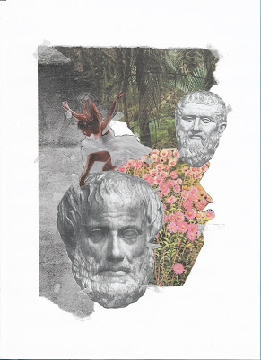
Inspired by DR. ME's talk on their creative practice and the work of collage artist, Adam Hale, I decided to experiment with contemporary hand-cut collage as my cover designs. Taking secondary imagery found in various magazine and flyers, I took those images which I felt represented some of the themes of the three books and pasted these together with masking tape to give it more of a hand-made aesthetic.
These experiments also included imagery of relevant philosophers, most of whom wrote the books or had some form of inspiration/input into beliefs conveyed within the books, such as Plato, Aristotle, Boethius and the Greek God of love, Eros.

Themes:
The Consolation of Philosophy
  • free will and determinism.
    puppet on strings could represent determinism, cogs/process of thinking to represent free will - the idea of making a decision freely.
  • the problem of evil.
    how can an all-loving, all-powerful and all-knowing God allow evil to happen in the world?
    attributes of God.


De Anima (On the Soul)
  • the body/soul distinction.
  • Plato - dualist (believed the body and soul were separate).
    Aristotle - interdependent (need each other to function).
  • believed the mind is the connection between the body and soul.
    the soul is the form of the body.
  • Analogy of the eye - if the eye were an animal, sight would have to be its soul. When the eye no longer sees then it is an eye in name only.
  • flowers/animals - nature, different types of souls.


The Symposium
  • the nature of love (Eros - Greek God of Love).
  • gender roles/sex in society/sublimation of basic human instincts.
  • Platonic love - same gender relationships.
    humans originally created with four arms, legs and heads with two faces, condemned to spend life looking for their other half.
  • "he whom love touches not walks in darkness".


OUGD404 - Studio Brief 02 - Chosen Penguin Classics

The Consolation of Philosophy by Boethius.
The Consolation of Philosophy was written by the sixth-century philosopher, Ancius Boethius whilst imprisoned and awaiting trial for alleged treason, and in the time leading up to his execution. The text reflects on philosophical questions and issues, such as the problem of theodicy (how can an all-knowing, all-loving and all-powerful God permit the manifestation of evil?), and the nature of free will and determinism (if God is all-knowing, does man have free will?).

De Anima (On the Soul) by Aristotle.
De Anima was written by philosopher and student to Plato, Aristotle. Aristotle believed that the soul is the 'form' or 'essence' of any living thing and is not distinct from the body. The text focuses on this discussion on the soul and the different types that can be possessed by different living things. In De Anima, Aristotle aims to set out his theory of the soul as the ultimate reality of embodied form.

The Symposium by Plato.
The Symposium is written by philosopher, Plato, and is described as a powerful discussion on the nature of love, which is examined through the speeches of men attending a symposium in praise of love or Eros (the Greek God of Love). From their conversations comes a series of subtle reflections on gender roles, sex in society and the sublimation of basic human instincts.


OUGD404 - Studio Brief 02 - Timeline of Marber's Life

1920's
1925 - 25th October, Romek Marber was born.

1930's
1939 - deported to the Bochnia ghetto.

1940's
1942 - saved from being sent to the Belzec death camp by Sergeant Kurzbach.
1946 - arrived in Britain, reunited with his father and brother, working at a London clothing factory.

1950's
Early 1950's - enrolled at St. Martin's School of Art.
1953 - attended the Royal College of Art.
Late 1950's - worked on projects, including covers for The Economist and New Society.

1960's
1961 - commissioned by Germano Facetti to design covers for Simeon Potter's 'Our Language' and 'Language in the modern world'.
1964 - employed as artistic director for The Observer Magazine.
1960's - 70's - The Marber Grid layout adopted for all Penguin books.

1980's
1989 - retired as a designer, became a Professor Emeritus of Middlesex University.

2010's
2010 - published an autobiography on his experiences during World War II, 'No Return: Journeys in the Holocaust'.
2013 - The Minories, Colchester exhibited a retrospective of graphic work designed by Romek Marber for Penguin books, The Economist, New Society and other works. The exhibition went on to be shown at the University of Brighton and the Galicia Jewish Museum in Krakow.

OUGD404 - Studio Brief 02 - The Marber Grid

Romek Marber, in producing his proposals for the new designs for Penguin crimes, observed that this series had remained unchanged for almost 25 years since Edward Young's designs, which were mainly typographic. In the process, Marber developed his own grid system so that each design for the series could follow a similar layout and pattern.

The grid keeps the same horizontal branding used previously in Edward Young's designs, however, the cover image occupies over two-thirds of the available space, which he used as a strategy to capture attention and sell the book. All typographic information was then collated and divided into three bands within the top third of the page. These contained the colophon (a brief statement containing information about the publication of a book), series names and price, the title and author's name.

Inspired by Marber's designs, Germano Facetti adopted this specific arrangement throughout the 1960's and 70's for practically all Penguin book series, whilst others contained small white figures to give books by the same author a distinctive and individual identification.