Reflecting back on this module as a whole, many new skills have been learnt, all of which will help in my career progression after graduation. Undertaking three days of work experience at Autoglym in their brand marketing and design teams was one of the major learning curves in my development as a designer. Since I have never had any experience before working within a professional environment, this was good to see the day-to-day running of a brand department, showing me how I would potentially be working in a real-life professional environment. For me in particular, finding work after graduation was a big fear of mine, not knowing what to expect and wondering whether or not I would actually enjoy the work, however taking part in this work experience has now put me more at ease about this eventuality. In addition, this experience allowed me to get stuck in with their work, taking part in a brief to produce an exclusive set of vinyl stickers targeted at Autoglym's younger demographic of consumers. The ideas and designs I produced towards this brief will hopefully go into production after approval, which has helped get my work out into the world.
In addition to new skills, this module has also allowed me to continue developing existing skills in order to build up a portfolio of work that I am pleased with and one which communicates myself as the kind of designer I want to be. Since my creative practice is varied, this has allowed me to continue developing a wide range of skills, such as printmaking, bookbinding and editorial design, illustration, branding, and digital design skills. One of these which has been particularly developed throughout this module is my branding design skills. This is something I had not explored much in previous years since at the time it did not appeal to me as something I wanted to go into in the future. However, it was realised that branding actually creates a large portion of a graphic designer's work. Therefore I took on a number of branding briefs, such as the End of Degree Show branding, Creative Convos branding, hypothetical branding for an event, as well as even a live logo design brief for a client. Through these briefs I have therefore been able to develop skills in this more specific area of design, and found it was something enjoyable that can be made as creative as you want it to be dependent on the project itself.
In particular though, despite some challenges, I have enjoyed the two editorial briefs I worked on this module. These were both produced experimenting with new production and bookbinding techniques I had not used before, such as perfect binding and hardback cover binding (also with the addition of a magnetic flap). These methods are what made these books look much more professional than any previous book I have produced, new skills which I shall take away for use in the future. These briefs also confirmed my love for print and I hope to work within this part of the industry at some stage in the future.
For other briefs in this module, collaboration was key, however something which came with its fair share of challenges. For instance, in both the Creative Convos brief and photography book brief, there were instances where people did not communicate effectively which as a result affected work flow up until the individual brief deadlines, making these more challenging to work to. In addition to this, multiple other briefs were on the go, something which I feel has geared me up for a potential career in the industry since this is how I would typically be working. It also showed me the importance of timetabling, as if any challenges arise with collaborators or clients that may affect work flow, then time can be factored in to avoid these going over a deadline.
Monday, 6 May 2019
OUGD603 - Work Experience - Evaluation
Working predominantly with the marketing team at Autoglym, but also liaising with the design team, I learnt a lot of new information and skills, as well as undertaking multiple tasks that allowed me to get stuck in with work and learn first hand about what goes into a brand department. It was interesting to see the way in which they work towards a brief and how everything that they do has a different strategy or tone of voice in order to market to their different consumer demographics, whilst still working overall to a strict set of guidelines to represent the brand in general.
One task I was given during this experience was to create content which eventually went live on all their social media channels. This was fun to see my work and ideas being utilised in the real world, and seeing how different people reacted to this. In addition, I worked collaboratively on a stickers brief with members of the design and marketing team. Again, my work produced from this will hopefully eventually go into production and will be exciting to see being used by people in a real world setting.
As well as allowing me to broaden my network of contacts, skills and experience for the future, this experience has opened my eyes to a potential career path I had not previously thought about. Before it was thought that marketing did not have much to do with Graphic Design, however both are about communication, which meant that the marketing team and the design team at Autoglym worked closely together on design and marketing strategies. However, saying this, I enjoyed much more of the design side of things within this experience and so, in terms of a future career, perhaps marketing is not something I would initially go for.
OUGD603 - Work Experience - Day Three: Stickers Brief
Stickers Brief:
The brief was to create sticker designs which can be sent out in packs as an exclusive freebie to those who order directly through Autoglym's website, with the purpose to try and engage with a younger audience of consumers, as well as giving them impression of better value for money if buying straight from the site rather than external retailers. This will also act as an additional element of promotion for the company, in the hope that people will stick these onto their cars or toolboxes, etc, which will then be seen by others out in public.
Research Considerations:
The first step in this project was to conduct some market research, in order to see what is already out there and what people are currently using or like in terms of style. Some of these research considerations were:
- What does the Autoglym brand represent?
- Look at what people are currently using, and themes featured in these.
- Car features - could these stickers be made interactive in any way to work with certain car features, or simply play on the design of these features, e.g. headlights.
- Look at where such stickers are typically stuck / placement.
- Think about current Autoglym brand assets - could these be manipulated in any way? Don't worry about guidelines or potential restrictions in this stage, but work creatively.
- Relate to Autoglym and their products in an engaging way.
- Simple / creative?
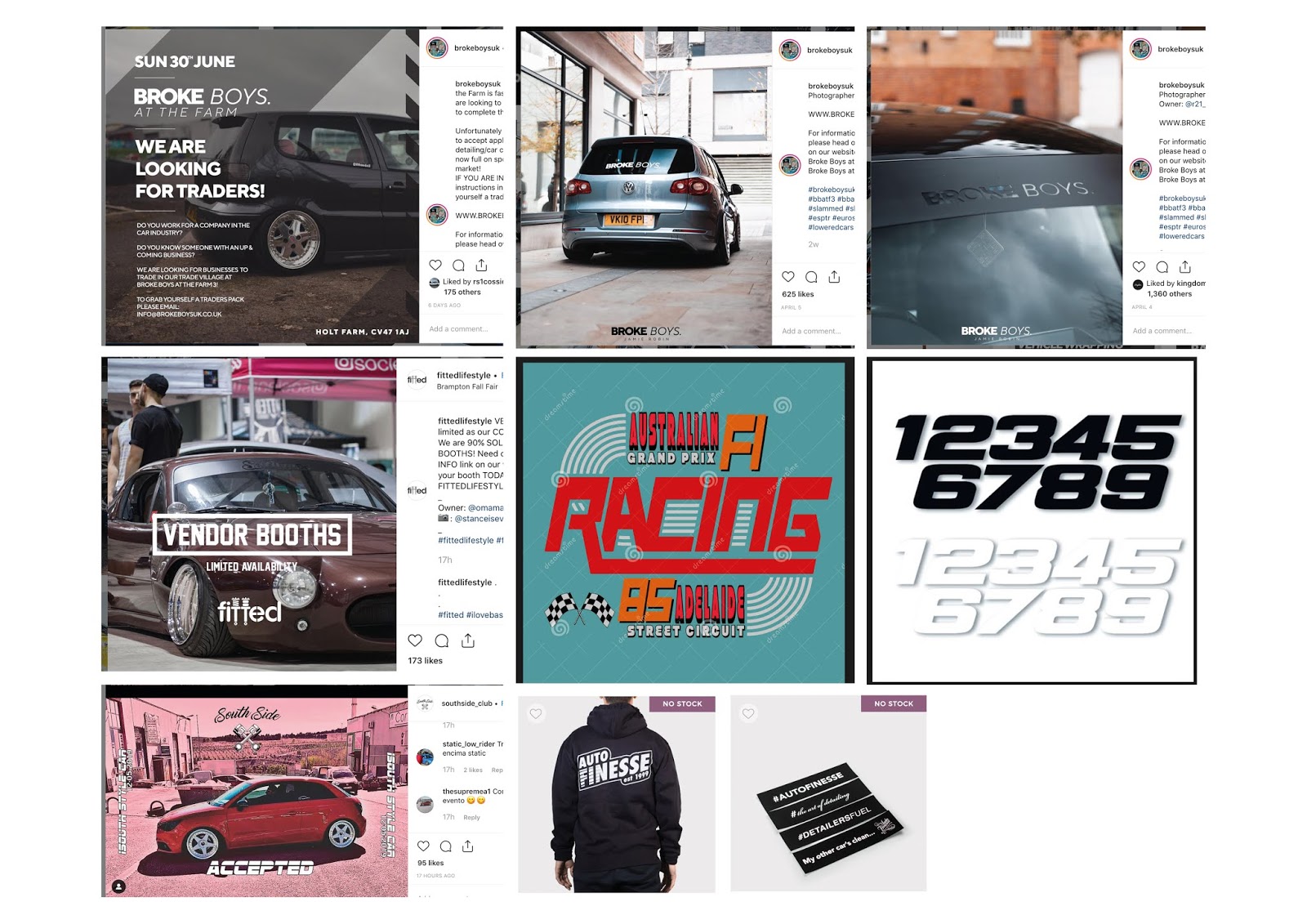
Another thing to look at in this market research was existing car brands or people that Autoglym are affiliated with in some way in order to see what their audience likes, and search hashtags on Instagram, such as @brokeboysuk, @stancenation, autofinesse, #stance, #stancenation, #ultimate dubs, #builtnotbought, and others which may appear in similar posts.
Market Research:

Based on research, one of the things I found was that the most common placements for car stickers were on the back windscreen, bumpers and passenger windows, potentially so that these are easily seen and create some impact, as well as working more practically in their placement. The size of these, therefore, it was also found are typically formatted in rectangles or circles, again, to work practically with being able to see out of the back window for instance. However, there were some exceptions to the rule, whereby others liked larger stickers which created much more of an impact on their cars.
Another thing that was found was that a lot of people tend to like more typographic designs in order to communicate some sort of message. This is something which was also found to work with the typical placements of car stickers in their formats, etc. These typographic designs are usually quite playful, utilising a mixture of different font styles, whilst others remain fairly simple, utilising different font weights or simply a brand's logo.
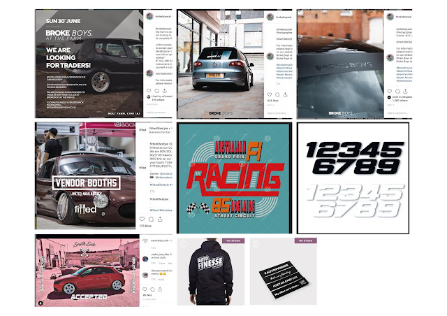
This piece of research therefore got me thinking about different type styles and trends at the moment with the younger demographic. One of these styles was 'Vaporwave', which can be described as quite retro (a style which seems to be coming back into fashion) and focuses on themes such as consumer society. Due to this underlying theme, the typographic designs tend to communicate ideas of movement and a 'fast-paced' society. This sense of movement I thought, whilst the style itself relating to current style trends with the younger demographic, also relates to the Autoglym brand itself in that its related to cars which are 'fast-paced', as well as its new range of products which require a pressure washer to be able to use.

In contrast, one other thing I found through market research was that other members of the younger demographic also like cartoon style designs and themes which relate to popular culture, such as films, caricatures, etc.

Another thing that was found was that a lot of people tend to like more typographic designs in order to communicate some sort of message. This is something which was also found to work with the typical placements of car stickers in their formats, etc. These typographic designs are usually quite playful, utilising a mixture of different font styles, whilst others remain fairly simple, utilising different font weights or simply a brand's logo.
This piece of research therefore got me thinking about different type styles and trends at the moment with the younger demographic. One of these styles was 'Vaporwave', which can be described as quite retro (a style which seems to be coming back into fashion) and focuses on themes such as consumer society. Due to this underlying theme, the typographic designs tend to communicate ideas of movement and a 'fast-paced' society. This sense of movement I thought, whilst the style itself relating to current style trends with the younger demographic, also relates to the Autoglym brand itself in that its related to cars which are 'fast-paced', as well as its new range of products which require a pressure washer to be able to use.

In contrast, one other thing I found through market research was that other members of the younger demographic also like cartoon style designs and themes which relate to popular culture, such as films, caricatures, etc.

Ideas and Scamps:
Based on this market research, some initial ideas were formed and rough scamps were sketched out, attempting to better visualise some of these ideas. One of these ideas was based on an additional piece of market research, which found that people seem to like stickers which match the colours of their car. The idea based on this therefore was to create a simple design which features the Autoglym logo with a transparent background. This means that the colour of the person's car is able to show through and be in keep with the colours of their car. In addition this idea plays on Autoglym's product branding, whereby different product series has a different colour background featured in the logo, and so essentially making the consumer's car a part of Autoglym's brand.
Other ideas played on Vaporwave styles of typography. Various ideas based on this utilised the names and taglines for Autoglym's new product series, 'The Polar Series'. One of these products is called 'Polar Blast' which is a shampoo for your car which is described as 'snow foam'. One idea therefore was to typographically reproduce the name 'Polar Blast', with the word 'Polar' styled as if creating out of foam and contrasting this with the word 'Blast' in an italics font to represent the movement of a pressure washer needed to use this product. Another idea based on this was to utilised the name 'Polar Blast' in a simpler way, utilising Autoglym's typography and placing this on a Northern lights background used in their current campaign for this Polar Series.
Continuing to play on Vaporwave aesthetics of typography, a few other ideas were sketched playing on Autoglym's brand history. This took a section from their tagline "Passion For Perfection" and paired this with 'est. 1965', the year in which Autoglym was founded to produce the new tagline 'Perfection est. 1965'. This type would then also utilise varying font styles in order to communicate the idea of movement in an engaging, playing and 'trendy' way.
Further ideas looked at creating more illustrative designs. These explored creating characters which could be used to promote the Autoglym brand and new Polar product series, kind of acting as an ambassador for the brand. One idea was to utilise the image of a polar bear holding a product, and another utilising the image of a seal. In order to enhance the message, an additional idea was to pair these characters with playful taglines based on the different products within the Polar Series. For instance "Keep It Polar" paired with the polar bear, and "Always Seal In" paired with the seal to represent their Polar Seal product.

Not necessarily an idea for this particular sticker range, but one additional idea I had for a sticker was to simply create a QR code. These are sometimes added to Autoglym's product packaging in order to get the consumer to engage more with the brand. For this idea therefore, it was thought that these QR codes could also be made into stickers, which could then be sent out to brand ambassadors to stick on their cars. Often these ambassadors take pride in their cars and take them to shows, etc. This idea would then aim to get the public to interact with their cars at these shows and therefore also engage with the Autoglym brand. This would therefore act as an additional element of brand promotion from their ambassadors.
Existing members of the design and marketing team also worked on additional ideas and scamps which looked at answering this brief.
Rachel's Scamps:
Similar to some of my ideas, a lot of Rachel's ideas looked at exploring the creation of characters which could potentially be used in a playful way to engage the younger demographic and act kind of like an additional ambassador to the brand. Other ideas of hers looked at playing on typography, particularly geometric designs, which she found through her own market research is a big trend at the moment, whilst others played on the brand's logo in a simple but playful way, such as creating this into a puddle under a crying sponge and overlaying this onto pattern.


Shaun's Scamps:
Similarly, again, some of Shaun's ideas looked at creating a character, which he paired with the playful tagline "Kick The Bucket" in order to communicate the idea of the new Polar product series avoiding the need for a two-bucket wash, since the products have been designed to work with a pressure washer. His idea therefore was to visualise this character doing different tasks, however each time reinstating the message that she is getting rid of the bucket, working interestingly with the tagline he produced to go alongside in in "Kick The Bucket".
Other ideas of his looked at playing on the properties of the products. Their snow foam product has been designed to cling to your car for at least 10 minutes in order to loosen any dirt. Through this, Shaun created another character designed to look like a bundle of foam with another playful tagline "My Snow Foam Is Clingy... Like My Ex" in order to try and make this funny and relatable to both real life and the Autoglym product in question.


Final Ideas to Mock-Up:
At the end of the day all members of the marketing and design team held a meeting to liaise and present each others ideas. Based on this we created a list of those ideas which we felt were strongest and wanted to take forward to mock-up digitally. These included:
- Autoglym logo - full transparent and transparent text in a variety of colours.
- "Perfection est. 1965" in Vaporwave style.
- Polar bear with "Keep It Polar" tagline.
- Autoglym love hands with Polar series logo underneath.
- Super Resin Man.
- Leopard Autoglym logo and other pattern ideas.
- Car care explosion / floral art.
- Cartoon resin polish character.
- Kick The Bucket character.
- Rectangular pattern ideas as background image with type overlayed - one line Autoglym logo or polar blast vaporwave / foam style type.
It was also considered that some of these ideas would work better as GIFs. This something which Shaun found from market research on Instagram whereby people can add GIFs and digital stickers to their story posts. It was thought that a pack of these could therefore also be created which Instagram brand ambassadors or members of the public could use on their Instagram stories if promoting the Autoglym brand, which others would then see and can interact with. Those ideas which we thought could be turned into GIFs were:
- "Perfection est. 1965" in Vaporwave style - could have a simple shine move across the type, or make it seem as if a part of the type is moving to give the impression of action and movement.
- Polar bear with pressure washer - washing his igloo or bear turning around and looking as if covered in snow foam product.
- Super Resin Man - keep figure static, make cape move as if blowing in the wind.
- Clingy snowfoam - have the snowfoam character slide down the screen slowly and keep eye contact the whole time.

Approval and Production:
After the meeting, Shaun explained the process of production for this brief. Once mocked-up, each of these ideas would be presented to a person of the higher management team for approval for production. This person will assess the ideas and discuss whether or not they are deemed appropriate or reflect the brand in the best light. For this reason, once digitally produced, these ideas would be mocked-up onto images of cars as an additional way to convince the management team for approval in showing the designs in context and a more professional way.
Unfortunately during my time at Autoglym, there was not enough time for me to put any of my ideas into digital production, however I have been given the opportunity to continue with this brief in my own time and send over any designs I want to eventually see go into production.
OUGD603 - Work Experience - Day Three: Making A Social Media Post

Making A Social Post Task:
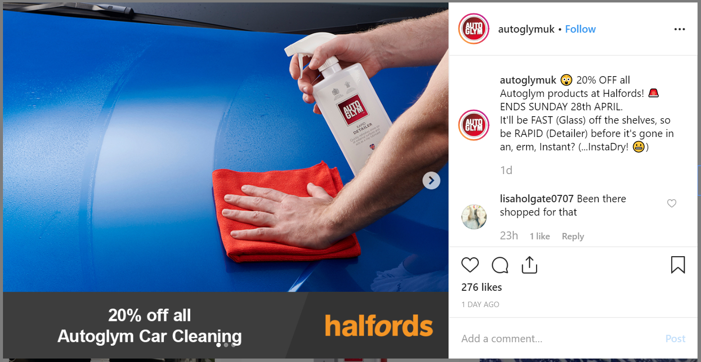
In order to further see the running of and production of content for social media channels, I was given the task of helping to create a post informing customers that they only have until Sunday 28th April to get 20% off all Autoglym products at Halfords. When working in partnership with external brands it was said how there are regulations that need to be followed in creating any content for this, since there will be certain guidelines which the external brand would want to be used in conjunction with Autoglym's branding.
For this task we therefore initially explored the use of design on Halfords' website to see if some consistency could be created in brand elements in the design of this content.
 |
| Screenshot of logo design on website. |
 |
| Screenshot of offer design on Halfords website. |
Since there are guidelines in the use of the logo, we decided to keep this the same, utilising the logo on a grey background with a slanted line which separates this logo from other information. We also looked at the use of type on the website they used to promote this offer, and attempted to recreate this by finding the closest typographic match and then manipulating the spacing. One alternate idea to this, however, was to use orange for the offer information in order to match the Halfords' logo, however it was eventually decided to change this to white in order to more appropriately differentiate between the two pieces of information and allow both these sections to stand out individually, rather than blend into one as they did when experimenting with this orange.

In terms of imagery, we had a couple of ideas. One of these ideas was to utilise an image of Autoglym's new polar range series in order to further promote these new products. However, it was considered that the use of these products as imagery may 'cheapen' the look of the products, suggesting to the consumers that this new series is not selling very well and so are discounting them already, which is not the case. For this reason, another idea was to use imagery of products with 'fast' names and those which show movement, as a suggestion for call to action (call the consumers to act upon the offer at hand). Products we made a list of for potential use were:
- Rapid Detailer.
- Fast Glass.
- Instant Tyre Dressing.
- Instant Show Shine.
- Instadry.
Eventually, we decided on three which best suggested this call for action in their product in use shots, which were Rapid Detailer, Fast Glass, and Instadry.
 |
| Rapid Detailer. |
 |
| Instadry. |
 |
| Fast Glass. |
We then added the offer line to the bottom of these images, formatting both elements so that the product in the photographs is shown clearly and impactfully, as well as showing clearly what is being communicated in terms of the offer.


Based on these content images I was then given the task of creating written content to go with the social media posts. Since posts on social media gain more of a following from their younger audience demographics then these can be more playful in their tone of voice, communicating with the audience in a friendlier way as if close friends. A lot of my ideas for this written content therefore consisted of attempting to create puns out of the names of the products to continue to communicate a call to action, whilst directly referencing Autoglym's products.


After reviewing all my ideas with Shaun and the marketing manager, we decided to go with "It'll be FAST (Glass) off the shelves, so be RAPID (Detailer), before it's gone in an, erm, Instant (...Instadry!)". As another way to create playfulness and engagement with the younger demographic on social media, the marketing team often use emojis to continue to convey this friendly tone of voice, therefore some of these were added amongst the post also.
Final Posts:
 |
| Facebook Post. |
 |
| Twitter Post. |
 |
| Instagram Post. |
When making these posts, it was also important to consider their format and resolution, which had to be changed depending on the social platform. Furthermore, in posts such as these, the marketing department, where they can, always tag the external brand in their posts so that consumers of both brands can see and potentially attract a new audience demographic.
Post Management:
After the post becoming live, throughout the day we continued to monitor the interaction with this post from consumers. It was interesting to see how the tone of voice used for the post engaged people in different ways, with the playful tone in particular being something which people commented on and allowed them to feel as if they could reply in a similar way.

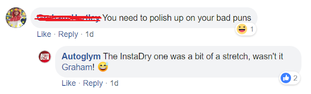
After the post becoming live, throughout the day we continued to monitor the interaction with this post from consumers. It was interesting to see how the tone of voice used for the post engaged people in different ways, with the playful tone in particular being something which people commented on and allowed them to feel as if they could reply in a similar way.


OUGD603 - Work Experience - Day Two: Core Range Assets

Core Range Assets:
Core range refers to the most popular products which Autoglym sell, separated into three categories with three products in each category: internal, external and wheels. It is important to update photography for these assets in creating consistency in design, especially product shots on the website, as well as allowing these to appeal in the current market.
 |
| Screenshot from current website showing their old and new photography techniques for product assets - shows how these need to be updated to produce consistency amongst all product images. |
As a way of managing these assets, the marketing team introduced a method called "search and spin" whereby one person from the marketing department is called to present new ideas on how to improve outdated photography through exploring current photography styles and trends. The technique they currently use they named "The Jesus Effect", whereby they shoot the product from below and at an angle, rather than their old 'head-on' approach, since they found that this elevates the product and gives it more of an impact since this is not a typical angle you would view something, giving it some sort of superiority as an object.
As well as individual product shots, they also show product in use shots in order to show how each product is effectively used and how it works. Within this, one other update consideration Autoglym have is the car models they use for product shoots. These have to be current and relevant, and appeal to a wide audience of car lovers and enthusiasts so that certain demographics do not feel alienated. Often Autoglym use their brand influencer's cars or borrow new cars from local garages for these product in use shoots.
Meeting The Photographer:
In further showing me the importance of updating these photography assets and how they go about doing this, I was introduced to their product photographer, Brian, who gave me a tour of his studio and explained parts of his practice. In taking product in use shoots, Brian explained the importance of small details, such as reflections. All of these small, subtle considerations which you may not even notice initially are what makes up a brand's identity.
Demonstration Videos (part of core range data assests):
As another part of Autoglym's data assests, they also produce demonstration videos on how to use each product, which feature on both their website and YouTube. Like their photography, Autoglym are constantly thinking about ways these can be updated in order to appeal to a wide audience of car lovers so that certain demongraphics of theirs do not feel alienated.
In these videos, Autoglym used to have a presenter showing how to use each product, however realised that this only appealed to a specific demographic. For instance, if the presenter is a white male in his 30's then it may target this audience more and other consumers may feel alienated and like they are either too young or old to be using Autoglym's brand of products. For this reason, they looked at adapting a new video style. This new style was inspired by videos by Primitive Technology, whereby he does not use any additional music or instructions, he simply uses the natural sounds of the environment and materials he uses, as well as close-up shots to show clearly what he is doing to achieve his result. It was considered by Autoglym that this style appeals to more people since, for instance, if a certain music style is used, this may then only appeal to those who enjoy that certain style of music, whereas if the natural sounds of an object or process are used, then more people can relate to this.
This new style of demonstration videos were also inspired by videos from Freitag, a brand which use stopmotion methods to show products in use in an environment which is natural to it.
The new video style takes elements from both Primitive Technology and Freitag. The videos simply use the natural sounds of the products and processes being used, such as the sound of the pressure washer and the sound of product being poured out of the bottle. The videos have also been shot in an environment which represents the brand and products, shooting these in a warehouse/factory setting, with metal floors and background elements. These then use on-screen instructions rather than their old way of having someone speak through the process, meaning that its inclusive to everyone, not just consumers from a certain demographic, whilst this also means the videos can be watched without sound too for those who are unable to watch with sound.
Storyboards:
In learning about this process of updating data assets, I also learnt about the process which happens before these kind of videos are created. Shaun starts by sketching out the subject at various different angles and creating cutout pngs of these to be used in the storyboarding process. Some considerations were:
- Keep it simple to allow for change and flexibility, otherwise a vision might be too resolved and therefore make it hard in the production of the video, and cause challenges if this vision is not able to be achieved in the way it was initially thought.
- Use simple sketch lines for camera and motion movement to differentiate between the two.
- Try to stick to one page.
- Write notes underneath as guidance instructions.

Meeting The Digital Printers:
Throughout the day I also got the opportunity to meet the digital printers which Autoglym use to print any advertising media or product packaging, who gave me a tour of their workshop, and explained some of the print processes and equipment they use. One of these pieces of equipment was called the 'Indigo Press', which works by electronically firing an image onto paper, recreating this same image individually in CMYK. This process allows the print quality to therefore be exactly the same no matter how many runs were produced, from one to one thousand. As a part of this print technology, the printers also have a special program code which allows the image to be personalised on each print in just one run, without having to print separate layers in two or more runs - a process good for tickets, personalised products, etc.
OUGD603 - Work Experience - Day One: Marketing, TOV, Social Media and Brand Guidelines

Autoglym was established in 1965, formerly known as Welwyn Plastics and quickly became a trusted name in car care across car dealerships and garages.
Marketing and Tone of Voice (TOV):
Autoglym has five different brand departments within their brand:
- Autoglym retail brand.
- Autoglym professional.
- Autoglym lifeshine.
- Autoglym Carbon Shield.
- IMO.
Each of these need a different tone of voice to appropriately market to the different types of consumers, as well as changing these depending on what media they are using to promote their brand, for instance, social media, press and advertising, and POS (point of sale, meaning what consumers would see where the brand products are being stocked in a retailer and are about to purchase or think about purchasing a product, for instance, product stands, etc).
Within this there are also two different types of marketing:
- B to B marketing = business to business marketing.
- B to C marketing = business to consumer marketing.
Each of these need a different tone of voice, also, since business to business care more about value for money if buying a product in bulk for their business, but the product packaging and design for this still needs to look professional so that if a product is on display then customers can see what they are using and get a good view of the brand. Whereas, business to consumer marketing needs to have a friendlier tone of voice so that consumers easily understand what each product does and get the impression that they are a trusted brand to use in taking care of their car.
* QUICK TIP: for making type look more professional, place in all caps, up the kerning/tracking between letters and place on a dark background. When typesetting, it is best to set to 0 or optical.
Social Media Channels:
Shaun's first task of the day is to run through Autoglym's social media channels and review the previous evening's engagement, interacting with people's comments and posts and flagging up any complaints or questions with the customer care team who deal with this. If another brand or business has commented on something it is also good to engage with this in some way for the potential of working with them on future projects or marketing strategies.
Autoglym also have brand influencers on Instagram and YouTube who get sent products free from Autoglym and then have to do at least three posts a month endorsing Autoglym's products - strategy they use in order to reach new consumers and show that they are a trusted brand, which is important to get from a consumers perspective, since people are more likely to believe this if it comes from people like them, as they know that the brand itself has to say its great to be able to sell. Autoglym hold a document with all influencers and their details in in order to keep track and monitor what posts they have done, how good they are at endorsing the brand, reliability and trustworthiness, and how much product they have been sent. Influencers who do not post to these guidelines are flagged up in red and on the brink of terminating their contract - some people run with the free product and never post, so Autoglym have to be careful with who they let on. Autoglym also need to be careful in this sense with who they take on as influencers since this will also have an effect on how the brand is portrayed, for instance, if a person or potential influencer is racist, etc, Autoglym does not want it to seem as if they endorse this kind of behaviour, since it would look bad on their part and as a result affect the successfullness of the brand. If an influencer hasn't posted in a while, sometimes a god way is to interact with a post of theirs to job their memory.
Another easy way to engage with consumers on social media, especially Instagram, is to share things to their stories which customers have tagged their brand in. Sometimes Autoglym also works in partnership with other brands and businesses in an agreement which promotes Autoglym on the other brand's page, again to try and reach new audiences and types of consumers.
They also keep on the look out for any news stories which they can jump on and make reactive content to that promotes their brand in current affairs, for instance "Blood rain = Polar Wash".
 |
| Example of reactive content to current affairs to promote their brand. |
 |
| Example of reactive content to current affairs to promote their brand. |
Brand Guidelines Task:
After a rebrand a couple of years ago, this meant that Autoglym's brand guidelines were outdated. As an exercise to see all the different small elements that you may not realise goes into creating a brand, the task for the day was to help in starting to create new brand guidelines, which also aimed to show how the document will break down to serve the various brand departments and their different design and marketing strategies.
Referring to other brand guidelines, such as Harrods and Seat, as well as liaising with the design team, a contents page was initially created. We found that it was important to place elements of the core branding first in the guidelines, since how these should be used will ultimately affect design elements, such as packaging, POS (point of sale), and current campaigns, etc.

Based on this contents, we then began working on a section for Tone of Voice (TOV) for the retail brand, the brand of products which ordinary consumers will see online and in stores, such as Halfords. Each of these TOV's were different for different elements of marketing, such as social media, advertising, point of sale and packaging, since each of these hold different consumer demographics which Autoglym need to appeal to.
It was important that these sections were worded in ways which anyone could understand, since these brand guidelines will serve as a document which can just be handed over to anyone who may need to work with the brand on design and marketing material, such as external agencies.

Since this document will be an ongoing thing and certain elements will change over time, the task was not finished, however, referring back to other brand guidelines and the old Autoglym guidelines, we looked at how this finished copy would eventually be presented in a document.
Typically, it was found that brand guidelines start by giving some background information on the brand, so that external agencies or anyone who this document is handed to have additional information which could help them in presenting the correct tone of voice and help them understand how the brand portrays themself, or at least want to be portrayed.
 |
| Example of old brand guidelines page. |
 |
| Example of old brand guidelines page. |
It was also found that brand guidelines give examples of how the core design elements have been utilised in existing campaigns, design, and brand material. One idea in the production of the new Autoglym brand guidelines we had therefore, in the tone of voice section, was to present information next to an example of how this tone of voice has been conveyed before, for instance in an existing social media post.
 |
| Example of old brand guidelines page. |
 |
| Example of how information and examples would be paired together in new brand guidelines. |
Saturday, 4 May 2019
OUGD603 - Guidebook - Evaluation
In evaluating the final outcome, it was considered that the guidebook succeeds in both reflecting some of the typical design elements of a guidebook as well as the feel of it as something to be seen as more of a souvenir item, not just a practical item, which has been conveyed well through its production.
It was also considered that the layout of the guidebook worked effectively in presenting clarity of information, as needed in a typical guidebook. The underlying use of Fibonacci sequences and golden ratio within this layout also proves to be an interesting and creative way of representing ideas of nature in the context of the book through its design, a direct link to the Arts and Crafts movement which featured heavily in the design of Letchworth Garden City, likewise in the design of this book.
Originally, it was intended to include 'the people of the Arts and Crafts movement' A6 insert within the guidebook itself, however unfortunately as a last minute change it was suggested that this should be removed since this left too large of a gap within the spine to be able to bind it together with the rest of the A5 pages. This gap would have ended up compromising the bind and the design of the book whereby glue would seep through to the inside pages. This will be remembered for next time, instead creating an insert such as this with a smaller page count or at the same size as the book, but still utilising a different paper stock as a separation between this and the rest of the content. However, despite this challenge, the insert has still decided to be utilised within the guidebook, instead simply inserting it within the front cover since it features interesting information which was designed to accompany other information featured in the book.
In addition, there were many challenges in creating the hardback cover for the book. One of these was that the magnets used for the magnetic flap, once utilised within the book, lost some of their strength, and so the closure of the book is weaker than would have hoped for. However, despite this, the concept behind this idea of using three magnets to hold the book together in representing Ebenezer Howard's three magnets diagram for the development of Letchworth Garden City was considered to be a strong and creative way of incorporating the context of the book within the production of the book itself. If this were to be done differently, though, it was thought that perhaps the magnets should be adhered to the outside of the cover material so that these not only work stronger, but are also visible to the reader and so potentially communicates the idea behind using them clearer.
Subscribe to:
Posts (Atom)