Sneak Typeface
Sneak is a crisp, sans-serif typeface, available in six different weights. The typeface features several reversed characters, such as B and S, which Fohrer describes himself as "a typographic bridge between order and disorder".
One aim of TIGHTYPE is to provide visually strong typefaces for people who value contemporary type design. I feel that Sneak type works well in this sense, as it is quite clean and contemporary, which could have multiple applications within use as a display type. The reversed characters mean that certain letterforms are more weighted at the top rather than at the bottom. This creates links with my own project in creating a 'flimsy' typeface, as some letterforms are more top-heavy meaning they could be seen as unstable (which was one of my initial ideas for studio brief 02). Other letterforms are quite narrow, such as M in Sneak Mono, which could reflect a thin, fragile material or structure. On consideration, this could also link to the sharp slants used in uppercase Caslon (a traditional serif-typeface), which makes the letterforms seem really narrow and as if they are toppling over.
However, Sneak type takes a sans-serif typeface and diminishes it's strong, stable characteristics in manipulating it's weights in some characters. I will continue to work with sans-serif typefaces, such as Univers and Helvetica within my own work, therefore initially contrasting with the idea of 'flimsiness' but developing it into a typeface which is much less stable and more fragile than originally intended. To help inform these ideas and the purpose of my developing typeface, I should consider how it would be used in context. For example, manipulating a strong typeface into a flimsy one, then using it in a way which solidifies the typeface again in an impactful context. Inspiration would come from how Sneak type has been used in Victoria Jung's Perspective Poster Series.
 |
| Fig. 1. Sneak Type, Fabian Fohrer (2016). |
 |
| Fig. 2. Sneak Type, Fabian Fohrer (2016). |
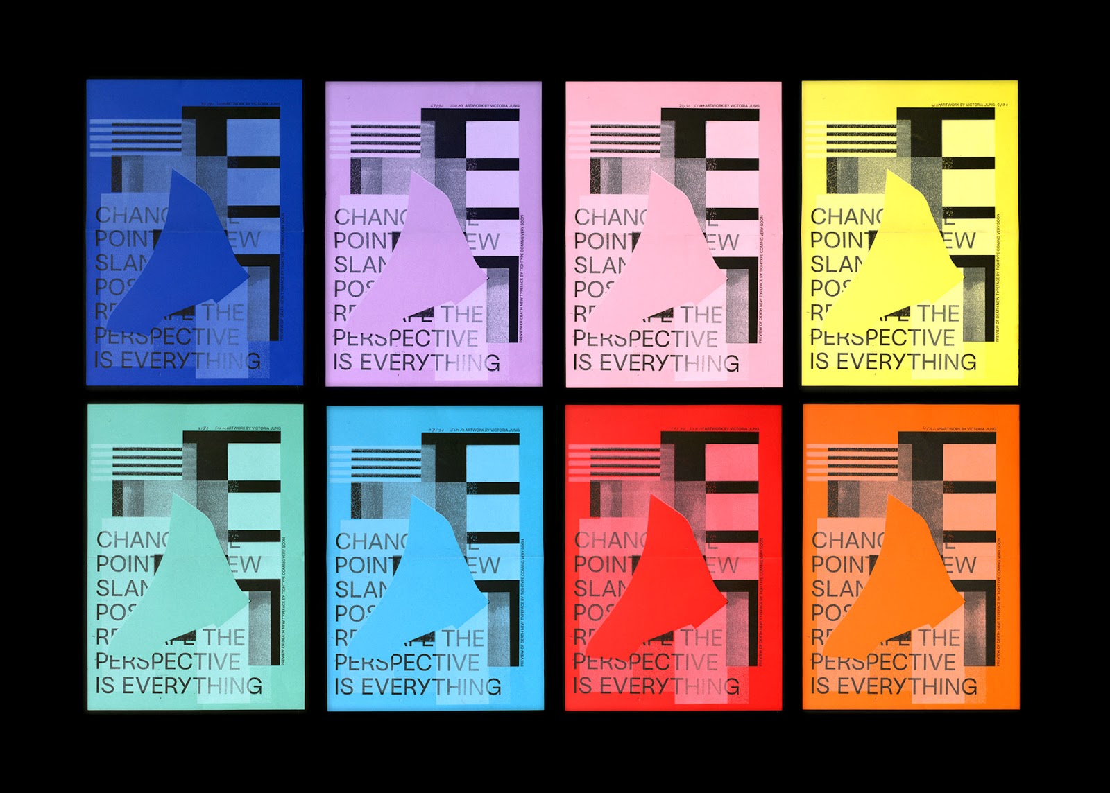 |
| Fig. 3. Sneak Type in use - Victoria Jung's Perspective Poster Series. |
No comments:
Post a Comment