Throughout this module I have learnt a great deal about designing both for print and for screen, in terms of both design elements as well as production processes. Due to the more commercial and practical nature of this module, this has taught me about the various requirements when designing for print and for screen which would need to be utilised. One of these requirements is the development of wireframes, personas and task flow charts, all essential elements when designing for screen. Working with these processes when designing for screen has shown me their importance in effectively communicating layouts in app and interface design, as well as showing the navigation processes through these. This has therefore helped me to better understand what a client would require in the real world, and such processes will help me to better communicate my ideas to a potential client in the future if designing for screen.
Designing for screen is something which I had not had any experience with before this module, and is something which I had not considered in it's entirety. This module has therefore allowed me to develop new skills in the use of specific software, such as Adobe xd which allowed me to produce a click-through navigation of how my interface would potentially work if it were a fully functioning interface through the wiring of specific elements and functions. Another element of this is the development of new skills in animation, particularly using Photoshop frame and video timelines, to also produce simple animations of my final interface would process. This was an enjoyable part of the module and will continue to be developed in further modules as well as other future design works. Despite enjoying this element, this module has also taught me that designing for screen is possibly not something I wish to pursue in a future career as a graphic designer.
Although having experience with layout and publication design last year, this module, in particular studio brief 01, has allowed me to further develop such skills and gain a wider understanding of specific principles and processes when designing for print in a more commercial way. For instance, workshops taught me the correct ways to print booklets from InDesign, each specific to certain types of binding methods. In addition, other workshops as well as independent learning has helped me to further develop my bookbinding skills showing new ways to bind material together which can have just as much of an effect on the design of a publication than the content itself. Since handmade and book design is something of particular interest to me, this was an enjoyable part of the module, skills of which I will continue to develop upon in future design work.
In addition, the unexpected switch in what we would be designing our publication for was a valuable experience to gain. Although not initially agreed upon, the experience replicated the client - designer relationship in the real world, whereby an author will provide the content and the designer will place this in some sort of coherent designed format for them. This affirmed the importance of collaboration within design and therefore I will be making an effort to work more collaboratively with people, not just from this course, in order to further inform my creative practice and create new connections which I could potentially use in the future.
Sunday, 19 November 2017
OUGD504 - Studio Brief 02 - Feedback Developments
Based on peer feedback from the final crit session, it was decided to develop my final interface design to see how these potential improvements would work for the interface. One piece of feedback suggested the the initial use of rounded border for text made the overall design of the interface look 'childish'. For this reason, developments made use of more squared borders in order to convey a more mature and professional design which would better target an older generation who would be more inclined to use this service.

In addition, it was suggested that the colour scheme also conveyed such a childish theme. Therefore to improve on this, more neutral colours were experimented with, such as grey and black, which made specific elements feel more professional, such as the keyboard. This development also reflected the style of keyboards typically found on android mobile and tablet devices, which gives the interface a sense of familiarity which could potentially help with it's ease of use. Additionally, this helps provide consistency with the integration of Google maps for the interactive map feature as part of the final interface design.

Continuing along the lines of consistency, one piece of feedback suggested that the typeface used for the time screen and that used for the rest of the information were too contrasting. Although one used initially to reflect the aesthetics of existing flight and train departure boards and the other to ensure accurate communication of information regarding journey bookings, these were experimented with in order to help provide consistency amongst them. For the first, I looked at integrating Helvetica Light into the time board. Due to the practical nature of this typeface this continued to work just as well for the time element of the interface in terms of clarity and communication of information, as well as ensuring more consistency throughout the final interface design. On the other hand, the more digitalised typeface known as 'fake receipt' was also experimented with as the predominant typeface for all other information, including the time screen. However, this did not work as well since it made the interface seem more 'robotic' and could potentially intimidate the older generation of users.
The main colour of the typeface, used in the start and end screens, and those which appear when not viewing the interactive map, was also toned down. Peer feedback suggested that the initial blue colour used for the final interface was perhaps slightly too bright and again, led back to the potentially childish theme. Toning down the colour meant showed more consistency with the more neutral colour scheme, and would potentially better enhance the effective communication of information on screen since this information does not get distracted by the bright colour.

Since this interface is neither an app or a website, in the real design world clients would expect to see a responsive version of this interface, for instance if it were eventually converted to mobile. Based on this, experimentation was done into how the interface would work in a portrait format. Through these developments, it was found that placing the time screen down the side of the interface would mean that a continuously column of information could be formed, allowing for better and more accurate communication, whereas when this was placed at the top of the screen, the information appeared more crowded and illegible. It was also found through these developments, that a responsive format would potentially better reflect the natural movements of the users, such as when scrolling through information feeds. This would therefore provide a more natural navigation process through the interface, which overall would enhance it's ease of use.


In addition, it was suggested that the colour scheme also conveyed such a childish theme. Therefore to improve on this, more neutral colours were experimented with, such as grey and black, which made specific elements feel more professional, such as the keyboard. This development also reflected the style of keyboards typically found on android mobile and tablet devices, which gives the interface a sense of familiarity which could potentially help with it's ease of use. Additionally, this helps provide consistency with the integration of Google maps for the interactive map feature as part of the final interface design.

The main colour of the typeface, used in the start and end screens, and those which appear when not viewing the interactive map, was also toned down. Peer feedback suggested that the initial blue colour used for the final interface was perhaps slightly too bright and again, led back to the potentially childish theme. Toning down the colour meant showed more consistency with the more neutral colour scheme, and would potentially better enhance the effective communication of information on screen since this information does not get distracted by the bright colour.

Since this interface is neither an app or a website, in the real design world clients would expect to see a responsive version of this interface, for instance if it were eventually converted to mobile. Based on this, experimentation was done into how the interface would work in a portrait format. Through these developments, it was found that placing the time screen down the side of the interface would mean that a continuously column of information could be formed, allowing for better and more accurate communication, whereas when this was placed at the top of the screen, the information appeared more crowded and illegible. It was also found through these developments, that a responsive format would potentially better reflect the natural movements of the users, such as when scrolling through information feeds. This would therefore provide a more natural navigation process through the interface, which overall would enhance it's ease of use.

OUGD504 - Studio Brief 02 - '100 Ideas that Changed the Web' by Jim Boulton, Responsive Web Design
RESPONSIVE WEB DESIGN:
Through feedback of the final interface design, it was pointed out that since the function of this interface is neither an app nor a website, in the real design world clients would expect to see a responsive version of this interface.
Jim Boulton talks about the importance of responsive web design when working with design for screen. "Increasingly, the most important screen is our phone, the last screen we look at at night", however content optimised for larger screen experiences often produces disappointing results when viewed on smaller screens or vice versa when design for smaller screens is viewed at larger resolutions. This issue therefore prompted Ethan Marcotte to coin the term 'responsible web design', becoming particularly inspired by responsive architecture whereby buildings react and adapt as people pass through them. He stated that "rather than tailoring disconnected designs to each of an ever-increasing number of web devices, we treat them as facets of the same experience. We can design for optimal viewing experience, but embed standards-based technologies into our designs to make them not only more flexible, but more adaptive to the media that renders them".
In further developments to the final interface, such responsive design would therefore need to be catered for if this user experience were to also eventually be developed into a mobile app, whereby it would possibly get more use in terms of function since mobiles have been researched to be the most important screen in ux design. This research shows how designing a responsive version of my interface does not have to replicate an exact version of the interface on a smaller scale, but elements and standards in it's overall design can be taken and utilised to make the responsive version function better at a smaller resolution whilst staying consistent with the design of other versions.

OUGD504 - Studio Brief 02 - Branding
Since the purpose of the final interface is to provide a solution to the potential problem whereby a member of the public may have no battery left on their mobile device in order to book a taxi or do not hold any cash in order to pick up one from a rank, and the function of the interface being to book such journeys, it was decided that the branding for this interface needed to reflect upon this. It was decided initially that the logo should be representative of the typical view people hold for a taxi. This included the image of the traditional yellow taxi's found within the United States.
An illustration was then produced in order to reflect this. The illustrative style was used to reflect a friendlier nature to the interface, something which had been considered throughout many other elements of the final interface design that could potentially put the users more at ease and provide a comfortable service if they are in such a situation whereby they cannot get to their destination easily, as outlined in the initial problem. Since fully functioning interfaces are usually developed to be on a global scale, the use of a yellow taxi was considered to reflect upon this usual requirement, since it is the stereotypical image of taxis held by many people in the world and not just the United States where they are found more often. The circle was used to outline this logo, whilst also making it more consistent with the design of other elements, for instance the rounding of corners on borders of information, again which were used to convey a friendlier tone.


In terms of naming the interface, since the interface has been designed for navigation and travelling purposes, it was decided to convey this sense of movement within the name. Initial generation started through researching synonyms for words such as 'travel' and 'connect', reflecting upon connections which can be made through travelling, such as roads links and connecting people with and between specific destinations.
However, based on peer feedback from the final crit session, it was considered that the use of a yellow taxi as a symbol for the interface did not work well to reflect where the location in which the interface would be situated, predominantly being larger cities within the United Kingdom. For those who many not be aware of the traditional yellow taxis, this could potentially cause confusion in the communication of it's message. Additionally, the use of an illustration was considered 'childish' like other elements of the interface which could potentially deter the older generation of the target audience from using the system and therefore limiting it's function.
Based on this criticism, this logo was further developed in order to convey a more mature and professional tone in order to enhance it's engagement with the specified target audience. The logo was created into a pictogram style image, symbolising a front profile view of a taxi, which has been limited to the colour palette of black and white to reflect a more neutral aesthetic as well as reflecting the typical 'black cabs' found in the capitol of England being London. The use of a pictogram also provides objectivity within it's design, allowing the logo and interface to work better on a global scale since it is now clearer as to what the image represents.

An illustration was then produced in order to reflect this. The illustrative style was used to reflect a friendlier nature to the interface, something which had been considered throughout many other elements of the final interface design that could potentially put the users more at ease and provide a comfortable service if they are in such a situation whereby they cannot get to their destination easily, as outlined in the initial problem. Since fully functioning interfaces are usually developed to be on a global scale, the use of a yellow taxi was considered to reflect upon this usual requirement, since it is the stereotypical image of taxis held by many people in the world and not just the United States where they are found more often. The circle was used to outline this logo, whilst also making it more consistent with the design of other elements, for instance the rounding of corners on borders of information, again which were used to convey a friendlier tone.


In terms of naming the interface, since the interface has been designed for navigation and travelling purposes, it was decided to convey this sense of movement within the name. Initial generation started through researching synonyms for words such as 'travel' and 'connect', reflecting upon connections which can be made through travelling, such as roads links and connecting people with and between specific destinations.
- CONNECT / LINK / LINKS / AFFIX / TREK / NEXUS / ROVE.
These were all initial ideas, however it was decided that the name used for this final interface would be ROVE, meaning to wander, or travel constantly without a fixed destination. For obvious reasons, this was chosen due to it's links with the idea of navigation and the interface's ability to provide journeys to various different destinations for individual users, therefore meaning the interface itself does not have one fixed destination whereby it can navigate users to.
However, based on peer feedback from the final crit session, it was considered that the use of a yellow taxi as a symbol for the interface did not work well to reflect where the location in which the interface would be situated, predominantly being larger cities within the United Kingdom. For those who many not be aware of the traditional yellow taxis, this could potentially cause confusion in the communication of it's message. Additionally, the use of an illustration was considered 'childish' like other elements of the interface which could potentially deter the older generation of the target audience from using the system and therefore limiting it's function.
Based on this criticism, this logo was further developed in order to convey a more mature and professional tone in order to enhance it's engagement with the specified target audience. The logo was created into a pictogram style image, symbolising a front profile view of a taxi, which has been limited to the colour palette of black and white to reflect a more neutral aesthetic as well as reflecting the typical 'black cabs' found in the capitol of England being London. The use of a pictogram also provides objectivity within it's design, allowing the logo and interface to work better on a global scale since it is now clearer as to what the image represents.

Friday, 17 November 2017
OUGD504 - Studio Brief 02 - Evaluation
During the final crit session, a number of strengths and weaknesses were discussed regarding the final produced interface design. It was widely suggested that the purpose of the interface was strong and could be seen as fully functioning system within the real world which effectively solves the initial problem. Despite this, however, the overall design of the interface was deemed 'childish' which may not attract the desired target audience and therefore would affect the usage of the interface if this were placed in the real world. One of these elements was the rounded corners of each border. Although initially designed to reflect a friendlier nature which could put users at ease if they found themselves with no easy way to get to their desired destination, these were seen as 'too round' and did not necessarily work as a consistent element throughout the interface design. As an improvement it was suggested to square these border off more in order to convey a less childish, and more mature and professional quality. As a result, this would work best to target the desired audience being of an older generation, such as the elderly who may not have a smartphone to use apps such as Uber, but also who may rely predominantly on public transport for travelling. Similarly, the colour blue was initially chosen as the dominant colour throughout the interface due to it's calming qualities, but this too was seen as quite childish and perhaps should be improved on by making the colour scheme more minimalistic and neutral.
Despite this, it was considered that the rounded corners work well in terms of the taxi company options since this reflected the already familiar style of phones apps and would not have as much of a dramatic effect on the consistency of the interface if these were not developed on.
Although not the main element to focus on within this brief, the branding of the app was also discussed, which made use of a taxi illustration as a logo, Helvetica as the main typeface and a 'Fake Receipt' typeface which was used to reflect the digital aesthetics of train and flight departure boards. It was suggested that the global scale of this interface needed to be more carefully considered within this, for instance, would it be used within only the United Kingdom? If so the use of a yellow taxi as the logo conveyed an inaccurate message which linked more to American style taxis. This could be developed and improved on through the production of a pictogram image, which would also decrease the 'childish' nature of the interface suggested earlier.
Consistency was considered generally good, however there were some disagreements in terms of typeface choices, since the main body text was different from that used on the time feed board. These were initially going to be produced as separate boards and the difference in type was used to convey this separation, as well as adhering to the researched aesthetics of train and flight departure boards, and the practical communicative characteristics of Helvetica in use for the text found in the main section of the interface. Similarly, consistency between the logo and other features needed to be more carefully considered, for example in terms of the logo's circular border and the other square border used throughout the interface.
Since the interface is neither an app nor website in itself, the nature of this also meant that in the real design world this interface would also need to be produced in a responsive format, for instance conversion to a mobile device if it were an app. Developments in terms of layout, however, were experimented with through the initial design development stage of this brief and such responsive or portrait layouts were discarded due for reasons of functionality.
Thursday, 16 November 2017
OUGD504 - Studio Brief 02 - Process Animation
In order to further develop my Photoshop animation skills, it was decided to produce another animation. The animation has been produced in order to show the navigation process through the final interface using a video animation, rather than a frame animation. This process allowed me to work more with individual layers as opposed to individual frames. As a result, this meant additional aspects could be animated through transformations in size, opacity and position which overall helped the animation process run much smoother.
Tuesday, 14 November 2017
OUGD504 - Studio Brief 02 - Concept Rationale
The purpose of this interface is to provide a solution to the potential problem whereby a member of the public may have no battery left on their mobile device in order to book a taxi or do not hold any cash on their personnel in order to pick up one from an ordinary taxi rank. The interface predominantly allows users to book taxi journeys from their current location, paying before their journey using card payment. The interface also includes an interactive map feature, allowing users to pinpoint the nearest bus stops, train stations and taxi ranks if opting for another mode of public transport. The purpose of this is to also help with the general navigation of the area in which users are in, a particularly useful feature for those who are new to the area, such as tourists. These interfaces would be placed in more public and the most popular areas whereby people would need to get from more frequently, such as shopping centres, as well as at designated pick-up points, such as taxi ranks and train stations where it is easier for taxi drivers to pull up and pick up their customer.
Monday, 13 November 2017
OUGD504 - Studio Brief 02 - Adobe xd Experiments
One piece of software which would traditionally be used by designers when designing for screen is Adobe xd. This allows designers to produce their user experience at appropriate sizes suitable for various mobile, web and tablet formats to avoiding the need for scaling the designs up or down and potentially losing quality or important information through the process. However, the main aspect of this piece of software allows designers to produce a prototype version of their interface. This works through creating links between specific elements of the interface, wired together so that the click of a specific button will take the user to the next stage in the interface's navigation process, therefore providing a way of showing clients the the potential click-through processes users would make if such designs were a fully functioning app or user experience. This also allows designers to easily spot any potential mistakes or missed stages within such processes before the user experience is developed. Elements, such as transitions and scrolling movements can also be played around with in order to change the nature of the experience.


Through the production process of this final interface design, experiments were produced using Adobe xd, a software which I had not worked with before this module. These proved to be successful in showing how the first few screens could be clicked through by a user, however it soon became apparent that the initial production of such an interface should have solely made use of this program since elements had to be transferred individually from what I had already produced using other programs, which made for a very long process. Instead, a process animation was produced using a video timeline within Photoshop in order to show how users would potentially navigate their way through this final interface, however I will continue to develop my skills in Adobe xd which will then be utilised through other modules and future design works if ever producing work for such specific purposes like screen-based design.


Through the production process of this final interface design, experiments were produced using Adobe xd, a software which I had not worked with before this module. These proved to be successful in showing how the first few screens could be clicked through by a user, however it soon became apparent that the initial production of such an interface should have solely made use of this program since elements had to be transferred individually from what I had already produced using other programs, which made for a very long process. Instead, a process animation was produced using a video timeline within Photoshop in order to show how users would potentially navigate their way through this final interface, however I will continue to develop my skills in Adobe xd which will then be utilised through other modules and future design works if ever producing work for such specific purposes like screen-based design.


OUGD504 - Studio Brief 02 - GIF Frame Animation Experiment
The desired effect of this animation was for the taxi logo to appear as if it were moving along a road, however whilst also staying static in it's position on the screen. To produce this effect the taxi was moved in an up and down motion, whilst the wheels turned around at the same time.
It was felt the final animation communicates this idea and effect clearly enough that users would be able to understand it's intentions, however due to the nature of frame animations, the taxi seems a bit jumpy in it's movement. Through the process, there is a stage whereby it is possible to tween the animation, which adds extra frames between each of those initially inputted in order to make the animation run through smoother. This was experimented with to try and solve the problem of the animation being jumpy, however this resulted in the animation continuing to be jumpy and too slow in it's movements even when put on the lowest frame time rate.
However, despite not initially intended, this jumpy movement can be considered to reflect the movements vehicles make occasionally as they are driven, particularly reflecting the rubber nature of tires in how the body of the car is almost bounced by these as it moves along a road.

OUGD504 - Studio Brief 02 - Final Design Decisions
The interface includes other features, such as an options sidebar and filter searches, which allow users to make the experience more specific to their own needs. For example, users can add a via point into their journey if there is a particular route they wish to take or if have even more specific needs, are able to browse through a selection of local taxi companies which run in the area, allowing them to view information on each company before deciding whether or not to book with them. Users can also filter such searches by price range depending on their travel budgets and means users know how much the journey is going to cost them before booking.

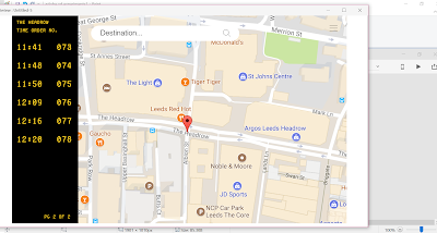
The design of the interface includes a live time feed, allowing users to keep up to date with any changes in their travel time whilst other users book their own journeys. The design of this screen was based on the typical design of train and flight time boards found in stations, airports and even some bus stops. This element stays in a consistent place throughout the interface on the left hand side of the screen, allowing it to work more effectively in how most users would scroll through similar touch screen interfaces, predominantly using their right hand, linking to the idea that the larger part of the population are right handed. This also means the time feed is not hidden or distracted from by the current user's arm movements.
The type used for this was also chosen to reflect the typical style of such journey time boards, a style the public would be familiar with so allowing information to be more accurately communicated. This digital aesthetic means that times can be changed quickly through the movement of basic lines and dots so that users are constantly updated on their journey times.

A light blue colour has been used consistently through the design of this interface. This colour was chosen as it is known for producing a calming effect, which could potentially help to put users more at ease and not feel intimidated by it's design when using the interface. The colour is also known for being a symbol of intelligence in some cultures, reflecting on the system's knowledge, as well as the user's knowledge in that they will be able to get to their destination easily and safely, which overall can help to create a more friendly and comfortable experience for users.
In addition to this, the use of blue and yellow aspects could potentially produce a slight effect known as the contrast of complements, since these colours are close opposites on the colour wheel, meaning a suitable and complementary contrast between different elements is produced, and as a result enhancing the vibrancy of each.

Many elements of the final design of this interface, particularly those pieces of information which are framed, the corners of these have been rounded off. This has been done purposefully in order to enhance the friendly nature of the user experience and as a result, potentially put the users more at ease. The continuous use of this element also allows for consistency throughout the interface in terms of it's design. This aesthetic has also been applied to elements such as the keyboard, making the edge of the keys less harsh and intimidating, a decision which was based on research that suggested the original design of the traditional qwerty keyboard was to stop typists from hitting the keys too hard and jamming mechanical typewriters which would have been used at the time of development. This layout again helps with ease of use for the general public since this is a layout which they would be most familiar with. The typeface used for the characters within makes use of Helvetica Light, a typeface known for it's practicality and clear communication of information. This has also been utilised for other elements of type used throughout the interface, such as search and booking information.


OUGD504 - Studio Brief 02 - Initial Design Developments: Colour
In order to make the interface more user friendly, it was decided to experiment with the use of colour. One idea was to use light blue tones. The colour blue is known for producing a calming effect and as a symbol of intelligence, which could potentially help to put users at ease if they are stuck in a particular situation. Also being a symbol of intelligence, this can reflect the systems knowledge and the knowledge of the user knowing they will be able to get to where they need to be easily and safely.
In addition to helping to communicate a more comfortable experience for users, the use of blue and yellow together produces a slight effect known as the contrast of complements, initially identified by Johannes Itten. This is produced when colours opposite each other on the colour wheel are used together. Since yellow and blue are close opposites, this effect causes a slight contrast between the two colours which results in them enhancing their vibrancy. However, dependent on saturation of these colours, the effect could potentially cause discomfort in viewing for some users which could effect the accurate communication of information on screen.


In addition to helping to communicate a more comfortable experience for users, the use of blue and yellow together produces a slight effect known as the contrast of complements, initially identified by Johannes Itten. This is produced when colours opposite each other on the colour wheel are used together. Since yellow and blue are close opposites, this effect causes a slight contrast between the two colours which results in them enhancing their vibrancy. However, dependent on saturation of these colours, the effect could potentially cause discomfort in viewing for some users which could effect the accurate communication of information on screen.

Another colour experimentation was with the use of green tones. This colour is known for producing meanings of safety, potentially an unconscious association with the function and meaning of traffic lights in their use of colour. These meanings can be transferred into it's use here in that the users would potentially feel safe using the interface in order to safely get to where they need to be. The colour isn't too bright either, meaning the user does not have to strain their eyes to focus on information and therefore does not affect the accurate communication of such information which is paramount for users to be able to book their journeys correctly.

The final colour development was with use of yellow tones, which is known for symbolising positivity and, like the other colour developments, communicates a friendlier nature that would potentially enhance the experience for users. The use of this colour in the design of this interface would also enhance consistency throughout the design, since this is the same colour used for the live time feed. It's use in this design, whilst ensuring consistency, means that there are no major colour clashes between this element and the others which allows for more accurate communication of information. In addition, this colour was chosen in order to reflect the typically associated colour of taxis particularly found in the United States, therefore representing the nature and purpose of this interface.
One potential problem with this use of colour, however, is that the colour could be seen as almost too bright making it uncomfortable for the user to look at for a prolonged period of time. This colour being the same as that used for time information and a similar shade to that of the taxi logo, these colours can also be considered to merge together slightly making it harder for the eye to read without getting distracted by the larger blocks of colour, as well as making it harder for certain elements to be easily distinguishable from others, such as the logo from the background.

OUGD504 - Studio Brief 02 - Key Design Elements: Keyboard
Another key element to design for is the keyboard for users to input their details into the booking system. Since the interface would make use of google maps as part of the interactive map feature, it was decided to look at the layout and style of default google keyboards integrated into android mobiles and other interactive devices, such as tablets. These all followed a pretty standard layout which make use of the traditional qwerty layout for keyboards, initially designed to slow typists down due to problems whereby mechanical typewriters would jam if the keys were hit too hard. For this reason, the most commonly used letters were placed furthest apart. It was decided that the use of this traditional layout would help with ease of use since it is another element which users would be most familiar and comfortable with.
 In designing this element of the interface, it was decided to use Helvetica Light with a 0.25 point stoke size since the typeface is known for it's clarity in the communication of information. This means users will be able to clearly distinguish letterforms in order to accurate input their information into the system.
Initially, each letterform was placed within square boxes allowing the letterforms to be even more distinguishable in their separation, as well as helping with the accuracy of typing since it is clearly communicated exactly where the user needs to press to input the desired letterform.
It was decided to continue working with this frame in further developments of the keyboard, however it was considered that the squared nature of these seem quite harsh. In order to make the user experience as comfortable as possible and put the users at ease if they are in the situation where they have no phone or cash to get to where they need to be, it was decided to manipulate this shape slightly by rounding off the corners of each square to communicate a softer nature. This squared-off shape of each frame also creates consistency throughout the rest of the interface design, since it has been decided that other framed elements would use similar shapes, for instance the search bar, in order to continue the communication of a more comfortable user experience. The keyboard would also utilise the same final colour scheme as the rest of the interface in order to continue with it's consistency. The use of brighter colours would hopefully emit a happier feeling to the user which can help put them more at ease.

OUGD504 - Studio Brief 02 - Group Crit
- Look at the design of various touch screen interfaces for ticket machines at train stations, etc.
Such designs and user experiences are already familiar with the general public, which would help with speed and ease of use, as well as allowing the users to feel more comfortable in the situation due to it's familiarity - keeps them reassured that they can book a journey without hassle if they are in the situation where they have no cash and no battery on their phone. - Work with the aesthetics of live train and flight time boards and feeds.
This aesthetic works well with the live LED time screen which would be consistent down the left hand side of the interface - continue to keep this aesthetic consistent throughout the interface, for example in terms of typeface use. - Continue to look at the problem of how you would overcome others potentially stealing your taxi service.
Users would potentially have to input their name into the system.
Give each user an individual order number and the option to print a receipt of their booking details, which includes this number, that can act as a reference for the taxi driver to know they have picked up the correct customer and that the service is already paid for.
However, would this contradict the potential idea of travelling light? For instance, if the user had no phone or cash, although not much, the receipt would add to the material they have to carry.
OUGD504 - Studio Brief 02 - Key Design Elements: Time Feed
Initially the idea was to produce this interface in portrait format. This layout would help with the functionality of the interface if there were a lot of elements and pages to scroll through, as this would mimic the movement of someone scrolling through feeds and apps, etc on their mobile devices, a movement in which users would be most familiar with. In this format, the placement of the live time feed was experimented with using columns on each side of the whole screen which would flow with the scrolling movements users would potentially make whilst using the interface. It's placement would also allow users who have already booked their journeys to clearly see any updates and changes in time whilst a different user is still able to book their own. This was also experimented through placing the screen at the top of the interface for similar reasons. However, it was decided this did not work as well as a continuous column down the side since the times appeared closer together, which was thought to affect the legibility of information. This could get confusing for users in that times and order numbers could easily be misread, therefore affecting the accurate communication of information.

Although the use of a portrait layout works well to mimic the natural scrolling motion of most touch screen interfaces that users would be familiar with, it was decided that this could also be harder to work with depending on it's size. Therefore, landscape formats were also experimented with using both columns and a row at the top of the screen. With it's placement at the top of the screen, this posed similar problems to that as when it was in portrait.
Based on these developments it was felt that the placement of this element worked best in landscape format as a column on the left hand side of the screen. This means a decent sized screen was left to work with for other elements to be placed in, for instance the interactive map. In landscape this can be easily moved around by users in any direction that need be. It also means they can get a clearer and bigger picture of their location and it's surrounding areas since their eyes would not be strained through continuously looking up if used in portrait. Placement on the left hand side also works more effectively in how most users would scroll through touch screen interfaces, predominantly using their right hand which links with the fact the majority of the population are right handed. This means that the live time feed is not hidden through the arm movements of it's current user, so others can still clearly keep track of their own journey times.

Friday, 10 November 2017
OUGD504 - Studio Brief 02 - Task Flow Chart
Work flows (flow charts) is a practical element used by user experience designers in order to simply convey the stages involved in completing certain tasks (task flow) or the journey a user takes through the system (user flow). This has flat drawing has been produced, using simple digital wireframes, in order to show a visual process of how my final interface would work before being developed into a final screen design. In the real world, this would give the client better understanding of how this interface would work, ensuring any problems or missed stages in the process to be recognised so that the flow works efficiently and consistently.


OUGD504 - Studio Brief 02 - '100 Ideas that Changed the Web' by Jim Boulton, Web Mapping
WEB MAPPING:
One initial idea for the design of the final interface was to include an interactive map feature which allows users to gain a better understanding of their surroundings for accurate navigation purposes. This feature would also be used within the interface showing a plotted route of the users inputted journey, showing how they would get from A to B.
Jim Boulton talks about the importance of interactive web mapping today. The web map of choice for millions of users at this present time is Google Maps, which was designed initially as an offline program by Lars and Jens Rasmussen and launched as a web-based feature in October 2004. Since it's launch Google Maps has had a distinctive impact on the development of user experience design, not just in terms of interactive web mapping. Boulton states that "without Google Maps, we would not have Web 2.0". Each day such maps become more comprehensive and accurate through the on-going process of data, and soon "maps will become increasingly realistic, but perhaps more intriguingly, reality will become more like a map".
For the final design of the interface, Google Maps would therefore be integrated as the map of choice, since it is the most commonly used interactive map by millions of users around the world. It knowledge and continuous development means that it's use in the final interface would provide more accurate representations of the user's surrounding in order to provide more accurate navigation for a user who may be new to the area. The map would also provide familiarity within the interface, ensuring a more comfortable experience for users, particularly those of the older generation who may not be as tech-savvy as younger generations.

Tuesday, 7 November 2017
OUGD504 - Studio Brief 02 - Developed Wireframes and Navigation Process


PROCESS:
- Start screen.
- Interactive map pinpointing user's current location and any nearby bus stops, train stations or taxi ranks.
- Drop down destination search bar - shows most popular destinations and suggestions as the user types.
- Map with plotted route of journey - at this point the user can decide to book their journey instantly using the default settings which include a default taxi company and a standard sized taxi - makes the process slightly quicker for users who are not fussy about specificity.
- Sidebar of filter options to make journey more specific: via point, size, browse individual taxi companies:
1. List of companies and the option to filter by price.
2. Information on selected taxi company.
3. Choose size of taxi, alongside an estimated price range. - Interactive map showing any changes to journey based on new options.
- Book journey.
- List of details - lets user double check the information inputted into the machine before proceeding to payment - option to make changes if necessary.
- Payment screen.
- Confirmation of booking and reference code - allows users to print a receipt of journey details to keep for their records and as a reference for taxi driver to ensure the journey is paid for and that the correct customer has taken the correct taxi - avoids the potential problem of people taking other users taxis.
- Back to start screen for new user.


Monday, 6 November 2017
OUGD504 - Studio Brief 02 - Peer-led Crit (Wireframes and Initial Ideas)
- Look at the First Bus service website - supports a simple user experience process, whereby users just have type in their destination and the website will give a feed of live bus times alongside service numbers and the specific bus stop locations needed.
- Also look at the Leeds Light Night interactive map which pinpoints routes/destinations and bus service numbers needed to get around the various venues of Light Night.
- Do not make the user experience too complicated - focus on taxi services only rather than opening out the interface to transport in general since information on bus and train services could be found just as well elsewhere at various stops and stations - however, leave the interactive map feature pinpointing the nearest bus stops and train stations alongside the user's current location to find whereabouts to gain such additional information.
- Live feed is an interesting and practical idea, however -
What happens if the user has to move locations in order to be closer to their designated pick up point and something changes in regards to their journey? Users will not have access to this information if they have moved locations.
POTENTIAL SOLUTIONS: - Users have to create a user profile and login to use the service - or rather than having to create a profile, users are able to login using their card which would be used to pay for their taxi service, and have to enter a pin code as a form of password.
- Produce a smaller, separate LED screen which is present at designated pick up points and locations which shows a live feed of current bookings, which allows users to view any time changes to their journey regardless of whether they have moved from the booking location or not - although this solution avoids having to continue logging into the server to view information and frees up the interface for other users to book journeys, the system could get over-complicated and confusing since information of bookings from all across the city would have to be synced with these LED screens.
OUGD504 - Studio Brief 02 - Initial Wireframes

CONSIDERATIONS:
Once you have booked and paid for your journey, how do you stop another customer or person from stealing your taxi?
POTENTIAL SOLUTIONS:
- Interface needs a step in the process whereby the customer has to input their name or some form of details into the system which can then be given to the taxi driver upon arrival as a form of booking reference.
- Add a feature which allows users to print out a code to reference to driver or a printed receipt of booking details.
What happens if the taxi is late or for any unknown reason cannot make the booking and has to cancel? If the user has no battery left on their phone (purpose of the interface) then the user has no way of knowing what has happened to their taxi.
POTENTIAL SOLUTIONS:
- Introduce a login feature whereby users have to create their own user profile - makes the experience more personal to specific users and gives comfort in knowing users can make it to their destination soundly even if their phone has ran out of battery. This also gives users a way of checking for any updates or changes in their journey.
- Introduce a sidebar which presents live times of the most recent bookings that informs users of any changes in their journey/pick up time - allows other users to book a journey whilst those who have already booked wait and are kept updated on their personal journey at the same time. Feed clears once users have been picked up.
Sunday, 5 November 2017
OUGD504 - Study Task - Analysing UX Interfaces
UBER APP:
Uber Technologies Inc. is a global transportation technology company. The company supports a mobile app whereby users can book taxis and journeys on their mobile devices and pay instantly using their card which is registered alongside the app.
 Once the interface has loaded, the first screen which appears is a map of the area in which you are presently situated. The map shows almost a 'live feed' of uber drivers near you, giving users an estimate as to waiting time (based on distance from their location) and how many taxis are in service nearby.
 Alongside this map, the interface is also made personal to the user by showing the two most frequent or recent destinations, a feature which makes it easier for users to book a journey to such destination in only a couple of clicks rather than having to input their destination each time the user logs on to the app.
If travelling to a new destination, this initial page also supports a search bar whereby the user can then input their destination which brings up a new screen. This screen shows a current map of your location with a plotted route of the journey, meaning users know exactly the route they would be taking before deciding whether or not to confirm the taxi. This also means that if there is a specific route or via point users wish to take, this can be specified to the taxi driver or inputted into the app before the journey.
Alongside this map, the interface gives three options for taxi size depending on how many you're travelling with and a rough price estimate so users know roughly how much the journey is going to cost them as to not cause any shocks at the end of the journey when money is instantly taken out of their card accounts.
 In addition to these features, the app also supports features which allows users to edit payment information, such as splitting costs between different party members, and view their last made trips alongside how much they paid for the journey. If public transport, specifically taxi services, is something the user frequently uses to get around then this allows the user to keep a track on how much they have spent on various journeys, for example when budgeting to save aside a suitable amount of money for travelling based on how much they have previously spent on specific or similar length trips.
ANALYSIS:
For users the app is fairly easy to navigate around. In certain aspects of the interface, it does not require many steps in the process of booking a taxi, specifically when travelling to a destination already visited since the two most frequent or recent destinations appear on the first screen when the app is opened to allow for quick and easy booking. The idea that you do not have to pay cash upfront to the taxi driver at the end of the journey not only means users can get to their destination quicker without the hassle of waiting for the driver to count change, but users also do not have to worry about having the correct amount of cash to hand since journeys may be more expensive than initially anticipated.
Ideas from this app can be transferred into my own design ideas for a transport interface which allows customers to instantly book and pay for services using their card. Although this interface would be out in public areas and therefore cannot be made personal to individual users, the interface could support a feature whereby it suggests the most popular destinations to users in order to potentially help with ease of booking their journey.
Similarly to the uber app, one of my initial ideas was to feature a map of the users current location showing them the closest bus stops, train stations, as well as taxi ranks or services. This would help users to gain a better sense of location and navigation of the area, particularly if they are new to the area. The design of the overall uber app interface is fairly neutral and minimalistic, which can be seen to help users take in the information better since the design isn't distracting to the eye and maps are sometimes hard enough to understand as they are without extra information affecting this. These ideas will be considered in my own screen interface design.
Uber Technologies Inc. is a global transportation technology company. The company supports a mobile app whereby users can book taxis and journeys on their mobile devices and pay instantly using their card which is registered alongside the app.

 Alongside this map, the interface is also made personal to the user by showing the two most frequent or recent destinations, a feature which makes it easier for users to book a journey to such destination in only a couple of clicks rather than having to input their destination each time the user logs on to the app.
If travelling to a new destination, this initial page also supports a search bar whereby the user can then input their destination which brings up a new screen. This screen shows a current map of your location with a plotted route of the journey, meaning users know exactly the route they would be taking before deciding whether or not to confirm the taxi. This also means that if there is a specific route or via point users wish to take, this can be specified to the taxi driver or inputted into the app before the journey.
Alongside this map, the interface gives three options for taxi size depending on how many you're travelling with and a rough price estimate so users know roughly how much the journey is going to cost them as to not cause any shocks at the end of the journey when money is instantly taken out of their card accounts.

ANALYSIS:
For users the app is fairly easy to navigate around. In certain aspects of the interface, it does not require many steps in the process of booking a taxi, specifically when travelling to a destination already visited since the two most frequent or recent destinations appear on the first screen when the app is opened to allow for quick and easy booking. The idea that you do not have to pay cash upfront to the taxi driver at the end of the journey not only means users can get to their destination quicker without the hassle of waiting for the driver to count change, but users also do not have to worry about having the correct amount of cash to hand since journeys may be more expensive than initially anticipated.
Ideas from this app can be transferred into my own design ideas for a transport interface which allows customers to instantly book and pay for services using their card. Although this interface would be out in public areas and therefore cannot be made personal to individual users, the interface could support a feature whereby it suggests the most popular destinations to users in order to potentially help with ease of booking their journey.
Similarly to the uber app, one of my initial ideas was to feature a map of the users current location showing them the closest bus stops, train stations, as well as taxi ranks or services. This would help users to gain a better sense of location and navigation of the area, particularly if they are new to the area. The design of the overall uber app interface is fairly neutral and minimalistic, which can be seen to help users take in the information better since the design isn't distracting to the eye and maps are sometimes hard enough to understand as they are without extra information affecting this. These ideas will be considered in my own screen interface design.
Monday, 30 October 2017
OUGD504 - Studio Brief 02 - LUST Studio Research
LUST is a multidisciplinary graphic design studio based in The Hague, Netherlands. LUST takes a more experimental approach to design for screen and digital platforms. Much of their practice focuses on new media and interactive installations, in exploring new pathways for design where new media, information technologies, urban systems, architecture and graphic design overlap.
Glasgow Atlas and Megacities - Institute For Future Cities:
The aim of this project was to seek improvement of the quality of human life in urban areas across the world, and enable current and future cities to be understood in new ways. LUST studio helped this through the production of a website that showed interactive maps visualising statistics on topics such as, housing prices, drug use and hospitalisation, deprivation and population, in showing how the role of cities potentially impacts these aspects in regards to quality of life.


https://vimeo.com/102519438
This project shows how maps could potentially work on an interactive level within my initial idea for a large-scale interface. One aspect of this interface pin points megacities on a map of the world, highlighting the more predominant areas based on specific statistics, such as population. Each pin pointed location can also be hovered over to reveal more in-depth statistics and graphs. Such elements could be transferred into the production of large-scale interfaces for transport through the inclusion of a map of the area a user is situated, initially viewing their present location in order to help gain a better sense of location for navigation purposes. Users could potentially use a sidebar to make the map more specific for their needs, such as using it to highlight the nearest train stations, bus stops and taxi ranks, etc. Like specific maps within LUST's design production, colour could be incorporated in ways to code and differentiate between modes of transport, for example, and other such elements.
*UrbanSensing:
The aim of this project was to bring a new product into the urban design, city planning and urban management market. This involves the production of a platform which extracts usage patterns and the perceptions of citizens concerning city spaces, through the analysis of user generated content (UGC) shared by users and inhabitants over social media networks and digital media. This platform allows the analysis of users' perceptions related to specific geographic locations so to understand how the population reacts to new urban policies within participatory mechanisms.


https://vimeo.com/87756472
This project shows again shows how maps could potentially work on an interactive level within my initial design idea, however this time the maps are based on the real-time use of social media networks and digital platforms, such as Twitter, which means the maps are open to change. This allows users to interact with the platform showing them the real-time effects of these interactions. Such elements could be an incentive for the public to use a large-scale interface in that showing the effects they are having on certain aspects of the interface could make it a more personal experience, catering to the users needs at that specific time of use and interaction.
OUGD504 - Studio Brief 02 - Initial Ideas
Problem: No cash, no battery on mobile phone to call or book taxi.
Solution: The production of large-scale touchscreen interfaces to be used for booking, plotting and planning journeys via public transport. Users can browse through taxi companies and compare prices, to eventually book their journey and pay by card on the spot with no hassle of hunting down a cash machine beforehand. This way users can get the most out of their journey and know exactly how much it will be costing them in advance of the trip. These interfaces would be placed within main public areas, such as train stations and shopping centres, where people would potentially interact with them more frequently.
Target audience: Young adult and adults, those old enough to be out and travelling independently. This includes tourists or members of the public who rely heavily on public transport to get around. In particular, this would apply mostly to the younger audience within this category who cannot get around by other means, for instance driving. This could also be applied to the much older, elderly audience within this category for the same reasons.
Considerations:
- Think about how broad the interface is going to be in terms of its use? For example, is it purely for taxi services or could it be used for transport in general, such as live train times, interactive map, etc?
- Consider how it would be different from a phone screen interface, how would it work on a larger scale? For example, navigation around the interface.
- Think about whether or not it is purely for use when someone's phone is out of battery (part of the initially stated problem) or can the public use it in general whenever necessary? For example, news stories, transport updates, etc. Could further solve this problem through the addition of a charging port for phones, that allows users to charge their phone as they book their journey.
- How are these interfaces going to be monitored/maintained? For example, are they going to be under government/council ownership?
Friday, 27 October 2017
OUGD504 - ONLY Studio Talk
Branding agency, originally from Leeds, now based in Manchester, identifying new ways for brands to connect with people. Their approach to design takes inspiration from real people, resulting in a better understanding of their clients and the value of creative experiences. Although working with various different clients, the agency has a more predominant focus on working for entertainment, education and non-profit organisations, both nationally and internationally.
- Research (competitors, audience, personas, principles).
- Wireframing (ideation, test assumptions, client buy-ins) - this helps to map out the functionality of a product - usually a collaborative process with art directors, etc.
- Design (including prototypes).
- Front end.
University of Suffolk:
Since gaining university status, University Campus Suffolk became The University of Suffolk and so commissioned ONLY to rebrand their logo. The section cut away from the right hand corner of the square is said to represent the geographical location of the university, but also shows change in the university's status. It is clear throughout ONLY's branding that these ideas have been kept consistent throughout the branding and across platforms, which includes web and mobile, as well as physical content such as prospectus design.
Things to consider in personal projects when designing for screen:
(How do they keep the branding consistent across platforms, including screen-based, and how these work on different scales/formats, e.g. the difference between web and mobile).


Design Process (Design for Screen):
- Research (competitors, audience, personas, principles).
- Wireframing (ideation, test assumptions, client buy-ins) - this helps to map out the functionality of a product - usually a collaborative process with art directors, etc.
- Design (including prototypes).
- Front end.
University of Suffolk:
Since gaining university status, University Campus Suffolk became The University of Suffolk and so commissioned ONLY to rebrand their logo. The section cut away from the right hand corner of the square is said to represent the geographical location of the university, but also shows change in the university's status. It is clear throughout ONLY's branding that these ideas have been kept consistent throughout the branding and across platforms, which includes web and mobile, as well as physical content such as prospectus design.
Things to consider in personal projects when designing for screen:
(How do they keep the branding consistent across platforms, including screen-based, and how these work on different scales/formats, e.g. the difference between web and mobile).


(Printworks, Goldsmiths University, University of Suffolk, Lost Village).
Subscribe to:
Posts (Atom)