Wednesday, 24 October 2018

OUGD603 - Initial Statement of Intent and Time Plan

An initial statement of intent / position statement which clearly identifies and articulates:

- themes, subject matter and lines of enquiry.
- research methodologies.
- practical development (media, methods, production skills).
- contextual and theoretical references.
- approaches to documentation and recording.
- reflection and evaluation.
- project management (including a clear time plan).

---------------------------------------------------------------------------------------------------------------------------

Initial Statement of Intent:

In terms of my creative practice, I am interested particularly in more traditional, handmade methods of design production, such as the screen-printing process, as well as other analogue processes like contemporary collage. However, on the other hand, I am also interested in other more digital processes, such as digital illustration and editorial or publication design. One of the themes therefore I intend to explore is handmade vs. digital techniques within design, particularly within my context of practice essay, discussing themes such as the resurgence of analogue methods of production, and exploring whether this is having any effect on the world of graphic design. Through this essay though, I will focus more specifically on phenomenology and aesthetics, regarding experience and interaction between a piece and design and the viewer, aiming to answer the question “how does the experience of a handmade or digitally produced poster design affect our aesthetic appreciation of the design?”

Other, more general, themes I also have an interest in and intend to explore are philosophy and ethics (in terms of the Ancient Greek philosophers and their theories), travel and music. Based on a shortlisted banner design, produced during last year for a school’s competition brief, I would also be interested to perhaps explore design for education, building on my knowledge from this previous experience.

In terms of going about exploring these topics discussed above, I intend to use a variety of research methodologies, such as reading design and theory books to continue to widen my knowledge of the world of design and different theories which could be linked to such practice. This would in turn help enhance my creative practice more theoretically. Other forms of research would consist of internet and video research, and the critical analysis of examples of contemporary graphic design, looking at what is already out there, how this is done, and how I can make my own designs original and different from such existing design work.

Experimentation is another research technique which shall be used throughout my practice, creating and testing different prototypes taking on a more primary approach. This could be paired with additional primary research methods, such as surveys of both students and creative professionals if deemed appropriate for a specific brief.

My practical development will touch on the themes, subject matter and lines of enquiry discussed at the start of this statement; handmade and traditional production techniques like screen-print and contemporary collage, as well as continuing to develop my digital design skills through the use of Adobe suite (in particular, InDesign, Illustrator and Photoshop) in producing digital illustrations, layout for publication design and bookbinding skills.

Both contextual and theoretical discussions will be referenced within my creative practice, engaging with ideas of phenomenology and aesthetics, and experience and interaction through my context of practice work. Other contextual and theoretical approaches referenced in my work would be through my interest in philosophy and ethics, and perhaps connecting the ethical discussions into producing a body of ethical design.

Documentation of these intents will be recorded mostly through continually updating my blogs to produce an accurate and clear development of my creative practice in the briefs I decide to undertake. A bibliography of sources and references could also be produced to accompany each brief to evidence the use of a wide range of research methodologies.

Reflection and evaluation of my work will also be continually recorded through self-critical analysis of my work, as well as through peer feedback, group critique sessions and personal tutorials. An overall evaluation will be written at the end of each brief undertaken, discussing the brief as a whole, including ethical considerations. A project management and time plan would also be evidenced to show organisational and time management skills, which could be transferred into a piece of design work itself, such as a calendar design showcasing how I have spent my time.

Until the Christmas break, most of my time will be spent working towards the December deadline for context of practice. However, amongst this I aim to complete at least two or three smaller extended practice briefs, like a logo design client brief and the Penguin Random House Student Design Award.

Time plan / project management (until December):


Friday, 19 October 2018

OUGD603 - Penguin Student Design Award - Brief Research

- Adult fiction cover: Norwegian Wood by Haruki Murakami.
- Adult non-fiction cover: The Establishment by Owen James.
- Children's cover: Wonder by R J Palacio.

The winning design will need to:

- have an imaginative concept.
- be an original interpretation of the brief.
- be competently executed with strong use of typography.
- appeal to the broadest possible audience for the book.
- show a good understanding of the marketplace.
- have a point of difference from other books that it will be competing against in the market.
- be able to sit on the shelves of a supermarket or ebook store as easily as it sits on those of more traditional bookshops.

DEADLINE: 5th March @ 2pm
Application form open: 3rd December.

---------------------------------------------------------------------------------------------------------------------------

Norwegian Wood:
- a nostalgic story of loss and burgeoning sexuality.
- character Toru Watanabe looks back on his days as a college student living in Tokyo. The story sees him develop relationships between two different women - beautiful, yet emotionally troubled Naoko, and outgoing, lively Midori.
- set in late 1960's Tokyo, when Japanese students were protesting against the established order (this serves as a backdrop to the story).
- the original title Noruwei no Mori is the standard translation of The Beatles' song "Norwegian Wood (This Bird Has Flown)" which is the favourite song of character Naoko. Mori in the title translates to "forest". Forest settings and imagery are significant in the novel.
- the original Japanese edition colour schemes were: first edition, red and second edition, green.

The Brief:
- the author's writing is 'vivid, dazzling, experimental and imaginative' and your cover design should reflect this.
- design a cover for a new generation of readers, avoid obvious cliches.

Wonder:
- the author wrote 'Wonder' after an incident wherein her son noticed a girl with a severe facial deformity and started to cry. The author attempted to remove her son from the situation as to not upset the girl and her family, but ended up worsening the situation.
- Natalie Merchant's song "Wonder" made her realise that the incident could illustrate a valuable lesson. The author used the song's chorus as the prologue of the first chapter.
- August "Auggie" Pullman is a 10 year old living in North River Heights in Upper Manhatten who has a medical condition often equated with Treacher Collins Syndrome, which has left his face disfigured.
- homeschooled, but enrolled into Middle School for the experience by his parents, where he is then bullied for his appearance.
- the book explores the nature of friendship, tenacity, fear and kindness, explores fundamental truths about how people behave and how they should behave.

"Auggie wants to be an ordinary ten year old. He does ordinary things - eating ice-cream, playing on his xbox. He feels ordinary - inside. But ordinary kids don't make other ordinary kids run away screaming in playgrounds. Ordinary kids aren't stared at wherever they go".

The Brief:
- the design should ensure that the book remains important and a must-read for every child.
- should also engage adults to want to buy it.

OUGD603 - Penguin Student Design Award - Norwegian Wood Brief

Saturday, 13 October 2018

OUGD603 - Personal Tutorial - 11/10/18

* Think about what you're interested in outside of graphic design, something you enjoy, will motivate the project more (e.g. Lord Whitney on Folk Lore) - mural design ideas?
* Timeline of briefs.
* Smaller briefs good to start with, get back into designing (e.g. pogsee logo brief).
* CoP - phenomenology and aesthetics, allows me to look at processes as well as design.
* Practical brief - could simply be producing something digital and something handmade but using the same information to show how it would be portrayed in these different forms.
* Practical brief - or could experiment with lots of different processes - have a large body of experimental work.
* "Tell a lie" - likes our project because its not just about the university or situated within the university - targeted other universities too who do not know what our project is.
* Speak to visiting professional on 25/10 about CoP work - interested in hands-on approach, but makes it look contemporary rather than old-fashioned - workshop could be good to inspire extended practice. (post-it notes/ type).

OUGD603 - Extended Practice Updated Brief Ideas

1. Student graphic design competition: Display Wizard:
Design two display stands for your university that focus on the career benefits of your course.
* 1x 3x3 EventPro curved pop up display stand.
* 1x 800mm swift banner stand.
In your designs, please try and create stands which showcase the job prospects, skills you've acquired and other career benefits of the studying of your course at university. You need to ensure the branding is consistent across the display stands and the design fits with the dimensions of the stand, whilst trying to appeal to prospective students who may want to study at your institution.
To be eligible you will also need to provide a 250-300 word description which explains the inspiration for your designs.
Use templates provided for your design.
DEADLINE: 1st May 2019.

https://www.displaywizard.co.uk/graphic-design-student-competition

2. Collaborative brief with a person(s) external from the course:
- work with a photographer/ a photography student to design and produce a book which showcases their work.
- work with just one specific theme, so that specific ideas can be generated towards this and consistency can be produced in the book and its design.

3. Penguin Random House student design award:
- launches: 16th October.

4. Traditional print:
- a brief which I can produce work using traditional print. (poster design?).

5. Logo design:
- logo design for pogsee photography and music.

6. Mural design:
- perhaps collaborative (big undertaking). Research into how I would go about this, if anywhere is looking for a mural design, etc.
- OR could perhaps be a research led brief. Mural may not actually have to be painted physically on a wall, but mocked-up and visualised well as to how it would potentially look.

Friday, 12 October 2018

OUGD603 - "Tell A Lie Convincingly" - Final Evaluation

One of the things this short brief taught me was what could be achieved in such a short space of time and will help me in particular with extended practice in figuring out how to manage my time between projects. In terms of this project itself, being to tell a lie convincingly, false messages got spread extremely quickly, showing the powerful communicative effects that graphic design can have on society and this is something to consider when working within the design industry. Although ours specifically only received one response, perhaps we would have been more successful if the timescale were longer, since what we were asking of people perhaps needed more time to mull over before applying to anything like our fake opportunity.

However, in terms of producing material for this fake opportunity, I felt as if this was quite successful in terms of how convincing and professional they looked. For instance, the flyers were printed double-sided on thin, glossy paper which mimicked real flyers in terms of their feel. The use of existing logos on these too, helped to make the material seem real and official. Despite this, the posters could have been printed on a thinner stock choice, perhaps the same as the flyers, since these almost looked a bit 'too professional' to be pinning up on university notice boards, etc.

The distribution could have perhaps also been a bit more considered, deciding more carefully where posters were placed. Most of these were pinned up on university notice boards where a lot of university and opportunity information is placed, however perhaps the mass of information puts students off from looking at such things for a particularly long time to take in anything important.

Most importantly, this short brief has taught me how important it is to consider ethical implications of something when designing. Most projects which got out of hand were to do with the use of existing branding, such as the LAU logo, used to falsely advertise within the university, whereas ours targeting an opportunity outside any institution specifically meant that our project could not be shut down quickly. This has therefore shown that problems associated with copyright of information need to be carefully considered when designing, along with ethical considerations such as the use of personal data when getting people to sign up for something.

Conclusion: The power of graphic design can be great, however this should not be abused.

OUGD603 - "Tell A Lie Convincingly" - Ethical Considerations

In terms of ethics, clearly the immediate consideration taken from this project is that lying isn't ethical, but can be extremely effective within advertising and other graphic design in order to effectively convince an audience or consumer to believe something, which is worrying in some regards since this could potentially cause all sorts of problems (as shown in some other groups presentations, particularly in terms of using an existing brand's logo).

The main ethical consideration in terms of our project would be the collection of other people's personal data. In the one response we received, we concluded this by emailing back explaining that the video shoot had to be cancelled due to unforeseen circumstances. We thought this would be a more appropriate way to contact her since she had taken her time to send us personal data, such as email, social media accounts and images of herself, and so she did not feel betrayed by this or worried that she had sent such information over so willingly.

Posters and any remaining flyers will now be collected, particularly around Leeds Beckett University, since this is where Nao (the artist) will be playing in March, in case of reasons that any of these happen to remain up for such a long space of time and Nao or her management herself find out about the false advertisement of our fake opportunity.

OUGD603 - "Tell A Lie Convincingly" - Responses and Conclusion

Unfortunately, our open call for auditions wasn't a success, with us receiving a whopping total of zero responses, despite the fact we targeted more than one university and felt like our designs looked pretty professional.

So why wasn't our project a success?

- Timescale - due to the short time frame of this brief, flyers and posters were distributed on Tuesday and a deadline day was set for responses on Thursday evening. For what we were asking of people to send in and the opportunity itself, was perhaps too big of a decision for people to respond within a few days. Something like this we felt as if people would probably want to mull it over, or spend time perfecting a dance routine or makeup example before sending in their applications in order to help them gain as much of a chance as possible of being accepted.

- Cost - since we were targeting three separate universities, perhaps we needed more flyers and posters to go round each for such large spaces, however tons of flyers would have had to have been printed and this could get quite costly.

- Distribution - in a similar sense to the above point, perhaps there were not enough flyers and posters to go around. Perhaps people picked up the flyers and were intrigued for a brief moment, however may not have actually been interested in the opportunity itself therefore may have just discarded of the flyer. This then raises the issue of the information not reaching the right people. Posters were also pinned onto various notice boards around the universities, a place we thought students would regularly check for opportunity information. However, perhaps students don't check these as regularly as we thought, or perhaps the bombardment of information on these boards meant that the poster drowned in a sea of other information and so was missed.

However...

After the deadline had closed and we had delivered our presentation, we did eventually receive one application from a girl who seemed very serious about the opportunity, showing us that perhaps indeed if the timescale was larger we would have had more applications like this one.

OUGD603 - "Tell A Lie Convincingly" - Final Video Presentation

Thursday, 11 October 2018

OUGD603 - "Tell A Lie Convincingly" - Distribution

In distributing the flyers and posters we thought carefully about our audience. Since we were targeting students specifically we wanted to distribute our material in places where these would hopefully be seen by large proportions of students. For this reason, one of the main places we pinned up posters were notice boards, which we thought students would typically look at regularly for updated opportunities and information. We also put some on more bare walls where they could be seen more instantly by passers by who would then hopefully stop and investigate what it concerns. Flyers were distributed in a similar way. These were placed on window sills amongst other flyers, on tables where people would sit perhaps in their free time and hopefully pick up out of curiosity or maybe even boredom, and on other surfaces such as entrance gates. These posters and flyers were not just distributed around our university, but also the University Of Leeds and Leeds Beckett University so to reach a larger proportion and a wider range of students, particularly targeting Leeds Beckett students since this is where Nao will be performing in March on her world tour, making it seem more realistic that these would be placed there.


Tuesday, 9 October 2018

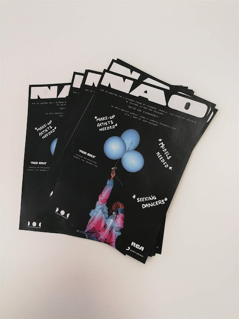
OUGD603 - "Tell A Lie Convincingly" - Printed Material

In printing final designs, we wanted these to look as convincing and professional as possible. For the poster designs, we decided to print these at a size of A4 in thinking that potentially universities might have regulations on how big notice posters can be and we did not want these to potentially be taken down if they did not meet these, therefore we felt A4 was a reasonable and the most common size for such posters. These posters were printed onto a matte paper stock, since we thought that this would bring out the grainy effect of the posters more.


The flyers were printed double-sided at a size of A5, which we established was the most common size for these type of flyers. Our choice of paper stock for these was a thin, glossy paper, with a similar texture to that of magazine pages. In thinking about existing flyers, it seemed this was the most common paper stock choice to use and as a result this gave the flyers a more professional feel, which we thought would be good to produce a more convincing piece of work.


In placing these two lots of printed material together, it is clear that there is a consistency between the two design variations which will hopefully work in our favour to make a more believable and professional looking body of work.


OUGD603 - "Tell A Lie Convincingly" - Final Designs

Following feedback from the rest of the group, final designs took on two forms, one in that of a poster and the other in that of a double-sided flyer. It was decided amongst the group to develop the design with the blue background and 'off-road' imagery to match the scene for Nao's fake music video we are advertising. Initially it was thought that this should be a flyer, however it was decided to rework this design to fit the format of an A4 poster to pin around various universities' notice boards. In developing this myself, information was condensed in order to all fit onto one A4 poster design, ensuring all appropriate information was present for all opportunities. Small use logos were used in replacement of the original and vectorised to allow for both black and white versions, which fit better and more consistently with each other in a small row at the bottom of the poster. Deadline date and time was also changed to black whilst the rest of the type remains white in order to give this some importance and make the audience aware of this. This condensed poster allows us to print and distribute more posters to a wider audience.


For the final flyer design, it was decided amongst the group to develop the black and white version since it was thought this was more 'to-the-point' and instantly shows what the flyer is regarding. Digital type was changed to be consistent with that used in the poster and the white, small use logos were also added at the bottom of the design.


However, one problem with the above design was that it did not include all appropriate information on how to apply for the opportunity and what actually needs to be sent in. For this reason, I developed a back to this flyer to produce a double-sided flyer. The back is simple, includes the same white logos as the front to produce consistency between the two sides, and includes all relevant information. This was also decided on the basis that, again, it would mean we would be more cost-effective in printing these, and as a result would also be easier to distribute to a wider range of students who may be interested in the different opportunities.

OUGD603 - "Tell A Lie Convincingly" - Group Feedback

- the condensed poster with all three titles on is immediately clear as to what it's after.
- it's good to see the artist herself on the flyers too, to help cement at a glance who and what the poster is about.
- black and white designs, however, do not include all relevant information on what needs to be sent in to apply and how to go about this.
- the design against the blue sky looks quite swish, however perhaps it is too text heavy for the average person skimming a poster, flyer or email.
- perhaps the logos should be a bit smaller on the designs and tinted the same colour, so either black or white depending on background colour.
- putting up a selection of poster designs on notice boards around various universities could be something nice and visual.

OUGD603 - "Tell A Lie Convincingly" - Further Flyer Design Developments (2)

Another initial flyer design drafted by a third member of the group continues with the use of Nao's branding at the top of the flyer. However, this design takes on more of a simple, handmade approach using handwritten type to put all role opportunities onto one flyer. Imagery of Nao herself have been used in these designs to show first-hand the face of the artist, which could potentially create more of a 'buzz' about the opportunity if her face is instantly recognised. The use of white type on a black background has been used to create an impactful contrast of colours and a slight hierarchy of information.


Another version was also created in the same format, but reversed colours.

OUGD603 - "Tell A Lie Convincingly" - Further Flyer Design Developments

Another initial flyer design drafted by another member of the group uses a similar format to the other designs, with the use of Nao's album branding at the very top of the flyer in order to create an impact and instantly catch someone's eye. The rest of the type has also been kept in a similar style to match the use of type in Nao's Saturn World Tour poster, with the use of physically handwritten type for the headings and a typeface called 'Impact Label Reversed' for the main body of information, which has been right-aligned in order to fit around the image used so as to not let any information fall hidden amongst the image.

Imagery has been used to match the 'theme' of the fake music video in a scene entitled 'off road' for Nao's new single 'Drive and Disconnect'. This image, along with the block-coloured background has been given a grainy effect similar to that of the imagery used on Nao's official tour poster. This block colour helps the information, especially the artist's name stand out.


These posters were then further developed by myself in order to make them seem more convincing, believable and professional, by adding three logos at the bottom of the flyer. These include Little Tokyo Recordings (Nao's own music label), RCA Records, which she is affiliated with, and Sony Music which are a part of RCA Records. A deadline date and time was also added to make the opportunity seem more official, as well as helping to ensure we receive application emails in time for the end of the week.


Upon reflection of these designs, it was thought that it would make more sense for the flyers to be double-sided otherwise three times as many would need to be printed, and since all three would be separate flyers, these may not reach all the appropriate people. If all roles are placed onto one flyer then this will hopefully allow information to reach a wider range of people, as well as helping to make distribution of these flyers a lot easier. This idea also makes the flyers more cost-effective to print. For this design then, information on makeup artist role and model roles was condensed to fit onto one side, with dancer role information on the other.

OUGD603 - "Tell A Lie Convincingly" - Flyer Design Developments

In drafting initial flyer designs, ideas were taken from Nao's existing Saturn tour branding to help produce consistency between the two. For the background, her existing Saturn album image has been cut to fit the flyer in a more abstract way to as to not reveal the full image and hopefully produce more of an interest in doing so. For the main heading, I have chosen a handwritten typeface in order to try and mimic the handwritten type used in Nao's branding for her world tour poster. For the main body of information, a more digital typeface has been used, again to match the type used to present tour dates information on her original poster. Logos from Little Tokyo Recordings (Nao's own music label), RCA Records and Sony Music, all music labels associated with Nao, have been added to the bottom and top of these initial flyer designs, exploring different layout variations to find which works better. These have been added to help make the designs more convincing and believable.


Further developments from this use the same area of the Saturn Tour poster cut diagonally across the background, paired with a textured background I produced myself using ink and water on paper in order to break up the image slightly and match a small part of the original poster design in my own way. The appropriate information has been added in these developments to see how well the text fits with the design.


Final developments combine the use of these ideas along with elements of Nao's official branding, placed at the very top of the flyer in a similar format to most of her album covers in order to present clearly what the flyer is regarding. If people see the big name at the top of the flyer and recognise it then potentially this could cause a big interest in people. Type styles have also been updated to better match the type used in Nao's tour posters, with the headings, such as 'open call for dancers' being physically handwritten rather than using a digital font which mimics handwriting. This text has been coloured white as to not take away attention from Nao's name which would create more impact on its own. The body of information now uses the typeface 'Impact Label Reversed' since it is clearer to read than the previous, but still mimics the digital font from the original tour poster. In addition, the image of Nao's hand has been photoshopped to appear in front of part of her name in order to add some dimension to the poster.

Information has been condensed into two designs in order to produce a double-sided flyer which would mean we don't have to print three times as many and means these will also be easier to distribute to hopefully reach more of a wider range of students.


Monday, 8 October 2018

OUGD603 - "Tell A Lie Convincingly" - Existing Tour Promotion Material

SATURN WORLD TOUR:
Upon research, it has been found that there isn't a wide range of promotion material for Nao's 'Saturn' World Tour. All material for this tour use the same image in a variety of formats, with and without text and information. The image includes a picture of the artist herself holding a bunch of white balloons in a seemingly deserted location. Potentially her position in the image of holding the balloons to the air conveys the idea of space in relation to the title of her tour. The image is quite grainy as if it has been taken on an old grainy film camera and the colours are fairly muted. Text varies between a more digital, typewriter-esque font and handwritten type.


Ideas for flyers:
- the flyers could potentially incorporate this similar grainy aesthetic present in the existing tour promotion material, alongside a similar colour palette of muted down blacks, greys, blues and purples to produce consistency between the flyers and this existing promotion in order to help make our "lie" more believable and convincing.
- use similar type styles - handwritten type for the "open call for auditions" title to match the "Saturn World Tour 2019" type style and for the rest of the block information use a more digital, typewriter font to match the tour date information on the existing tour material - again, use this for believable consistency and to produce a clear hierarchy of information.
- potentially add image of the balloons she is holding or an image of herself, however make it simple. If these flyers have just been made from Nao's management company then these may not look massively professional. Too much detail might distract from the information we provide on the flyers.
- add record label logos in small at the bottom of the flyers to again help with believeability.

Little Tokyo Recordings Logo (1).
Little Tokyo Recordings Logo (2). 
RCA Records Logo (1).
RCA Records Logo (2).

- create transparent vector images of these logos to put at the bottom of the flyers and emails.
- Little Tokyo Recordings is a record label produced by Nao herself.
- RCA Records are a part of Sony Music, so potentially this logo could also be incorporated into the designs since this is a big label which most people will know that could make the opportunity seem even more real and convince more people to audition.

OUGD603 - "Tell A Lie Convincingly" - Brief

OUGD603 - "Tell A Lie Convincingly"

Initial ideas brainstorm:
- create a fake event or talk from a creative professional.
- create an event for an existing charity, for example, Jeans for Genes day, get students to turn up to university wearing something specific.
- a food event, produce fake vouchers for students to get freebies.
- use of email, pretend to be a student representative for an event or charity.

MUSIC VIDEO AUDITION:
- find a music artist who is not too big (would seem too good to be true) and one who is also not too unknown, need to find the right balance.
- produce a fake email and other fake materials, such as flyers, for an opportunity for students to audition for a new music video being shot in Leeds.
- think of different positions to audition for in order to target a wider range of students to suit various different interests and talents.

- email account.
- pdf form of how to submit.
- promise to get paid - email back saying they have not been successful, lets people down easily and convinces them they haven't just been lied to, no real promise of money.
- flyers for the opportunity.

CHOSEN ARTIST:
- Nao, a British singer and songwriter from East London. Her sound has been described as soul combined with electronic music, funk and R&B.
- managed by RCA Records and Little Tokyo Recordings.
- upcoming world tour, date in Leeds @ Leeds Beckett University on 21st March 2019. Could be believable since she is playing in Leeds soon next year.
- music video for one of tracks on the new 'Saturn' album.

What needs to be thought about in producing a convincing lie/materials:
- Nao music video, open call for auditions.
- a fake email address to send auditions to.
- think of a deadline day to send in auditions/ quick turn-around, Weds 10th October 2018.
- information on how to submit.
- paid opportunity.
- transport, time and location. Leave this vague for the time-being in the hope that more people will audition and not worry about the date and location.
- logos for record companies affiliated with Nao. Makes the flyers and other material seem more professional and believable.
- flyers which can be handed out on the street and in various locations, such as the Uni of Leeds and Leeds Beckett where she is playing. Also target Northern Dance Studio for dancers to audition.
- look at existing promotion for the upcoming gig and album to make it more believable (although the design does not need to be hugely professional since it could be designed simply by management company).

TIMESCALES:
Mon 08/10 - research/ designs/ draft emails/ text.
Tues 09/10 - printing/ distribution/ visit locations.
Weds 10/10 - street research if other approaches not successful/ collate data together.
Thurs 11/10 - produce video and presentation.
Fri 12/10 - presentation to class.

Sunday, 7 October 2018

OUGD603 - Extended Practice

THINKING ABOUT BRIEFS FOR THIS YEAR:
- 10 studio briefs.
Include:
- a competition brief (D&AD, YCN, etc). This brief will not need to be written, but please research into the 'type' of briefs these competitions set.
- a collaborative brief with a person(s) external to the course.
- a collaborative brief with a person(s) from the course.
- a live/client brief.
- a research led brief. This may be informed by a previous/current COP question.
Consider:
- background.
- audience.
- deliverable outcomes.
- timescales.
(it would be beneficial to have briefs that range in mandatory requirements and timescales).

---------------------------------------------------------------------------------------------------------------------------

1. Student graphic design competition: Display Wizard:
Design two display stands for your university that focus on the career benefits of your course.
* 1x 3x3 EventPro curved pop up display stand.
* 1x 800mm swift banner stand.
In your designs, please try and create stands which showcase the job prospects, skills you've acquired and other career benefits of the studying of your course at university. You need to ensure the branding is consistent across the display stands and the design fits with the dimensions of the stand, whilst trying to appeal to prospective students who may want to study at your institution.
To be eligible you will also need to provide a 250-300 word description which explains the inspiration for your designs.
Use templates provided for your design.
DEADLINE: 1st May 2019.

https://www.displaywizard.co.uk/graphic-design-student-competition

2. Collaborative brief with a person(s) external from the course:
- work with a photographer/ a photography student to design and produce a book which showcases their work.
- work with just one specific theme, so that specific ideas can be generated towards this and consistency can be produced in the book and its design.