Since it was considered that the format of the book would affect the layout, it was decided to do some digital experimentation with layout based on my initial layout ideas and sketches amongst the different potential book formats in order to better visualise these layout ideas and how each different format would affect these ideas. In addition, these ideas would also be affected by the different formats of the photographs which Akshay has given me to work with, therefore it was considered that this digital experimentation would be good to explore these potential challenges to my initial ideas.
Format: H 210 mm x W 250 mm
The first format experimented with in its layout of content was H 210 mm x W 250 mm, which was found through research is a typical format or similar format to that of many existing photography books in order to allow the photography to create an impact, whilst working more effectively with the typical sizes of photographic imagery.
In all these layout and format experiments, it was decided to utilise a column grid, since it was thought that this was most appropriate for the format of the book, as well as working as an underlying element which links to the context of the book, since it was thought that the column format represents aspects of petrol stations, such as the long, tall signs which are placed outside the station with the brand logo and petrol prices on.

This first experimentation explored the use of negative space amongst the spreads in order to communicate a sense of isolation and emptiness which you would find and feel at petrol stations late at night. It was thought that this layout idea worked particularly well for the squared format images since they allowed for a lot of space around them. Within this, placement was also explored, whether these were placed centre or to the inside margins in order to see how this placement would affect the feel of the book. It was found that these worked better when placed on this inside margin closer to each other, since this then better conveys a sort of narrative between the two images rather than being completely separate, however still allows for that sense of isolation to be conveyed through the larger amount of negative space around the outside margins. Other variations of this placement explored increasing the size of the images in order to fill slightly more of the pages so that the images do not get too lost amongst this negative space and effectively create an impact.


Similar placements were explored with the rectangular formatted images, looking at whether these are more impactful placed towards the top margins or placed in the centre of the pages. Based on this it was thought that these worked better at the top margins which created a bulk of negative space at the bottom of the page and allows for the potential to include information or captions at the bottom of these pages to accompany the images. It was also thought that these images generally created more of an impact at the top of the pages, since this is where your eyes would naturally look to first when reading, as well as this placement creating a better hierarchy of information. In addition, it was thought that this layout represented some of Ed Ruscha's work in which Akshay was inspired by and his photographs link to in terms of their content.


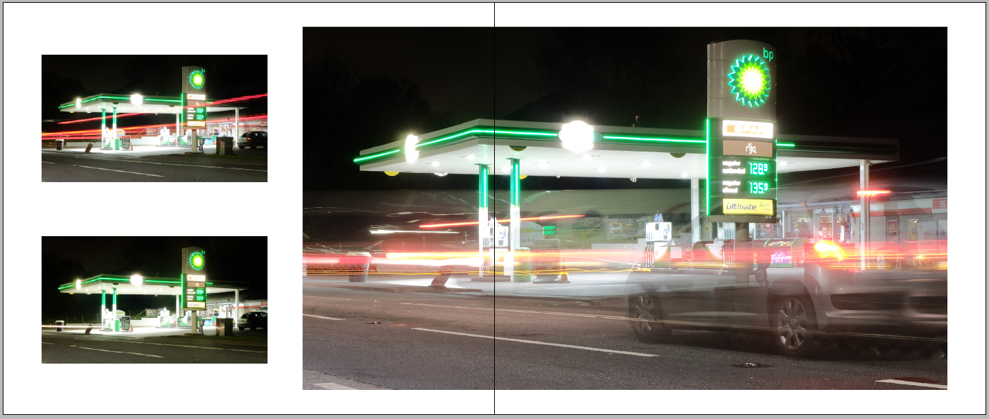
Another idea was to see how images would work across a whole spread in an attempt to give some images more of an impact than others, as well as representing the structures of petrol stations in their typical lengths and sizes. In this format, however, it was found that due to the size of the photograph itself and the slightly obscure size of this format, that the photograph did not fill the full spread. However, it was considered that this continued to allow the themes of the book to come across in the use of negative space. Placement was then experimented with at both the left and right outside margins, as it was thought that placing this in the centre would potentially lose some of the image in production. Based on these experiments, it was thought that this image layout worked best at the outside right margin since was found to create a better sense of rhythm and movement, which worked with the content of the photograph, since the car is cut off at the right and so placing this at the right margin makes it seem as if the car is continuing off the page, which therefore also creates a sense of direction and narrative for the book.


Other layout ideas looked back on initial ideas, one of which being based on the aesthetics of petrol columns which typically feature the brand's logo and petrol prices of that station separated into different sections to differentiate between the different pieces of information. In terms of layout then, the idea was to format photographs into columns, representing these aesthetics, such as stacking two images together at one margin of the page. Based on this experimentation, it was thought that this did not work that effectively with this particular format when the original image sizes were used. However, it was found this worked better when the images were cropped slightly to be more in-line with each other and work better with the size of the book. However, it was also thought that this could potentially cause a problem with the photographer or the content of the book, since parts of images would be cut out and not as they originally are, which may then give the wrong message across in terms of themes, as well as not presenting this work accurately.


Another idea was based on research into creating movement and pace in design, which suggested that perspective tricks the eye into thinking about movement, which can be created through cropping for depth and motion perception. This idea was also linked to visual research into the nature of petrol stations, looking at perspective in the way that these are photographed. In terms of experimenting with this idea in digital layouts then, images were juxtaposed in micro and macro formats in order to give this impression of perspective and movement. It was thought this idea would work most effectively with images which already convey a sense of movement so that this idea is clearly communicated and creates more of an impact in its layout.
Format: W 210 mm x H 210 mm
The next format experimented with in its layout of content was W 210 mm x H 210 mm, which was based on some of the typical formats of Akshay's photography. It was therefore thought that this could potentially be used in the production of the book to better contain aspects of his photography, as well as creating a good sized book which people can easily handle and so potentially cause more engagement between the readers and the content. It was also thought that this format would be relatable to a lot of people in its format being similar to Instagram, which could also potentially cause some engagement since its something which people can relate to.
Similarly to the previous format, similar layouts were experimented with in this format to see how these ideas would change. As thought, the squared images worked effectively in their placement since these allowed for an even border of negative space to be placed around these images. However, it was also considered that in this format this layout could be manipulated slightly to have one of these images full bleed on the page, contrasted with an image with negative space to create a sense of juxtaposition and narrative.
Although this format working effectively with the squared images, it was found that with the rectangular formatted images, placing one of these on each spread at original size meant that a lot of negative space was created and that perhaps this meant that these images lost impact amongst the spread since they were overpowered by this negative space.
However, it was found that this format worked more effectively with these rectangular images when used at a larger scale compared to the previous format, since this does not leave too much negative space, and works to balance the imagery and negative space better.
Working again with juxtaposition and perspective to convey the idea of direction and movement which could affect the narrative of the book, it was found that this idea worked interestingly with the squared images in creating more balance and impact. This idea could also be manipulated in presenting one image as full bleed to further enhance this juxtaposition and narrative.

An additional layout idea was inspired by one of my initial ideas in separating images into columns to represent the aesthetics of petrol station columns, whilst also being inspired by Ed Ruscha's photography work. One of Akshay's series of works is a homage to Ed Ruscha, and so this idea looks at exploring a sense of narrative as Ruscha does in terms of layout, pairing two images of a dark and empty petrol station with a full image of the station. Placement and cropping were explored within this idea in an attempt to create an interesting balance between the photographs. However, again, cropping images could potentially throw off this balance in some instances, and not present these original photographs accurately and as Akshay wants them to be presented.