Different typefaces were explored based on this, picking out a list of those with characteristics which I thought best reflected the typographic nature of petrol stations and 24 hr stops. Since these petrol stations are typically found on motorways and associated with transport, these typefaces also show characteristics which I thought linked to this idea of transport, with most be san-serif in nature and reflecting the idea of movement in their design.

Based on this initial exploration, these were reduced down and a few were chosen to continue experimenting with which were thought best communicated the theme of the book. 'Russo One Regular' will be used for the title of the book, since it was thought that this best reflected the nature of a 24 hour petrol station or store, whilst remaining bold, legible and impactful.
For the body font, 'Berthold Akzidenz Grotesk Regular' and 'Agency FB Regular' were both experimented with in order to see which worked better in context. 'Berthold Akzidenz Grotesk' was chosen due to its bold and legible characteristics being good for effective communication of information, whilst its bold nature also links in a way to the chosen title font. 'Agency FB' was also chosen as a potential font in that it was considered this has similar squared characteristics to the title font, whilst being slightly thinner in its weight which would allow for a clear distinction between the title and body copy, therefore also allowing for a clear hierarchy of information.

These fonts were then started to be experimented with in context, thinking about how these would work together, with the photographic content, as well as how the textual information could be formatted. One of these experiments was based on an initial idea which mimicked the tall style of petrol station signs, formatting the introductory text into a column using an underlying column grid to represent these signs. This format also includes a lot of negative space, something which was thought to reflect the isolated and empty nature of petrol stations at night, a mood portrayed through a lot of Akshay's photography in these themes.
Based on initial digital layout and format experiments, it was decided that the format H 210 mm x W 250 mm was most appropriate and effective in formatting content in an interesting and engaging way for the specific content of this book.

Continuing to play with these ideas of negative space and columns, another variation explored placing both these typographic elements onto the same page and leaving the first page blank, creating larger block areas of negative space. It was thought that this layout and format could potentially work with some initial layout ideas for the placement of photographic content throughout the book whereby some spreads feature breaks between content through this use of negative space, again to represent the idea of isolation in petrol stations and shops at night, whilst also allowing the reader time to better engage with content and think about what they just viewed or read. This layout would therefore add an element of consistency between more textual pages and the layout of photographic content.


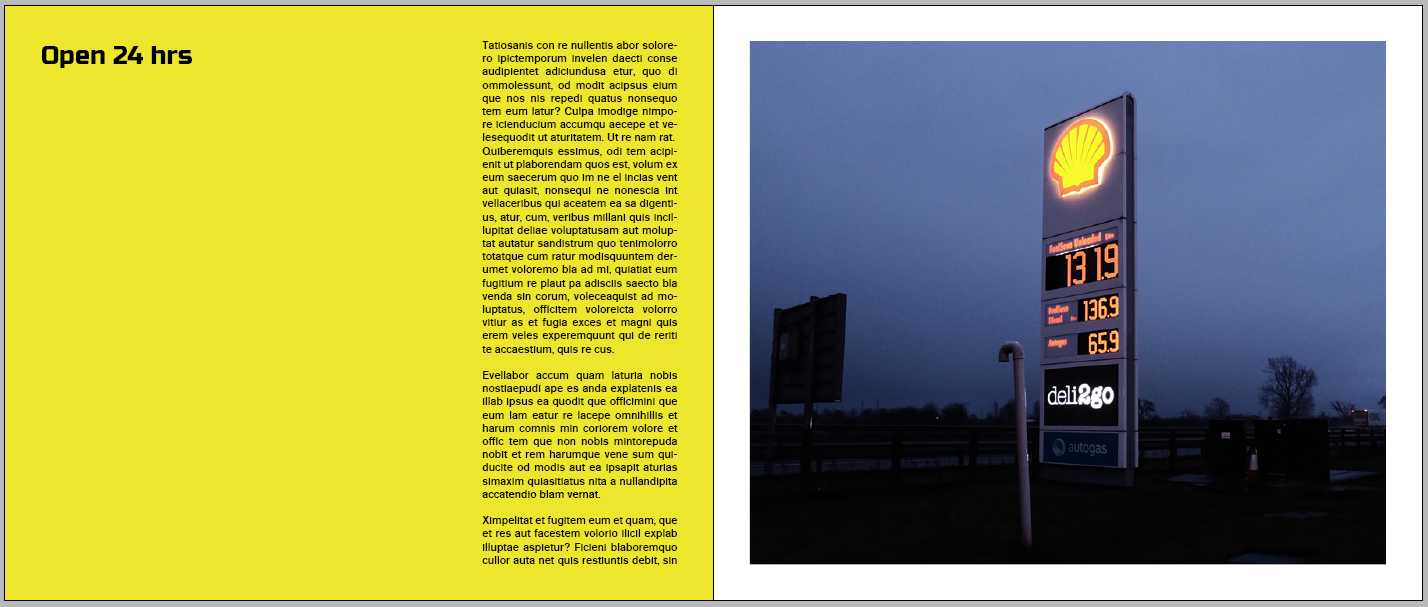
Another idea in the format of this textual information was to potentially pair this with photographic imagery from Akshay in order to give the reader an initial look at the type of photography which would feature throughout the book. The image I have paired with this textual information also highlights the idea behind the format of this information, with the image featuring a petrol station sign and the text mimicking this in its format. This side-by-side layout therefore can also be considered to show a juxtaposition between the two pieces of content, something which was found in initial research to create interesting narratives surrounding the themes of the book.


Since the photography is all based at night, it was also decided to experiment with colour in the design and format of this information, which could visualise how different stock choices and colours could potentially be used. One of these colour experiments for this spread was to have a black background, which potentially could be a black paper stock, with white text printed onto this, reflecting the colour of nighttime, with the white text standing out from the black similar to the way the lights in Akshay's photography show. However, due to the dark nature of the photography, it was found that this background perhaps limited the impact of the photography, with elements of this blending into the background. For this reason another variation was produced whereby this black background was only present on the text page and a white background on the photo page, creating more of a balance between the use of the two colours and allowing the photograph to stand out better from the background.


Other colour variations experimented with incorporating colours taken from the photograph itself for use as a background colour in order to colour consistencies between the photograph and the design of the book, and continues to play on the idea of juxtaposition of content.

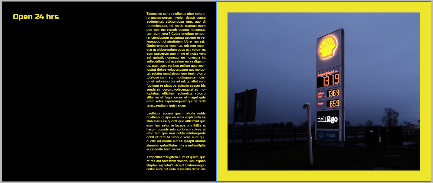
Further ideas looked back at experimenting with colour in the background of the photograph, taking other elements of colour from this, such as yellow from the glow of the logo and petrol prices. Variations experimented with this use of yellow and black, which was found to make the type in particular stand out from the background and reflect the idea of light in the darkness as featured throughout Akshay's photography and so communicates the content of the book in an interesting way through this colour and format. Another variations inverted this colour scheme on each page on the spread, reverting back to experimenting with a black background on the photograph, which originally was thought to limit the impact of the photograph, however paired with a brighter colour on the opposite page, it was found that this contrast worked in an interesting way and balanced the use of colour between each page.


No comments:
Post a Comment