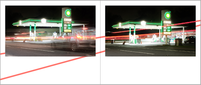
Based on research into creating rhythm and movement, and thinking about the context of Akshay's photography, it was decided to experiment with initial ideas formed from this research most of which were informed by the movement of cars and light found within specific photographs. Since the layout itself would create a sense of rhythm and pace, it was thought in this instance about how additional design elements could be incorporated throughout the book in order to further highlight this movement. One of these ideas was to play on the aesthetics of petrol station buildings, which all have similar aesthetics in terms of their structure. It was thought that the strip of light which goes around the top of the building could be used as a strip across certain spreads of the book, utilising similar colours and structures as those in the photographs featuring on each page. It was thought that then this would then also help to guide the readers attention across the full spread, creating a sense of direction and movement, and therefore securing a kind of narrative across images.
Another idea explored the use of light within the photographs. It was thought that strips of colour matching the strips of light featured within the photographs could be used across the spread, in some cases trying to marry this up at the same angles in which these light strips are positioned in the images. In a similar sense to the idea above, it was thought that this would help to guide the readers attention across the full spread, creating a sense of direction and movement similar to that sense of movement which features in the images, and so enhancing its mood and themes.
A further idea was to have light extending from the image in the negative space on the spread in order to give this sense of movement in a slightly different way and acting as an extension of the photograph. This idea was experimented with with one of Akshay's long exposure images, having the lines extend off the end of the page, creating a sense of direction which then prompts the reader to carry on and turn the page. Rather than having these lines extend from every line on the photograph, it was decided that, if used, this would potentially work more effectively if utilised in small sections of light extensions since it was thought that this could end up too bulky and distract the reader from the photograph itself and become a bit too chaotic in its design.


No comments:
Post a Comment