
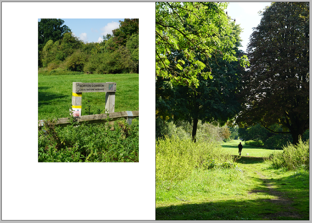
These sketches were then developed digitally, experimenting with these layouts using placeholder images and text in order to visualise how they would actually look in the layout and production of the book. This first digitally developed layout experimented with was actually taken from research into the typical nature and layouts of guidebooks, experimenting with having the image spread across the two pages with columned text in order to break this information up slightly in creating a more effective layout to read. This was also thought to allow for the imagery to take centre of attention, since it was thought that when looking in guidebooks for travelling, a large part of their design is images in order to attract the reader to the place in question and sell it to them, which is just as important as the textual information.

The next digital layout experiments looked at exploring the golden ratio and Fibonacci sequences in the layout of the book as relating to their relevance in nature and the Arts and Crafts movement. It was also thought this layout related to the Arts and Crafts in the use of negative space it creates on the page, representational of Arts and Crafts book design found in previous research. The layout below uses a grid of 21 x 34 with the text block 3 units from the inner margin, 5 from the outer and top margins, and 8 from the bottom.


Another experiment looked at formatting images into this Fibonacci area, as well as text. Based on this visualisation, it was thought that this may work for specific, perhaps more minimalistic imagery, but not for every image. However, it was considered this creates a good use of negative space as found in Arts and Crafts book design, therefore could still be explored in other ways.


As a development from the layout experiments above, it was decided to continue to explore placing imagery within the Fibonacci area, however counter-balancing this with alternative layouts and formats on the page next to this, as well as exploring the placement of text underneath this area for the same reason. This layout experiment was also thought to create an asymmetrical layout, another feature which was found through research to be evident in Arts and Crafts architecture which feature around the town and inspired its development.

Other layout experiments started to further explore these asymmetrical layouts through placing text in columns side by side with imagery, leaving large amounts of negative space amongst the pages. Text was also explored broken up by imagery, creating typographic interludes which give the reader a moment to pause and take in the information they have just read, allowing them to engage more with the content of the book.


Within the development and production of the book, a mixture of these layouts will be used in order to convey different elements of the Arts and Crafts movement, creating a consistent but varying layout structure throughout the book, also allowing me to choose the layout which works most effectively with the content of each page.
No comments:
Post a Comment