In physically producing the final branding material, the posters/speaker schedules were digitally printed onto a satin paper stock which gave the poster a slight glossy finish but thin enough for this to be folded twice so that the schedule is easy to transport whilst at the event and can be easily opened up once to view the schedule and then fully to reveal the poster which can then be kept as a memento of the event. This was produced at an A3 size and folded down to A5, with a front and back cover showing which day the schedule is for and a little information on the event itself featured on the back cover along with the BPS logo.
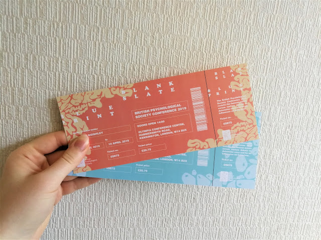
Tickets and lanyards were also digitally printed, this time using a thicker matte paper stock at 200gsm. This was thought to be appropriate for these pieces of material since they needed to be durable and hold their structure, whilst the matte finish, typically known as a good stock for enhancing colour, also allows the colour to create a small amount of impact.
The ticket designs were produced with a small section on the end of the ticket which could be ripped off by the staff to show the ticket has been used. This section was perforated to allow this to be ripped off easily without damaging the rest of the ticket, whilst the lanyards were laminated, taking inspiration from the design of other lanyards and passes, giving them more durability when being worn all day. This lamination gave the passes a slight glossy finish over the matte paper, adding to their durability.
Notebooks were produced and bound by hand showing an element of hand craft in their production based on the idea of skill and knowledge of the process, something which the nature versus nature debate touches on. These were packaged using recycled packaging in order to give them an element of professionalism, newness and quality, whilst this then also allows them to avoid dirt and damage whilst not in use.
For the tote bag designs, these were screen-printed using black ink in order show neutrality when using patterns from both sides of the debate, whilst this also allowed for cost-effectiveness in their production since if this were a real event loads of these would have to be produced. This production process was also used in order to reflect a part of the original concept for this project and branding in that the idea of tabula rasa believes that “the mind is a blank slate upon which experience imprints knowledge”, printing the image itself onto the material, whilst the process is also said to relate to the theme of being human itself in that every print is unique and show imperfection, much like our nature as humans.


No comments:
Post a Comment