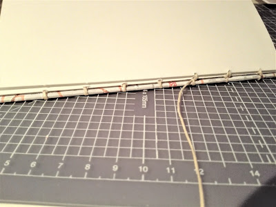
It was decided to use this method of binding since the stitch is visible on the outside of the publication itself, which adds to the aesthetic of the publication. This was thought to communicate a more handmade nature and give the final publication a more personal touch which the author had stated in their hand-off of information, also particularly based on the idea that the number of stitches can be personalised depending on your desired aesthetic.
A neutral 'sandy' coloured thread was used in the production of this publication since it was thought to work consistently with the slight 'burnt orange' theme running through the publication, seen in imagery of traditional street signs and much of Gaudi's architecture. The 'sandy' tone of this thread has connections to nature, and is therefore also reflective of themes of nature which were of much inspiration for Gaudi and can be seen in many design elements of the architecture around Barcelona.
A hardback cover was chosen for this publication, an idea based on the requirements of the target audience. In this instance, the target audience had been defined as travelling designers who would use the publication to not only guide their travels, but also their future design work. A hardback cover was therefore used and bound along with the main content which allowed for the publication to be more robust, limiting the chances of damage when being travelled with. In addition, rather than using the typical buckram material for this hardback cover, one of the maps collected by the author on their own trip had been used, again giving the final design a more personal touch, all of which strengthen the travel journal aesthetic.


No comments:
Post a Comment