
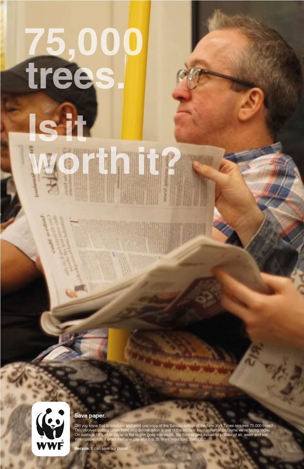
In starting to combine image with type, the original image was reflected so that the type would have a better place to sit within the image and not overlap any of the more detailed and prominent elements. This has also been done so that the type stands out better amongst the background and is clearer for the audience to read, important in accurately communicating such an important message like this one. The smaller passage of text has been kept in a consistent place in the left-hand corner of the image, as to produce a clear hierarchy of information and again so that this is not obstructed by more detailed elements of the photograph. Type has been made white, along with the background of the logo (stated in WWF's brand guidelines when using coloured backgrounds), also for better clarity of the information.
Another variation of this layout was to give the main statement a lower opacity of 70% since it was thought that perhaps the first was almost too bold. The percentage of opacity given to the text in this variation has been done to match the colour of the newspaper the women is reading, providing a subtle element of consistency between type and image, as well as presenting closer links to the context of the statement and the poster overall.


Initial type developments were produced in portrait layouts. Although the original image is landscape, for this reason, it was also decided to experiment with a portrait layout, something which had forgotten to be considered in taking this photograph. In this variation, I felt as though the smaller passage of text at the bottom of the page works better in this layout since it fills the whole width, however, the photograph was difficult to position in a way which worked effectively with the larger elements of type. To try and overcome this problem, the type was again changed to a 70% opacity and moved upwards slightly to try and fill more of the negative space.

No comments:
Post a Comment