Final designs in context:
Sunday, 31 March 2019
OUGD603 - The Batsford Prize - Final Speaker Schedule / Poster Design
Initial design developments were originally planned to be produced at an A2 size, however, it became challenging to think of what additional information could feature in the blank space within the design layout. It was then soon realised that this idea would still continue to work in the same way at a slightly smaller A3 size, which meant that this blank space could be rid of and simply feature the front and back covers of the schedule, the schedule itself, and the poster which would feature on the opposite side, utilising the original poster design concept.
OUGD603 - The Batsford Prize - Speaker Schedule Design Development
It was thought that typically attendees of an event will be made aware of the schedule of how the event will be running, therefore it was decided to make one also as a part of the branding material for this hypothetical event run by the BPS. Looking at how other events have used this piece of material, it was found that to make these more exciting and engaging, they produce them in interesting ways such as within a small zine-like publication, flyer or poster. It was decided in this case to produce the schedule and poster all-in-one, since this would allow to opportunity for me to feature my original poster design concept into this new direction for the brief.
Looking at the design of an existing schedule/poster I received at an event in the past, it was thought that this may work best at a size of A2, which could then be folded down into a manageable and transportable size of A5 making it easy for the attendees to carry around the event with them. Based on this, sketches of how the design would be formatted were drawn out in order to figure out where things will sit, the angles they need to be at, and their different sizes.
In addition, a couple of design ideas were sketched out for the schedule side. It was thought that potentially the times and speakers names could be contained within individual cells which feature on one of the patterns, and another with the times and names featuring within brain squiggles. However, it was thought that this would make the pattern of cells look too structured and therefore not accurately mimicking the more sporadic nature of human cells that has been utilised throughout all other elements of branding for this event.
Another initial idea which was developed digitally was to simply use a bordered pattern around the schedule with the speakers names and times within boxes in order to contain the information like found in some other elements of branding for this event. However, it was thought that this was not that engaging and perhaps needed a slight point of difference from the rest of the branding material which is all consistent but presented in different ways each time. It was also thought that this needed more information in order to fill in some of the negative space and make the schedule more detailed so that attendees can get a better sense of what each speaker will be discussing before the event starts.
Another design development therefore explored containing the patterned imagery within boxes themselves along with the written information overlayed onto these, and paired with a solid coloured background to make these box designs stand out. However, it was thought that perhaps the background also needed a small element of detail, so another variation was developed which featured a more minimalistic cell pattern in the top left-hand corner of the design so that this is overlayed with the 'day two' text in an attempt to make this not seem too isolated within the design, as well as to match the aesthetics of the original poster concepts and other branding material where the type is always slightly overlapping the imagery.
Although an interesting and playful idea, it was thought that perhaps in the developments above that the use of patterned imagery within the text boxes diminished the legibility of the type slightly simply due to its smaller size and use of colour. For this reason, further developments were produced exploring filling the text boxes with solid colours instead which match the colour scheme of the imagery.
It was thought that the design development above worked much more effectively in presenting clear communication of information, however the minimalistic background was also thought to make this design seem too plain and simple. Further design developments therefore reverted back to using the full patterned imagery as the background and filled the text boxes with the darker colour from the colour scheme in order to make the information stand out against this and make the overall design much more engaging, whilst the use of the full patterned imagery also links to the poster design which would be used on the opposite side of this schedule and creates an element of consistency between the two.
Additional refinements in this design looked at adding the BPS logo as well as highlighting the break with a lighter colour from the colour scheme so it is clearer to see at which times there are important discussions happening.
In starting to arrange this schedule into the appropriate format to work with the initial idea of having the poster on the opposite side which could be folded down into an easy A5 size, it was found this also needed separate designs which could feature on the front and back cover of the folded material. Different variations of this were produced, looking at how the pattern could potentially continue from the front to the back, as well as exploring more minimalistic designs that would allow the covers to be distinguishable from the schedule. However, it was thought that this did not necessarily matter since each individual part could be looked at whilst still folded and this side would not be typically looked at when completely unfolded since that's when the poster on the opposite side would come into play.
It was decided that additionally, the front cover should feature the name of the event, the day in which the schedule is relevant for, and on the back cover features the BPS logo to show that they are a part of the event along with a small passage of information on what the event is about, almost acting like a blurb of a book.
Saturday, 30 March 2019
OUGD603 - The Batsford Prize - Tote Bag Design
In thinking about further items you may see or receive at an event, one of these was tote bags, many of which I have received myself at events, something which is typically used to create publicity for certain places, brands, etc. For this reason, it was decided to create a design which could be used on a tote bag that attendees would also receive at the event in order to create some publicity for it, as well as being a practical element which the other branding material could be held in. Many of these type of tote bag designs simply use black ink, usually for productions costs and to keep the design fairly minimalistic but striking. I have decided to take this approach, since the branding uses two different colour schemes and rolling each into one design was thought would become too challenging and time-consuming in the production process. This meant that the two different patterns could be used together in a more neutral way that presented the event as a whole and both sides of the debate equally.
Final design in context:
In the production of these totes, the designs shall be screen-printed onto the canvas tote bags in communicating a part of the initial design concept for this brief which was based on the idea that "the mind is a blank slate upon which experience imprints knowledge", with imprinting being the key word, as well as to represent the idea that as humans we all have certain imperfections, which the screen-printing process can be likened to in that every design will be unique through these potential small imperfections.
OUGD603 - The Batsford Prize - Notebook Designs
In addition to the pin badges which attendees of the event would be given on arrival at the event and could wear to show which side of the debate they support, it was decided to create a set of A5 (148 x 210 mm) notebooks which each attendee would also be given as a token for attending the event which they could potentially use at the event itself in writing down any notes they may want to take from discussions. As well as being practical, it was also thought these would act as an element of promotional branding too, since these notebooks could then also be used outside of the event in which others may notice and so the event gets more publicity.
For the design of these, it was decided to use the full patterns created for the original poster design concept in order to make these notebook designs more playful and illustrative. Additional patterns were also created for these notebooks which would flow as a continuation of the pattern on the front cover when the notebook cover is opened out fully.
In these designs, it was also decided to add elements of type which would, again, match the original concept designs, utilising the same typeface and justified text alignment in order to make this consistent with the event's logotype and overall branding. However, rather than using the two textual elements of the logotype itself, it was decided to make these more playful in creating additional slogans which would communicate what the notebooks could be used for. For the brain pattern, it was decided to use the word 'brainstorm' to communicate the idea of people using the book to jot down their quick and initial ideas in, as well as matching the imagery in its use of the mind. For the cell pattern, it was decided to use the words 'field notes' to communicate the idea of using this notebook for more detailed findings in the psychological field.
The inside front and back covers would simply feature the darker background colour of each pattern variation in order to give a small additional continuation of the design onto this as an element of playfulness in the notebooks' designs. These would then be filled with plain white paper in communicating the original inspiration for these designs as based on the quote which suggests that our mind is like "white paper, void of all characteristics" as one side of the nature/nurture debate. The use of plain white paper also gives the notebooks practicality in allowing the receivers to use them as they please.
OUGD603 - The Batsford Prize - Final Banner Designs
For the final banner designs, it was decided that the variations with the patterns featuring at the top and bottom corners of the banner worked most effectively in creating more balanced imagery that left sufficient negative space to help in the accurate communication of typographic information, utilising the designs which feature boxes containing elements of information which was thought helped highlight some of the more important pieces of information whilst remaining separate from the logotype and staying consistent with the layout of typographic information on other elements of the branding already created. The way in which this information alternates in its alignment was, like other elements of the branding, to communicate the sporadic nature of DNA and human cells, as well as working to create some balance with the layout of the logotype. It was also decided to utilise the design in which the website link features underneath the about the event sentence, since it was thought this created more balance across the design and filled up enough of the negative space so that the design did not look too empty in places. The two different pattern and colours variations have been utilised which would sit side-by-side in order to give some playfulness to the event's promotion that would potentially allow the public to engage with the designs more since they are not all the same, whilst they still remain consistent in their layouts, and clear that they are a part of the same thing.
Final designs in context:
OUGD603 - The Batsford Prize - Banner Design Development
As part of the branding material for this event, it was decided that this needed elements of promotional branding as well as material for the actual event. It was decided that banners which could be hung outside on lampposts should be created in order to reach a wide audience of people who may be interested in the event. In starting to think about how these would be designed, some initial idea sketches were created, thinking about how the consistent use of pattern within this branding would work in the layout of these banners. One initial idea was to present both patterns on one promotional banner, with one pattern featuring at the top, and the other at the bottom in order to show both sides of the debate almost standing off to each other. However, due to establishing different colours for each pattern, this would have been challenging to produce and perhaps not as consistent with the rest of the branding material.
Due to the challenges of creating just one promotional banner featuring both patterns, it was therefore decided to produce two separate banners showcasing each side of the debate which could then be used side-by-side to contrast each other. It was thought that this would also create some variation amongst the banners so that they do not all appear the same, and so potentially causing more engagement with the public due to this playfulness. However, both would be consistent in their layout and format, making it clear that they are both a part of the same thing.
One initial idea based on this was to have an element of each pattern featuring in the bottom right-hand corner of the banner. It was thought that this minimalistic use of pattern would allow for sufficient negative space to place typographic information in helping to present this clearly.
However, it was thought that perhaps the design developments above were a bit too minimalistic in their design, therefore it was decided to experiment with placing the patterned elements in both the bottom right-hand corner and the top left-hand corner of the banner which was thought created more of a balance within the design in terms of imagery and information.
In starting to think about text arrangement within these banner designs, it was decided to place the logotype at the top of this design, overlaying this slightly with the imagery in order to create an element of consistency in the way this has been used and placed in other elements of the branding, such as the original poster design concept, as well as to start a clear hierarchy.
In placing other typographic elements around this, initially the date and location were placed just under the logotype, however it was considered that actually the name of the conference should go first in order to work more effectively with the hierarchy. This additional type also uses a clearer typeface which has been utilised in other elements of the event branding in order to allow for better legibility and accurate communication of this information. Based on the design of typical promotional banners, it was also thought that this should include a short sentence on what the event is about to give the audience a brief idea of whether they would be interested or not. The placement of this additional text has been aligned at alternate sides of the banner in order to match the layout of the logotype as well as communicating the more sporadic nature of our DNA, the same approach which was taken in the design of the ID cards.
In order to match the aesthetics of the ID card designs, further design developments experimented with variations which explored placing information within boxes to help better contain and highlight the most important pieces of information on the banner design. It was thought this also meant that this information would not then potentially merge into one with the logotype which could have caused miscommunication of information and would not allow the logotype to stand out as much amongst this additional information.
In addition, it was also decided to place the British Psychological Society's (BPS) website on the design so that if members of the audience are interested, they can find out more about the event online. This has been used in conjunction with the BPS logo in order to make it clear who this event is run by. Two variations of this were produced, again thinking about appropriate placement, whether this should be placed at the bottom with the logo or at the end of the short sentence about the event.
Due to the challenges of creating just one promotional banner featuring both patterns, it was therefore decided to produce two separate banners showcasing each side of the debate which could then be used side-by-side to contrast each other. It was thought that this would also create some variation amongst the banners so that they do not all appear the same, and so potentially causing more engagement with the public due to this playfulness. However, both would be consistent in their layout and format, making it clear that they are both a part of the same thing.
One initial idea based on this was to have an element of each pattern featuring in the bottom right-hand corner of the banner. It was thought that this minimalistic use of pattern would allow for sufficient negative space to place typographic information in helping to present this clearly.
However, it was thought that perhaps the design developments above were a bit too minimalistic in their design, therefore it was decided to experiment with placing the patterned elements in both the bottom right-hand corner and the top left-hand corner of the banner which was thought created more of a balance within the design in terms of imagery and information.
In starting to think about text arrangement within these banner designs, it was decided to place the logotype at the top of this design, overlaying this slightly with the imagery in order to create an element of consistency in the way this has been used and placed in other elements of the branding, such as the original poster design concept, as well as to start a clear hierarchy.
In placing other typographic elements around this, initially the date and location were placed just under the logotype, however it was considered that actually the name of the conference should go first in order to work more effectively with the hierarchy. This additional type also uses a clearer typeface which has been utilised in other elements of the event branding in order to allow for better legibility and accurate communication of this information. Based on the design of typical promotional banners, it was also thought that this should include a short sentence on what the event is about to give the audience a brief idea of whether they would be interested or not. The placement of this additional text has been aligned at alternate sides of the banner in order to match the layout of the logotype as well as communicating the more sporadic nature of our DNA, the same approach which was taken in the design of the ID cards.
In addition, it was also decided to place the British Psychological Society's (BPS) website on the design so that if members of the audience are interested, they can find out more about the event online. This has been used in conjunction with the BPS logo in order to make it clear who this event is run by. Two variations of this were produced, again thinking about appropriate placement, whether this should be placed at the bottom with the logo or at the end of the short sentence about the event.
Thursday, 28 March 2019
OUGD603 - The Batsford Prize - Pin Badge Designs
As part of the branding collateral, it was decided to create button pin badges which attendees of the event could wear to show what side of the debate they support. These use designs created initially for posters as part of my original direction for the brief, which use the full pattern for each side of the debate to make the badges more striking, overlaying these with the original use of minimalistic type which represents the two quotes which were used to inspire this design concept, as well as being consistent with the newly developed name and overall branding for the event.
OUGD603 - The Batsford Prize - Final ID Card Designs
For the final ID card designs, it was decided to stick with the final design developments in which the imagery only features at the top left-hand border of the design. It was thought that this use of imagery and its placement worked effectively with the event's logotype, with the type overlayed across this in a way which mimics and appears consistent with the original poster design concept, whilst this also allows for more negative space at the bottom of the design which better contains the rest of the typographic information which may have gotten lost if placed amongst the full patterned imagery, as well as creating an interesting and clear hierarchy of information.
For the cell patterned imagery, it was decided to utilise the newly experimented turquoise colour scheme since it was felt that this worked a lot more effectively in multiple ways. One of these is in relation to the other design and its colour scheme, in which both colour variations have similar tones/shades which makes them sit next to each other nicely, whereas the original blue variation proved too dark in comparison and the lighter blue variation seemed too washed out. Another way in which this was thought to work more effectively is that the colour shows a good happy medium between the idea of representing our DNA as a blueprint as well as the typical colour nature of cells, with this turquoise showing hints of both green and blue.
Final designs in context:
OUGD603 - The Batsford Prize - ID Card Design Development
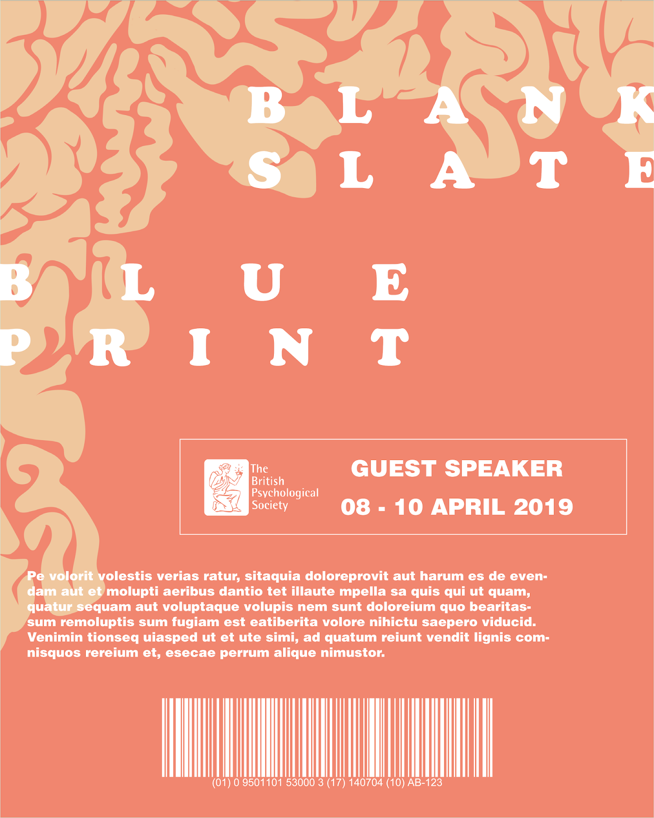
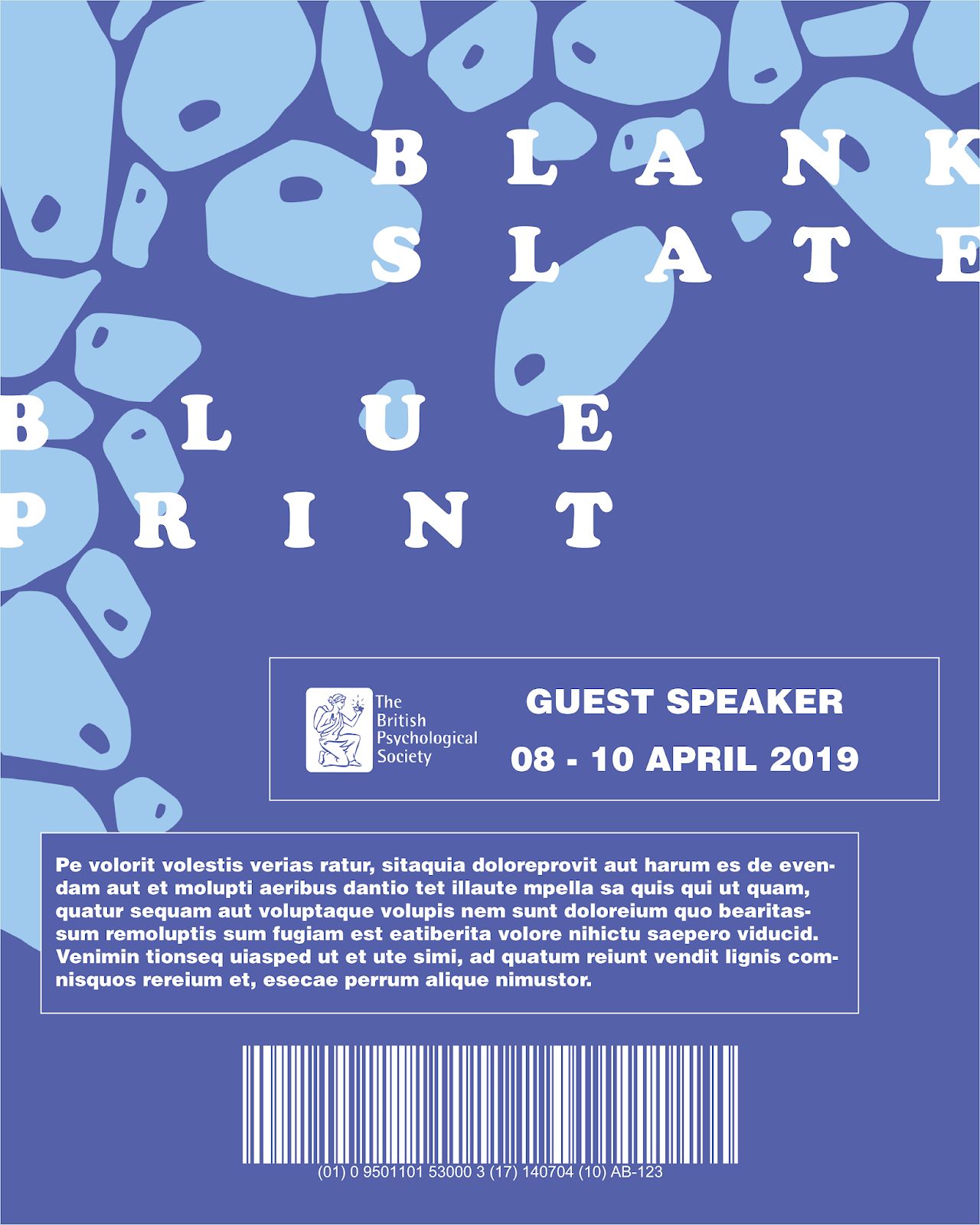
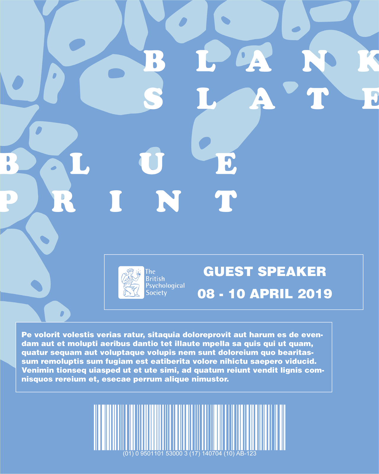
Thinking about the items you would typically see designed for an event, one of these was an ID card on a lanyard which staff and guest speakers would wear to show they are a part of the event and allow them to gain access to certain areas. In starting to design these, it was thought that typically these have a fair amount of information on and in using the original designs I had done, this may create illegibility of the type due to the chaotic nature of the patterned imagery, like what I found on poster designs for my initial concept when using the full quote. For this reason, it was decided to create some new imagery which would work better with the information needed to go onto these, however keeping the design branding consistent throughout. Therefore, in these designs, the same patterned imagery has been used but simply composing these in different ways to the original imagery by keeping a block of negative space in the centre to contain all the relevant information and creating a patterned border around the edge of the card.
In starting to place information onto these designs, various layout compositions were experimented with, initially placing the person's role in a box at the top of the design, outlining this and filling it with one of the same colours as used on the imagery itself in order to create an element of consistency but also to help the information stand out amongst this through the outline. Initially type was made black, however this made the type stand out too much and so it was decided that this text worked better in white to give it more subtlety, as well as matching the use of type on the initial poster concept designs. However, in these variations, the type style has been changed to one more legible and professional for these pieces of additional information, and keeping the more playful typeface used on initial poster concept designs as a logotype design.
It was found through experimentation that this information box worked more effectively filled with the darker colour and outlined in the lighter colour with white text, since this was thought to keep the subtlety of the type in its colour scheme whilst still allowing it to stand out from the imagery. Other variations also experimented with this box's placement, however it was considered that the placement of this should be decided after experimenting with the addition of other information so that an appropriate hierarchy of information could be created.
Further design developments began adding in the now logotype of the event which used the same playful typeface as on the initial poster concept designs to work with the shape and style of the imagery, keeping the alignment of this slightly sporadic and spaced out in representing the nature of our DNA and cells.
At the bottom of this design the British Psychological Society's logo has been placed to represent the debate as an event sponsored or run by this society, something which was thought could make the event branding seem more realistic in being in partnership with an existing brand. This has been used with the addition of a barcode also at the bottom of the design, something found to be on a lot of typical designs for event ID cards which allows the guest speakers and staff to gain access to certain areas of the venue. Based on these developments, it was thought the placement of this barcode did not work with its colour and the background imagery since the imagery made it hard to 'read' and if a real working barcode would potentially also make it hard to scan. Therefore, the placement of this was experimented with, placing this above the BPS logo and the guest speaker box.
As a completely new idea, utilising the full patterned imagery was also briefly experimented with, separating this out with a box which would simply hold the title of the person attending the event. This used the same typeface as the new logotype, however, it was thought this design was too chaotic and did not appropriately convey the information, with the logotype and title rolling into one with seemingly no clear hierarchy of information.
As a further idea, it was decided to make the designs even more minimalistic than the initial design developments, simply featuring the patterned imagery in one corner of the card design, where the typographic information would be placed closer to the top of the design and broken up into boxes, utilising the same colour schemes as the imagery.
However, having the imagery at the bottom was thought would potentially cause the same problem as in earlier design developments whereby the legibility of some of the text and the barcode would be diminished because of this imagery. For this reason, it was decided to place a section of the imagery in the top left-hand corner of the design instead, which the logotype was overlayed onto and better represents the initial poster concept designs where the text is overlayed on top of the imagery. This then also worked better with the legibility of type at the bottom of the design, as well as creating a better hierarchy of information, however continuing to experiment with the placement of the barcode, British Psychological Society (BPS) logo and guest speaker box in relation to each other.
It was soon realised that this design should also feature the dates of the event, something which typical event ID cards were shown to have in assuring that the pass is only valid for the days shown on it. This was experimented with placing this in the same box as the guest speaker title in order to contain the information together better. In addition extra text was added, something else which was found on some event ID cards with information or terms and conditions written on, but for now placeholder text has been used to convey this idea. It was thought this also bulked up the information on the design and made it seem more balanced and not as empty. Placement of this was experimented with, alternating the alignment information to match the nature of the logotype.
However, it was thought that on earlier design developments the barcode worked better in the centre at the bottom of the design, but this left the question of where the BPS logo would then sit. In these variations, the logo has been put in the same box as the guest speaker information in order to show them as a part of the society.
Following from this, it was thought that the variation in which the BPS logo sat on the left-hand side of the guest speaker information worked most effectively in its placement, and in order to make the rest of the typographic information consistent with the layout of this another box was created around this, which was thought also helped to contain the information better whilst remaining consistent with the rest of the design.
For the cell patterned design, multiple colour variations were experimented with in order to see what worked best, with peer feedback suggesting utilising the blue variation to better represent the concept of our DNA essentially being a blueprint for our behaviour and traits. However, in comparison to the 'blank slate' brain patterned design, it was personally thought that this looked too dark and would look slightly odd being used together as a part of the same branding. For this reason, green was continued to be experimented with in one variation, and in another experimenting with creating a happy medium between the two with a more turquoise colour.
Subscribe to:
Posts (Atom)