Basil & Ford are a family run screen-printing business based in Lincolnshire with backgrounds in design and advertising who, whilst creating their own designs, also utilise found imagery and old posters, cards, etc to screen-print over with their own typographic designs. Their approach to design is similar to some of my initial ideas in screen-printing typographic designs over imagery and was thought that I could gain some further interesting ideas and ways in which I can effectively compose type over imagery in my own designs through looking at their work.
It was found through this visual research that many of their designs use justified text alignments, which help spread out the text allowed more of the imagery to be shown from behind. Although some may say that justified text alignment is the least legible way to compose type, Basil & Ford seem to have found ways to overcome this problem of illegibility in highlighting different words through the use of different type styles, colours, and sizes. This also meant that they avoid having to hyphenate words, which may in some ways compromise the designs and make some sections less legible as words due to the hyphens separating the words down further.
 |
| Straighten Up - Printed on original World War II aircraft recognition posters from the 1940's. |
 |
| Learn - Printed on original book plates from 'Harmsworth's New Atlas' printed circa 1900. |
Other typographic designs, however, were found not to use justified text alignments, but centred text, separating words through using both serif and san-serif typefaces and different sizes in order to make the most important words in the quotes stand out amongst the design. Some also utilise the same typeface, however separate words through using regular and italic variations.
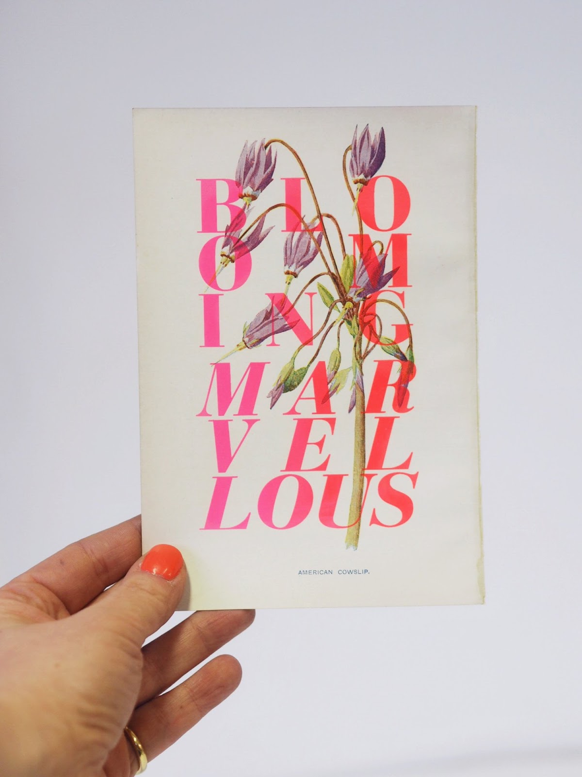
 |
| Mini Marvellous - Printed onto illustrations by F. Edward Hulme from 'Familiar Garden Flowers' and 'Familiar Wild Flowers'. |
 |
| Black Roses - Printed onto rare black vintage book plates of roses of illustrations by P.J Redoute. |
In terms of colour utilised in these prints, it was shown that Basil & Ford have carefully considered this aspect in choosing colours which effectively work in the context of the print, as well as choosing colours which work in both ensuring that the type is legible and ensuring that the imagery is not too covered or overpowered by the typography overlayed across it. All of these are things I should consider in my own print designs and ideas in attempting to effectively combine both type and image.


No comments:
Post a Comment