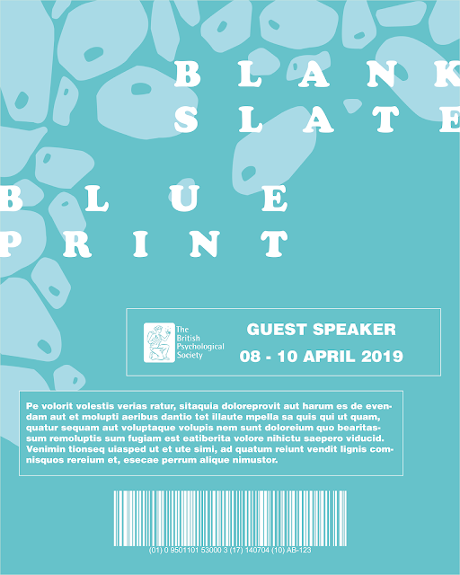
It was found through experimentation that this information box worked more effectively filled with the darker colour and outlined in the lighter colour with white text, since this was thought to keep the subtlety of the type in its colour scheme whilst still allowing it to stand out from the imagery. Other variations also experimented with this box's placement, however it was considered that the placement of this should be decided after experimenting with the addition of other information so that an appropriate hierarchy of information could be created.
Further design developments began adding in the now logotype of the event which used the same playful typeface as on the initial poster concept designs to work with the shape and style of the imagery, keeping the alignment of this slightly sporadic and spaced out in representing the nature of our DNA and cells.
At the bottom of this design the British Psychological Society's logo has been placed to represent the debate as an event sponsored or run by this society, something which was thought could make the event branding seem more realistic in being in partnership with an existing brand. This has been used with the addition of a barcode also at the bottom of the design, something found to be on a lot of typical designs for event ID cards which allows the guest speakers and staff to gain access to certain areas of the venue. Based on these developments, it was thought the placement of this barcode did not work with its colour and the background imagery since the imagery made it hard to 'read' and if a real working barcode would potentially also make it hard to scan. Therefore, the placement of this was experimented with, placing this above the BPS logo and the guest speaker box.
As a completely new idea, utilising the full patterned imagery was also briefly experimented with, separating this out with a box which would simply hold the title of the person attending the event. This used the same typeface as the new logotype, however, it was thought this design was too chaotic and did not appropriately convey the information, with the logotype and title rolling into one with seemingly no clear hierarchy of information.
As a further idea, it was decided to make the designs even more minimalistic than the initial design developments, simply featuring the patterned imagery in one corner of the card design, where the typographic information would be placed closer to the top of the design and broken up into boxes, utilising the same colour schemes as the imagery.
However, having the imagery at the bottom was thought would potentially cause the same problem as in earlier design developments whereby the legibility of some of the text and the barcode would be diminished because of this imagery. For this reason, it was decided to place a section of the imagery in the top left-hand corner of the design instead, which the logotype was overlayed onto and better represents the initial poster concept designs where the text is overlayed on top of the imagery. This then also worked better with the legibility of type at the bottom of the design, as well as creating a better hierarchy of information, however continuing to experiment with the placement of the barcode, British Psychological Society (BPS) logo and guest speaker box in relation to each other.
It was soon realised that this design should also feature the dates of the event, something which typical event ID cards were shown to have in assuring that the pass is only valid for the days shown on it. This was experimented with placing this in the same box as the guest speaker title in order to contain the information together better. In addition extra text was added, something else which was found on some event ID cards with information or terms and conditions written on, but for now placeholder text has been used to convey this idea. It was thought this also bulked up the information on the design and made it seem more balanced and not as empty. Placement of this was experimented with, alternating the alignment information to match the nature of the logotype.
However, it was thought that on earlier design developments the barcode worked better in the centre at the bottom of the design, but this left the question of where the BPS logo would then sit. In these variations, the logo has been put in the same box as the guest speaker information in order to show them as a part of the society.
Following from this, it was thought that the variation in which the BPS logo sat on the left-hand side of the guest speaker information worked most effectively in its placement, and in order to make the rest of the typographic information consistent with the layout of this another box was created around this, which was thought also helped to contain the information better whilst remaining consistent with the rest of the design.
For the cell patterned design, multiple colour variations were experimented with in order to see what worked best, with peer feedback suggesting utilising the blue variation to better represent the concept of our DNA essentially being a blueprint for our behaviour and traits. However, in comparison to the 'blank slate' brain patterned design, it was personally thought that this looked too dark and would look slightly odd being used together as a part of the same branding. For this reason, green was continued to be experimented with in one variation, and in another experimenting with creating a happy medium between the two with a more turquoise colour.


No comments:
Post a Comment