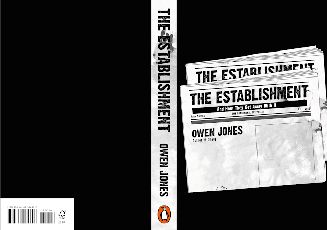
Based on initial idea developments, it was decided that The Son of Man idea didn't work as effectively in its imagery as would have liked, therefore it was decided to instead start developing the idea surrounding mediaocracy in which author, Jones, claims that the wealthy people that control much of the press have interests closely aligned with the establishment, and therefore tend to promote the establishment's views, rather than the views of the readers. In considering what might communicate this idea, it was thought that newspapers would typically be the main type of press in which the establishment can promote their views. For this reason, imagery was developed taking the form of a newspaper, composing type in a way which fits this aesthetic, for instance, using the title of the book as the name of the newspaper.
Rather than keeping this illustration a solid white colour, it was thought this needed something to make it more interesting and stand out to the reader. Therefore, a texture was created using watered down ink and ripped paper which was then applied to the illustration in order to give the newspaper a more realistic feel, a look as if it has been worn down or thrown away, representing Jones' views that the press is all rubbish since it does not promote the right kind of views.
Initially, a primary image taken in London was added to this newspaper, since these would typically feature imagery. However, utilised alongside a more illustrative image, it was thought this photographic imagery did not work that effectively, even with a translucent layer of texture over the top to make it seem more a part of the newspaper. It was decided, therefore, to instead fill the negative space with additional text like a newspaper article on the front cover, utilising the quote by Rene Magritte on that which is hidden to us, alongside a definition of the establishment.
In starting to place imagery into the cover design spread, for the spine, it was decided, in order to create some consistency with the front cover, that the spine should use a part of the same texture used for the newspaper along with the same bold, headline typeface. Initially it was also decided that the newspaper should be left blank with no additional information in order to reflect the real truth and other things being hidden from the readers by the establishment. This was placed on a solid black background in order to match with the colour scheme found on the newspaper.
However, it was thought that because all the relevant typographic information was contained within this newspaper illustration that this left too much negative space which made the cover seem a bit empty and therefore not as engaging or exciting. For this reason, other compositions were experimented with, layering up multiple of the newspapers in order to fill up some of the negative space, as well as to reflect the idea of newspapers being stacked in a shop.
In addition, other colour variations were experimented with, since it was thought that perhaps black was too dark and so continued to limit its potential engagement. For this reason, one colour variation which was looked at was a brighter, orange colour which was inspired by the colour schemes found on classic penguin books. This was done in order to show a link between the book and the publisher, and show it as a potential classic which everyone should read.
However, it was considered that the use of a block colour background did not work as effectively with the textured illustration in this context. Therefore an additional variation was developed which utilised another paper-like texture. This was manipulated in lowering its opacity and layering this with a darker block colour in order to create a colour and texture which continued to reflect the idea of newspapers and newsprint, which better matched the textured illustration. It was also decided to continue focusing on the compositions whereby several newspapers are stacked up as they would typically be displayed in a shop, for instance, which was also thought to make better use of the negative space around the illustration.


No comments:
Post a Comment