OUGD603 - Penguin Student Design Award (Norwegian Wood) - Feedback (28/02)


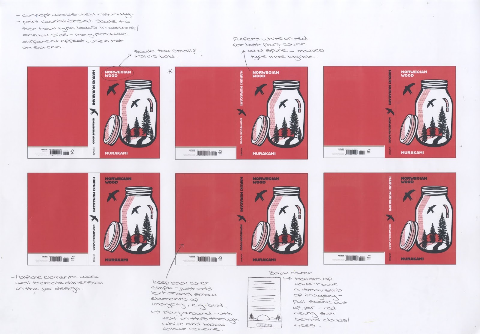
- The halftone elements work well to create dimensions on the jar, whilst resembling the pop art style - a good link to the time in which the book is set.
- Keep the back cover simple utilising just text or adding small elements of imagery which are consistent with the front cover, for instance, the bird.
- Play around with text on the back cover through the white and black colour scheme.
- There were lots of conflicting views on which variation people preferred, some liked the design with no white strip on the spine, and white text on the spine and front cover with smaller text size since it was thought the imagery was so strong that the larger type might overpower this, however others liked the variation where the type is larger on the front cover since it was thought you are drawn to it more - the solution to these conflicting preferences was to print the different variations at scale to see how the type looks in actual size/context, since this may look different from on-screen.
- Could also try a happy medium between the two sizes, for instance, larger title and smaller author's name.
- Use variation with no white on spine, allows the type to work better at a larger size.
- Concept works very well visually.

No comments:
Post a Comment