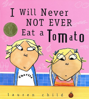
The two typefaces which were initially experimented with were Rudiment and Old Plain Dog. Rudiment was chosen for it's handwritten aesthetics in that the line strokes are slightly grainy and not solidly filled. The shape of these proved to be playful but not so much that the type is illegible. Old Plain Dog was also chosen, this time in relation to it's enhanced playfulness in differences of stroke width and curved elements.
 |
| Rudiment. |
 |
| Old Plain Dog. |
Type in use within one of our final designs:
Producing a mock-up of the book allowed us to see how the type style would work in relation to image as well as giving us a small insight into how the final book would look.
Although these typefaces were considered as good links to the childish theme of the brief and the handmade approaches taken in producing imagery for the book, it was considered that, especially for young readers, the playful nature of these could prove to be illegible in some ways which would therefore potentially miscommunicate the narrative of the book and would not show a clear development of how images work to enhance the communication of the text.
For this reason, further research into more classic children's stories was conducted and it was found that many of these use traditional serif typefaces. Serif typefaces are designed specifically for use as body text to ensure the accurate communication of messages. It was therefore decided to utilise this within the final book spreads. Caslon was chosen in this instance, since it portrayed such characteristics within it's design, with it's initial production being designed for use in extended passages of text.


No comments:
Post a Comment