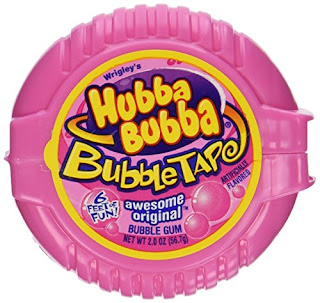
Based on research into the vaporwave aesthetic and the most commonly used imagery, I began to sketch out design ideas in the form of circles in order to match the stickers on the hubba bubba bubble tape packaging (a reflection on ideas of nostalgia). In doing so it was thought this would give me a better idea of composition and how imagery would fit within the shape.
In starting, it was decided to focus on the Greco-Roman bust and Doric columns which is one of the recurring themes within vaporwave to represent ideas of neo-classicism and surrealism (unreality). This has been drawn out in various compositions to represent such themes of surrealism within vaporwave. Some statues are shown blowing bubbles of gum in order to highlight the context in which they are being used, as well as to represent the more pastel colour theme of vaporwave, which includes pastel pink and relates to the whole bubblegum aesthetic.
Some designs have also been paired with elements of type to further highlight the context in which imagery is being used. The word 'bubblegum' has been translated into Katakana in some designs. Since there is no Japanese word for 'bubblegum' this has been spelt out alphabetically which they use to read some foreign words, so the characters literally mean 'ba-bu-ru-ga-mu'.
It was decided to experiment with this use of Japanese characters to further link the designs to the common vaporwave aesthetic, which makes use of Japanese and Asian imagery, including type to present 'the sin of Orientalism', ideas of escapism and the Japanese consumer culture.
In looking at the original bubble tape packaging, it was found the design is mainly typographic, with only a few small elements of imagery. Based on this, it was decided to experiment with drawing out the Japanese characters in a similar style using bold, rounded letterforms to represent that of a bubble. This was composed in various ways to try and fit the circular shape, and in some cases was also paired with the Japanese characters for the word 'vaporwave'.
Another focus of initial ideas development was outdated technology, in particular looking at windows software and large PC's, which are used within the vaporwave aesthetic to show how these pieces of technology and design were once state-of-the-art but now seem out of place. In sketching out potential designs, the main piece of imagery which I decided to experiment with was the windows 98 logo in various compositions since this was the software which brought Microsoft to become more popular. Some designs show this logo paired with the Japanese for 'vaporwave' to continue to incorporate elements of the Japanese and Asian culture into these.
These designs were also placed into circular forms which could go onto bubblegum packaging, however, potentially these should incorporate bubbles in a similar way to the Greco-Roman statue designs in order to make their context clearer and provide a link between the designs and the product. Therefore, potentially these designs would work better in a square format to be used as the sticker label on a set of floppy disks, since the context would make more sense, whilst still presenting a reflection on ideas of nostalgia.


No comments:
Post a Comment