


Height was adjusted so that all designs were consistent and aligned, however it was then thought that the halftone black overlapped onto the halftone blue looked a bit too harsh on your ideas, therefore this was further developed.

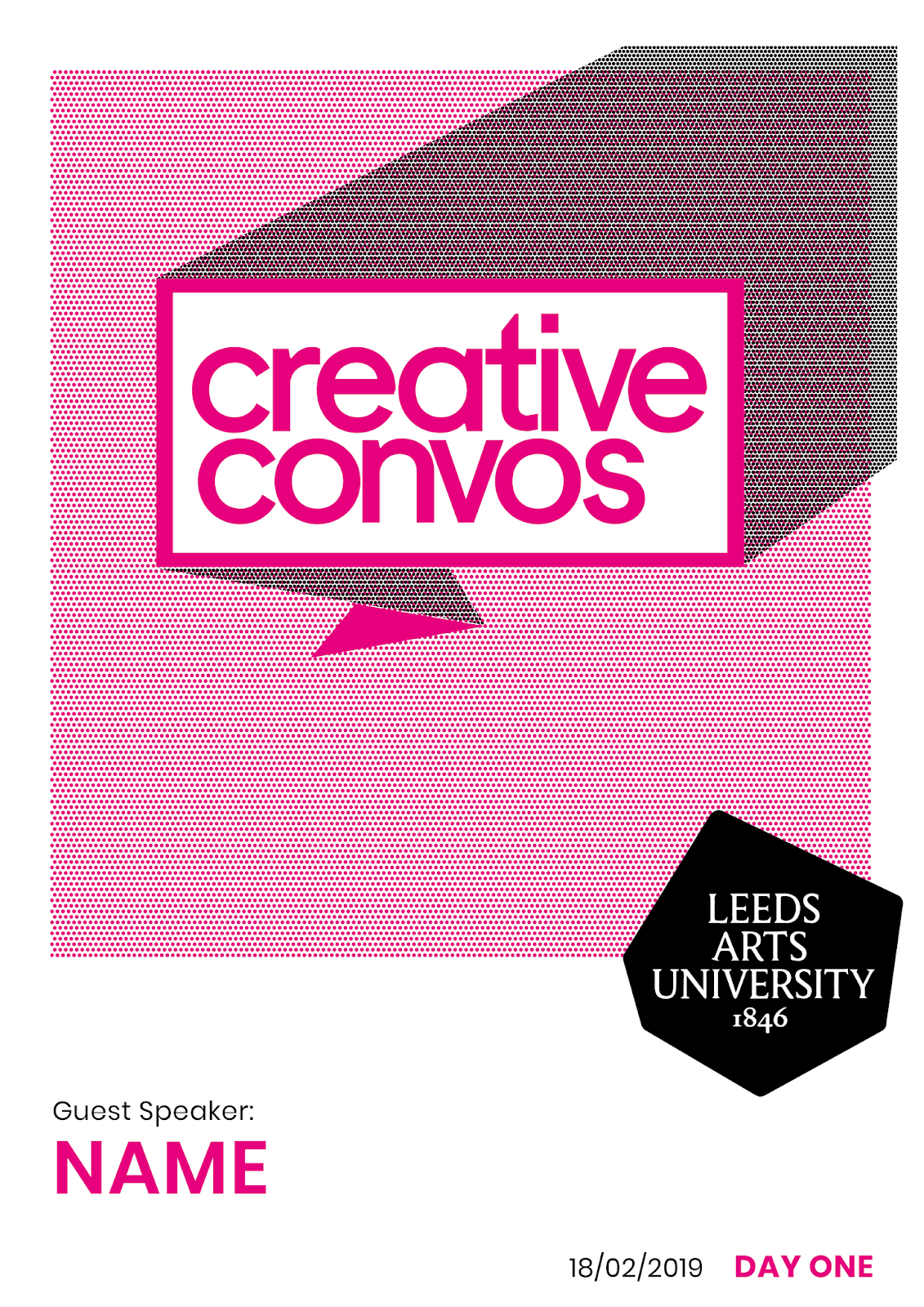

For the reason above, the posters were further developed so that the black shape was a block colour placed underneath the halftone blue. This was thought to not be as harsh on your eyes, as well as making the black more opaque which allows the speech bubble to stand out more and better match the opaqueness of the university's logo used underneath.


Although this opaque black shape underneath the halftone was thought to work more effectively, the slight overlap off the edge of the halftone shape was thought to look too dark and slightly off, despite potentially working with the black university's logo. For this reason, the shape was reduced so that it no longer overlaps and finishes where the halftone shape also finishes, which gives it a better impression of the logo extending from the corner of the poster. After this, it was then also thought that the use of the black university logo was too dark and overpowering in the design, which overpowered the main 'Creative Convos' logotype. The colours on the logo were then also manipulated to match the CMYK colours on each poster that created a better colour consistency throughout the designs.


Unsure as to whether or not these promotional posters would be purely typographic or include photographic imagery of each speaker on each day, a further variation of this poster series was created from the final developments which shrunk the 'Creative Convos' speech bubble logo, however keeping it at a consistent placement in the top right-hand corner of the poster. This would then potentially allow for more room to include photographic imagery of the speakers which would be manipulated to a similar halftone effect as already used.


No comments:
Post a Comment