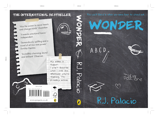
This second set of developments continue to explore the school settings of the book, this time through the idea of a chalkboard, used in the classroom setting of the book, particularly in English lessons and where August has his homeroom which leaves a lot of time for reflection. Based on this, some smaller illustrations were produced in order to reflect doodles on the chalkboard representing some of the other overarching themes and objects present in the book, such as August's love for science, his astronaut helmet, the Xbox, graduation and the ice-cream story as told by Jack. These have been drawn using a digital brush stroke style representative of the style and nature of chalk.
Since the background of this idea were to be placed on a chalkboard texture, it was thought that the initial digital note illustrations would not work as effectively in this design, since they were too illustrative compared to the realistic textured background. In response to this then, the note papers were manipulated to include textures of real paper.
In starting to develop this idea, it was decided to continue to use the idea of note papers on the back cover to contain the relevant information, representational of both the notes that the characters send each other as well as notices pasted on the chalkboard using masking tape. The use of typography uses a similar brush stroke to that of the illustrations paired with it in order to create an element of consistency amongst the design, as well as to reflect this type as if actually written in chalk on the cover. Typographic 'doodles' have also been placed on the cover in order to another dimension to the chalkboard in a different colour. Type on the back cover, however has continued to play on the idea of the notes being handwritten by August, therefore for the book's description, a child-like, handwritten font has been chosen.
Multiple variations of this design were then produced, exploring the use of colour in particular. The colour blue has been experimented a lot in these, attempting to add an element of consistency between my cover design and the original book covers which all use a similar colour palette of blue and white.
In the developments above, it was considered that one of the notes on the back cover did not work as effectively as it could in this instance in the way that it had been cut it does not look as realistic as it could. Therefore, a different shape was used that made the end of this paper look a bit smoother and slightly more realistic. This was enhanced through the use of drop shadows on these, making them look as if they have dimension.


No comments:
Post a Comment