


Based on initial two bubble poster variations, one suggestion from a group member was that the placement of the tails on the end of the speech bubbles could be moved again, having the tail of the first bubble facing the right-hand corner of the poster, whilst the second lower speech bubble's tail should face the left-hand corner of the poster, since this was thought to potentially work better to show a more natural build-up of a conversation.
This placement was experimented with on the poster variations that split up the logotype, aligning the top bubble's tail with the angle of the bottom bubble's shadow. Another variation was produced where the two bubbles touch where they align, however, I feel as if this variation doesn't split the bubbles up enough as if a natural conversation, whereas the slight gap between the two bubbles give a more realistic representation of time in a conversation.
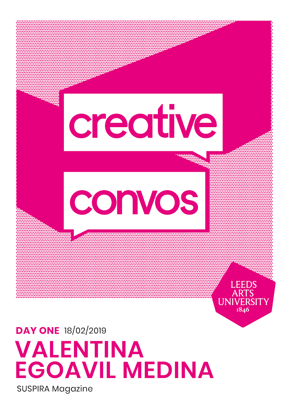

A similar layout was also experimented with in variations which placed the 'Creative Convos' logotype in one speech bubble and the speaker's name in the other overlapping underneath, as if they are speaking themselves. However, it was considered that this variation would mean that the type layout at the bottom of the posters would be compromised and the varying lengths of the speaker's names meant it was challenging to effectively align these two bubbles together.


Another suggestion from one group member was to change the angle and length of the bubble's shadows, which was thought to make the shadow less 'blocky'. However, experimentation with this longer shadow length meant that the angles were harder to work with together in their placement and so looked slightly off in the designs, particularly in variations where the logotype is split into two individual bubbles.


No comments:
Post a Comment