It was also tested and then decided as a group that we should continue to use the coloured halftone effect, however have the bubble's shadow this same colour, which meant this would make the screen-printing process much easier when most elements are the same colour, as well as creating more of an impact in its use that helps both the bubbles and colours stand out.
Tutor feedback also suggested we experiment more with the use of these bubbles, using multiple in order to present the information as more of a conversation between people. Poster developments below experiment with this idea, having the 'Creative Convos' logotype in a bigger bubble coming out at the top right-hand corner of the poster, with an additional smaller bubble coming out of the bottom left-hand corner of the poster which features the current day of the event. Underneath then continues to use a consistent layout of type we all agreed worked best, featuring the speakers name's who feature on that specific day.


These developments were briefly showed to members of the group and were thought to work strongly, however one adjustment which was mentioned was the placement of the bottom speech bubble's tail, which was suggested would look more natural if it were placed at the bottom of the bubble rather than the top.

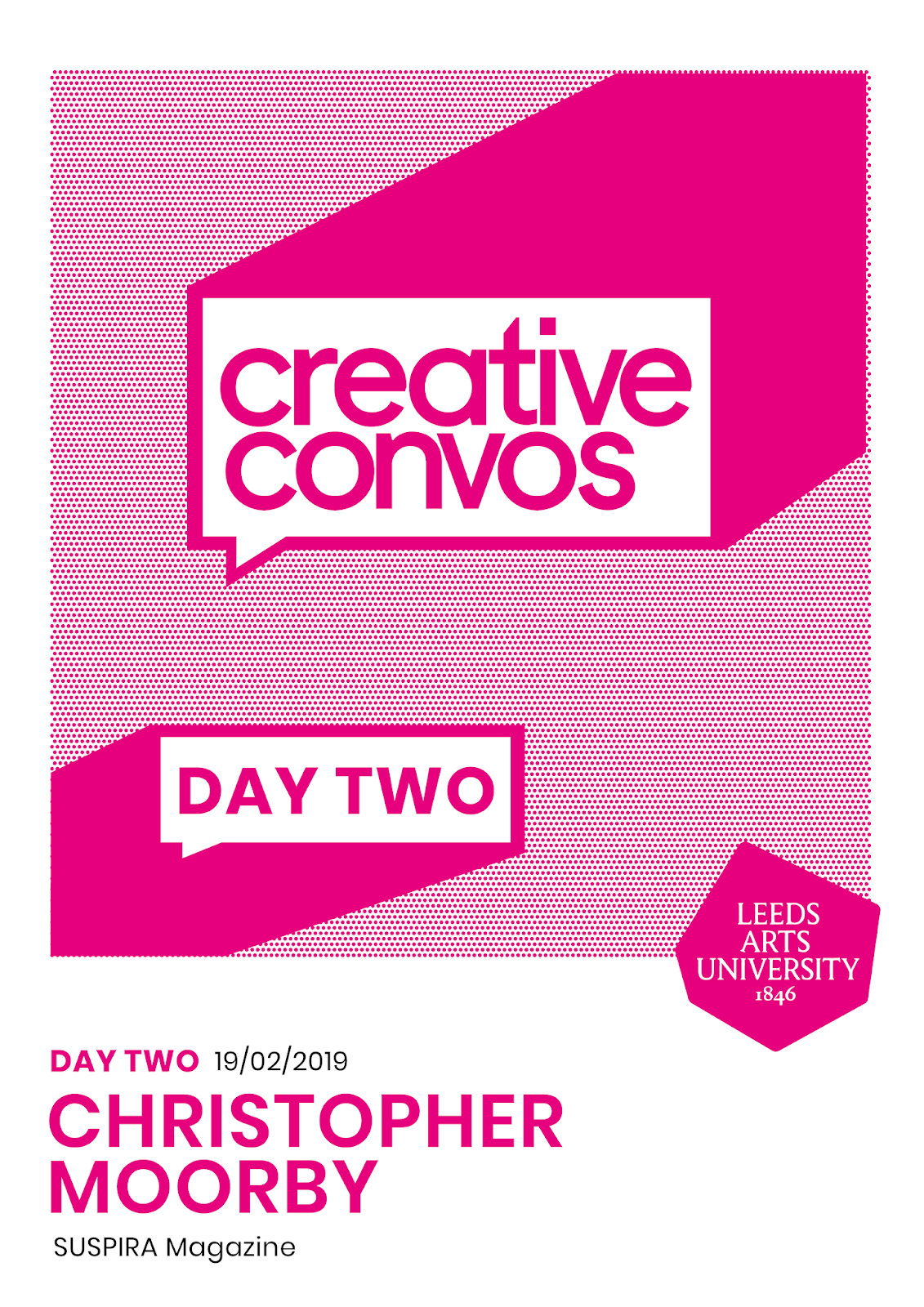

Placement of this tail was therefore played around with in other variations, particularly in having it facing the bottom right-hand corner of the poster, opposite to the 'Creative Convos' speech bubble, which was felt looked more natural in terms of the way a conversation would play out. In order to better encompass this placement of the tail, the angle of the shadow of this bubble was also played around with, showing it as coming out of the bottom left-hand corner of the poster, as well as further up the poster coming out of the side, as well as developing a variation which placed the date above the 'Creative Convos' logotype.


Another variation was developed, placing both speech bubbles at the same angle coming out from the same side of the poster, however it was thought that compared to the developments above this did not accurately communicate a conversation between two people, the placement instead looks as if the same person is talking in multiple messages.

No comments:
Post a Comment