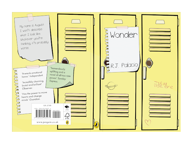
This first idea development was based on representing a part of the story which described August and other students exchanging notes through each other's lockers. Based on this, some initial digital illustrations were produced exploring how these notes could be visualised, including scrap/ripped up pieces of paper and post-it-notes. In addition, an illustration of a set of school lockers was also produced which was thought could feature across both the front and back covers of the book, as a continuation of the design.
In starting to bring these elements together, it was decided that, in order to better incorporate the note papers on the back cover, the end locker was removed from the illustration as well as making these generally a bit simpler, meaning the notes had more space and the design didn't become too over-crowded. The front cover features two note papers, which were thought could contain the relevant information, more representative of the notes the main characters send. This has been paired with a typeface thought to look almost 'child-like' and handwritten, along with the author's name in the same font as if graffiti-ed on the locker.
From the first development, it was considered that the type could be used more effectively and that the second note on the front cover was unnecessary. The type style was therefore changed to one which looked more handwritten, as well as also providing better legibility. Type was also placed into the notes on the back cover, using the same typeface as the front to create an element of consistency across the whole spread, as well as making it look as if August has written the book's description himself. Quotes used a different typeface in order to separate the information as well as communicate the idea that more than one person is sending these notes. In addition, smaller illustrations and type were added to the lockers using a 'brush' style as if they had been graffiti-ed onto the lockers.
Another variation of this design was then produced, working on the placement of text on the back cover in particular, utilising all three notes by spreading out the information which was thought made the text more legible than when it was bulked together. Quotes and August's description were also reversed, bringing the description of the book to the top of the back cover, showing this is of more importance and brings it more to the attention of the reader.
Some final refinements were then made to this design, filling in some gaps within the illustrations, and bringing the title of the book further down on the cover note whilst bringing the author's name up slightly. The title was then underlined using a similar brushstroke to the type to make it look hand-drawn, which allows the title of the book to be instantly recognised and create a separation/hierarchy between the title and the author's name.


No comments:
Post a Comment