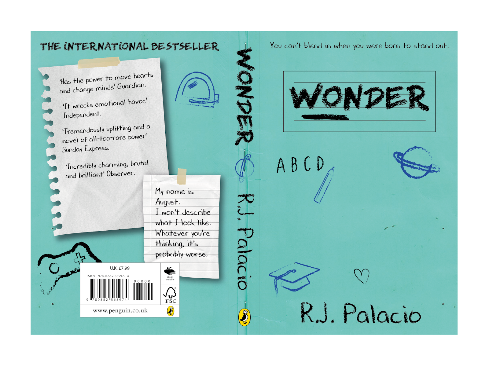
One piece of general feedback was that the use of the colour white in these designs did not work as effectively as the other colours since white pens or pencils are rare and not typically used, particularly in a school setting for writing in exercise books where the paper is also typically white. It was suggested therefore that black and blue should be experimented with more, adding elements of each on both the front and back covers to create an element of consistency and continuity. Based on another piece of feedback, another variation was produced using all black.


Similarly to other design developments, the type style on the back cover notes were changed again to the same typeface, which presented more legibility whilst still remaining as if handwritten and slightly child-like, which was thought to work better with the overarching design aesthetic.

No comments:
Post a Comment