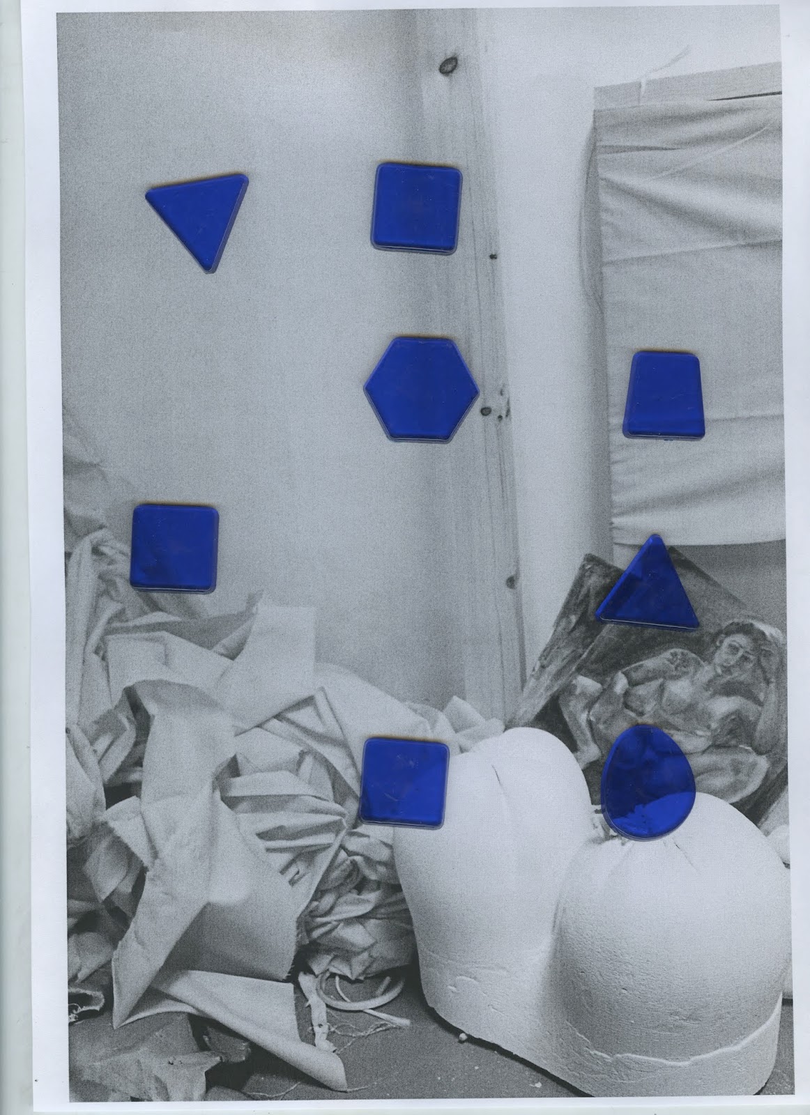
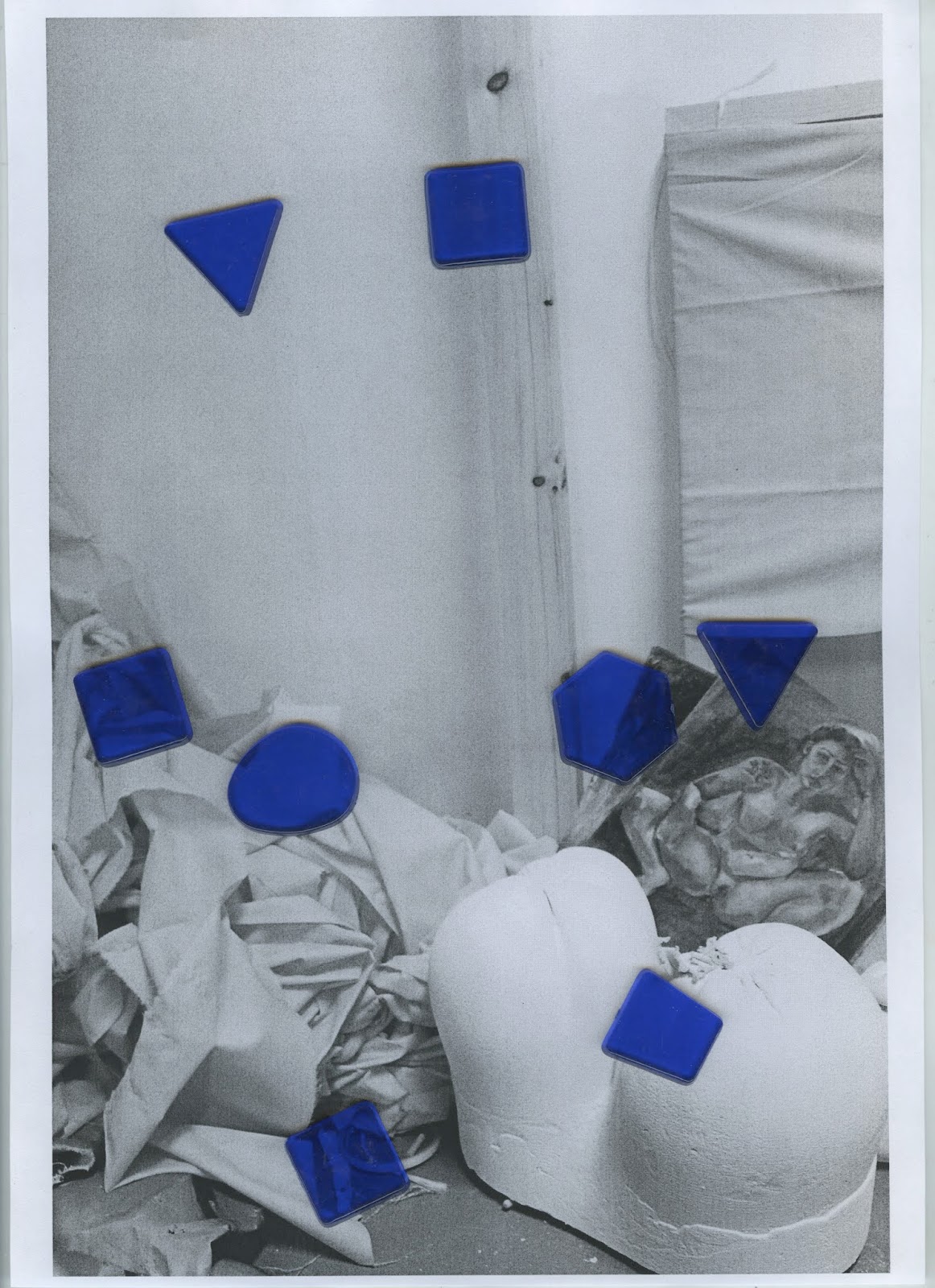
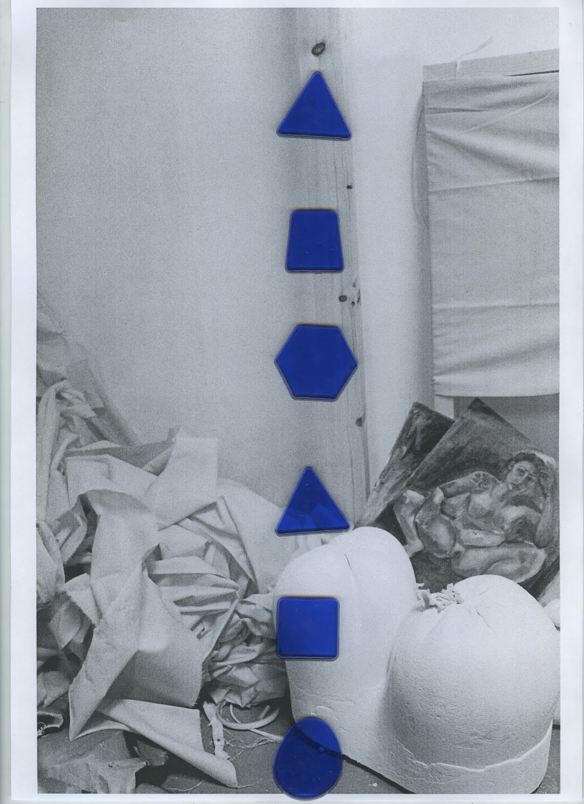
One idea was to place the mosaic shapes in rows of three down the photograph. It was thought this then allowed the image to be better shown through the shapes, whereas bunching them together more was thought could make the design too busy and complicated. In a similar style, another idea was to take away pieces from these rows to allow for more gaps in the image and create a more abstract placement. In another variation the use of rows was abolished altogether, shifting these shapes to form a less rigid and scattered placement that could potentially better represent a flow of creativity in that there's no set structure.


Further experiments were then developed continuing to utilise the idea of scanning, this time switching the colours up to see how different colours reacted to the scanning process. It was found that compared to the first set of experiments, the brighter colours worked much more effectively in this method, particularly on a lighter image which allowed for more of the photographic detail to be reflected through.


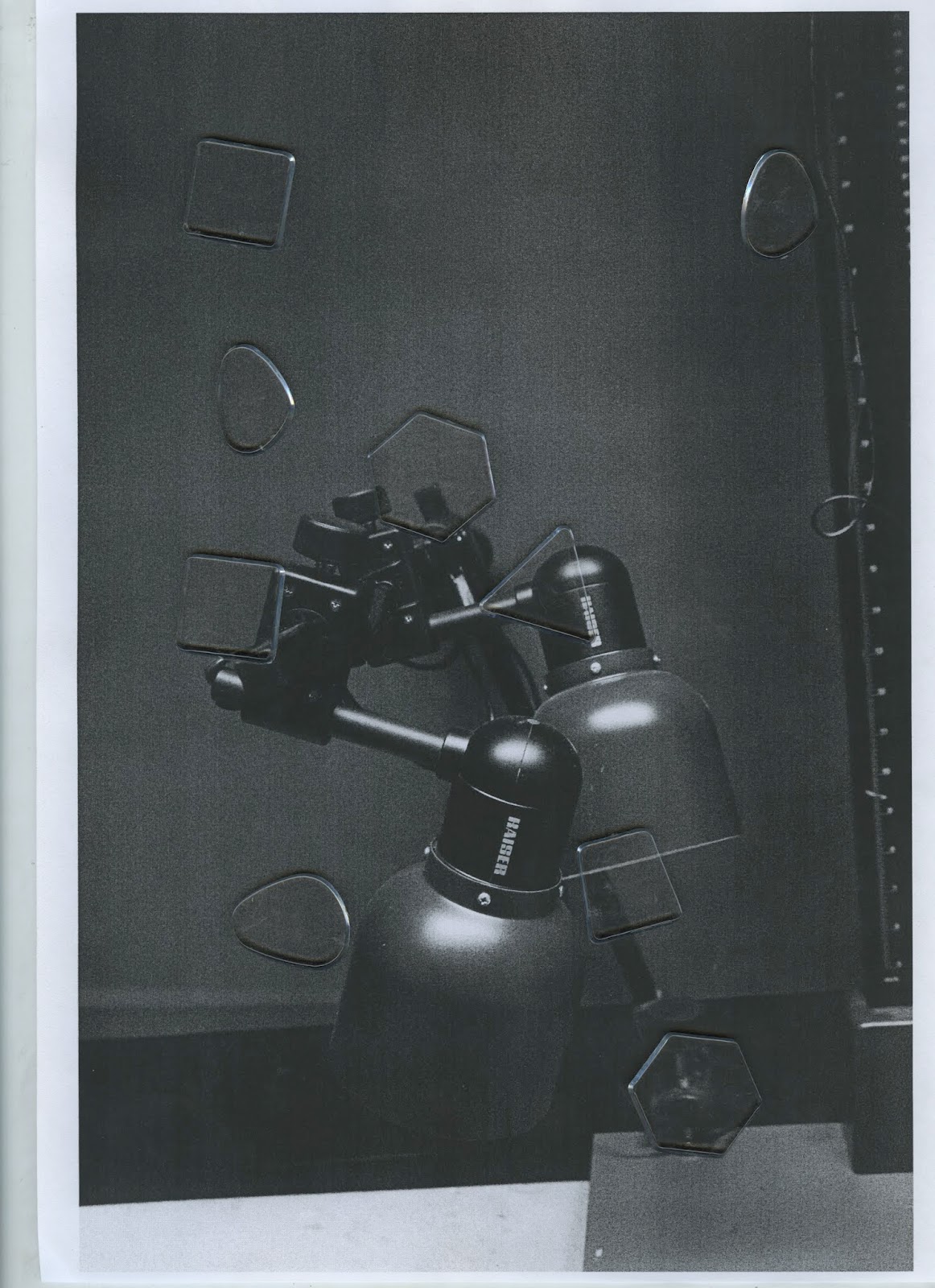
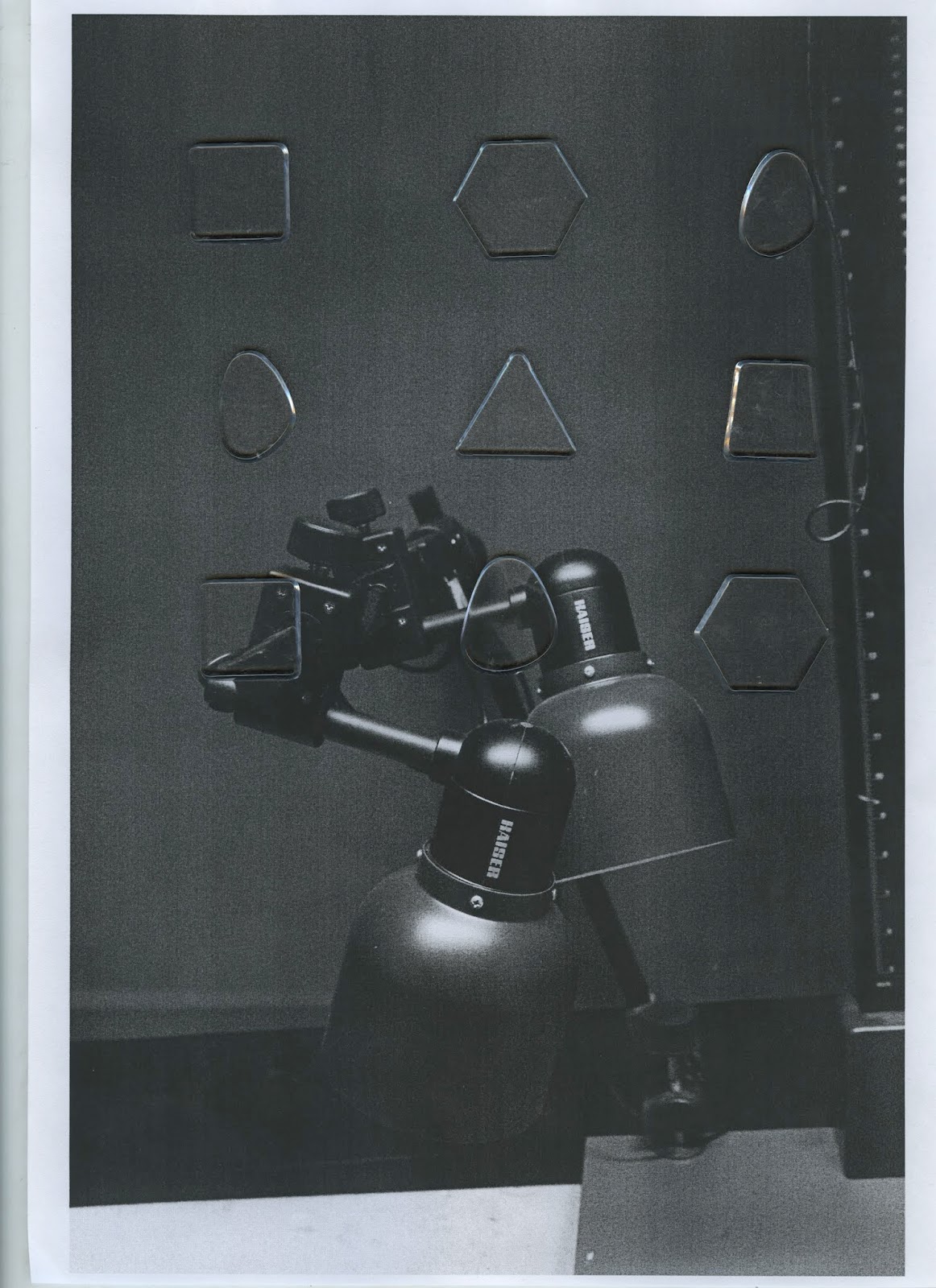
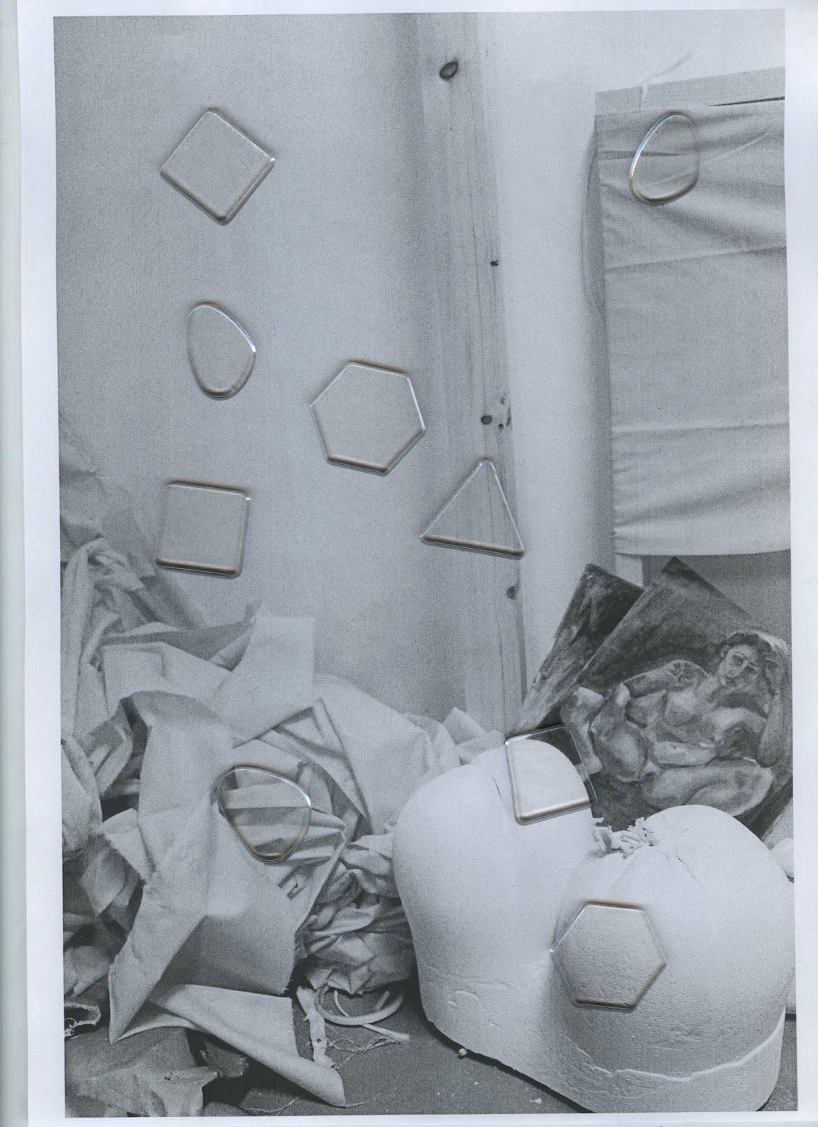
The clear coloured mosaic pieces, however, were found to be the most challenging to work with. Although these created an interest effect when overlayed onto photographic imagery, occasionally these were not as visible as the other colours meaning they got lost amongst the image. These pieces were experimented with on both light and dark imagery to see if this made any difference, however in both instances only the shadows surrounding the pieces were visible. It was thought this also meant the images which utilised this colour would be quite dull compared to the other imagery, and so does not convey the colourful environment of the university as effectively as we would like.
In order to show diversity in the university and its courses as a whole, as well as the idea of collaboration and representing the university as a community of creatives, experiments were also done utilising all the colours and shapes, placing these in rows of three as experimented with previously, as well as more scattered placements. As an additional idea, other variations looked at placing one of each of the different colours along the sides of the imagery.


Further experiments utilising all the colours together were created which explored bunching the different shapes together more to create more of a mosaic-style aesthetic, however it became apparent that this placement started looking too similar to previous degree show branding.


No comments:
Post a Comment