Throughout this module I have learnt a great deal about design practice. The module has allowed me to put all the skills I have learnt throughout this course so far into practical outcomes, whether that be individually, collaboratively or in response to live competition briefs. One skill I have learnt is the importance of collaboration and teamwork. Studio brief 03 focused on working with a team of peer students in the production of a brand identity for our end of year print exhibition. Working in a team meant that more work and ideas could be developed within a shorter space of time in order to work effectively and efficiently to a brief through each taking on an individual role within the group, which allowed us to play to our strengths in terms of design. Learning to negotiate and compromise was a big part of this to ensure everyone's ideas were heard and considered in order to produce consistent overall designs. Working in a team of people who I had never worked with before was an enjoyable part of this and as a result has brought me closer to different people.
This module also allowed me to take part in a live competition brief for the Penguin Random House Student Design Awards. Although the design was unsuccessful in being shortlisted, taking part in this brief proved to be a valuable experience in teaching me what it would be like within industry, working to a specific brief with strict guidelines and specifications. In developing initial ideas for this brief, the process again taught me that even if you are certain your concepts work well to communicate a specific message, this is not always what the client wants or needs, therefore you have to carefully redesign and develop your work to fit with these requirements, even if they are not necessarily agreed with. In the future of this course I will take part in more of these live briefs and competitions in order to gain more experience working to strict set of guidelines and help to inform my overall creative practice.
Screen printing a poster design for our end of year exhibition was one of the most enjoyable processes of this module. This brief allowed me to play to some of my strengths and interests in traditional handmade processes within Graphic Design. Although I had knowledge of the screen printing process previous to this module, this allowed me to continue developing such skills and allowed me to be more experimental in terms of method, process, colours and materials. However, not only did this improve my practical skills, the process also helped in developing my digital skills, particularly through the use of Photoshop. Workshops into preparing digital positives for print taught me the appropriate ways to develop and modify images ready to be exposed and screen printed, particularly in terms of photographic imagery and half tones, which allowed gradients of colour to be replicated when printing, which I had limited experience with before.
Another aspect of this module looked at speaking from experience. This again allowed me to work collaboratively in a pair, reflecting upon the new experiences, skills, difficulties and accomplishments of the first year on this course. This brief allowed me to work more freely in producing a final outcome and producing a set of guidelines and requirements for ourselves to work with, practically applying all that has been learnt throughout this course so far. Many such processes were used, for instance bookbinding, typography, format and layout, as well as learning to be more experimental and conceptual in my approach to set briefs which as a result makes work more engaging. This course, and specifically this module, has started to help in shaping myself and creative practice as a designer and I will continue to develop each of these skills throughout the next two years of the course.
Friday, 19 May 2017
Thursday, 18 May 2017
OUGD406 - Studio Brief 04 - Effective Communication of Intentions?
The initial intentions for this brief was to produce a graphic response which makes a statement, observation or piece of guidance to new students on our first year experiences. In terms of this aim, our final outcome can be considered to effectively communicate this through the use of humorous advice on the concept of shopping. This advice came from existing students’ shopping experiences, which makes the guide relatable and realistic of student life.
Another requirement for this brief was to produce a response which would make the overall transition process from school or college to university more welcoming. One of the guide’s limitations that was discussed was that the ‘childish’ aesthetics could potentially be seen as patronising to new students and could make them feel intimidated of older students, as well as the whole student experience. If this were the case then our final outcome does not effectively communicate a welcoming tone. However, despite this, overall the guide was considered entertaining and friendly which could in fact make new students feel slightly more at ease knowing other students have been through similar situations, but the best thing that can be done is to laugh and make light out of such stressful situations.
Another requirement for this brief was to produce a response which would make the overall transition process from school or college to university more welcoming. One of the guide’s limitations that was discussed was that the ‘childish’ aesthetics could potentially be seen as patronising to new students and could make them feel intimidated of older students, as well as the whole student experience. If this were the case then our final outcome does not effectively communicate a welcoming tone. However, despite this, overall the guide was considered entertaining and friendly which could in fact make new students feel slightly more at ease knowing other students have been through similar situations, but the best thing that can be done is to laugh and make light out of such stressful situations.
OUGD406 - Studio Brief 04 - Evaluation
During our final crit session, it was suggested that overall, the concept was quite strong in communicating our desired message. However, it was also considered by some that this concept could almost be seen as patronising to new students transitioning from school or college, potentially communicating to them that they are still ‘children’ and need to learn how to take care of themselves through this new university experience. The aim of the brief was to help new students feel at ease during the transition process, however the children’s book aesthetic could be seen as producing the opposite effect. However, in the production stage of this guide, this is one element which was considered and discussed. The ‘adult’ content, in terms of both illustrations and humorous captions were used deliberately in order to make the advice more relatable and less patronising, focusing on the idea that these new students are in fact young adults who are aware of such concepts.
Others considered the approach to be friendly and entertaining. The humorous content of the book was seen to make light of stressful situations, such as shopping for embarrassing and personal items, which lets new students know that these things happen to everyone with the guide offering advice which could be useful if they ever find themselves in similar situations.
Although the paper stock worked well in keeping consistency with the textured aesthetics, one potential improvement suggested that the covers should be printed onto a thicker stock. As a result, this would keep the front and back covers separate from the main content of the guide, as well as protecting these from damage since a thicker paper stock would hold the content together in a stronger manner. Originally, this was done purposely to help with the binding of the guide, however upon reflection the stock could have been made thicker for the front and back covers without the use of card.
Another potential improvement was to replace the digitally printed textures with the physical textures themselves. This would produce further links to our contextual and primary research in that the interactive element would be similar to that of a children’s touch and feel book. This idea would also potentially make the guide more engaging through physically replicating the textures of each illustration rather than digitally and having to interpret why they have been produced and used in this way.
The personification of the shopping items was one element which was well regarded, that adds to the humorous tone of the guide. However, the use of googly eyes on the front cover was considered ‘interesting’ and may not have been needed in the communication of these personified elements.


OUGD406 - Studio Brief 04 - Paper Stock and Binding
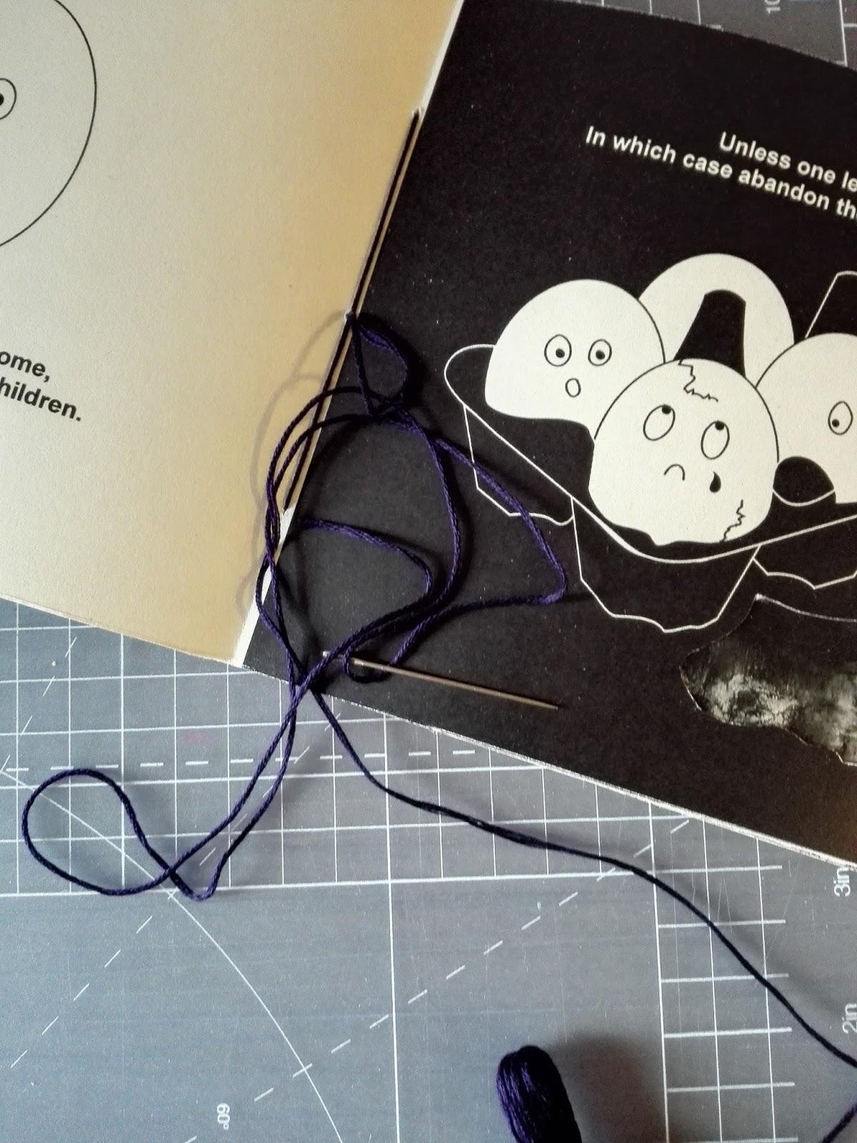
It was decided to use a paper stock known as bulky newsprint. This stock consists of two sides; one shiny, with similar properties to that of photo paper, and one rough side, textured like that of ordinary newsprint. It was felt this was an appropriate alternative to card since the stock was not too thick to bind but still had elements of strength which helped the pages keep their strength even when elements had been cut away.
The difference in textures between each side of the paper also enhanced the textured aesthetics of the overall designs, whilst keeping the front and back covers of a good quality which avoided the need for multiple paper stocks that could have made the pagination process difficult and confusing.
All printed content was then bound together using a traditional saddle stitch method, which involves the use of either staples of thread down the fold of the booklet. This production method was chosen, as it felt appropriate for the use of a smaller publication, did not inhibit the design in any way and kept consistency in it’s minimal design.


OUGD406 - Studio Brief 04 - Texture Production
It was decided that in order to make the textures more realistic and appropriate to the shopping item illustrations they were being used with, we should explore producing textures from the objects themselves. This production process involved various different materials, most used with black ink to enable clarity of the textures.
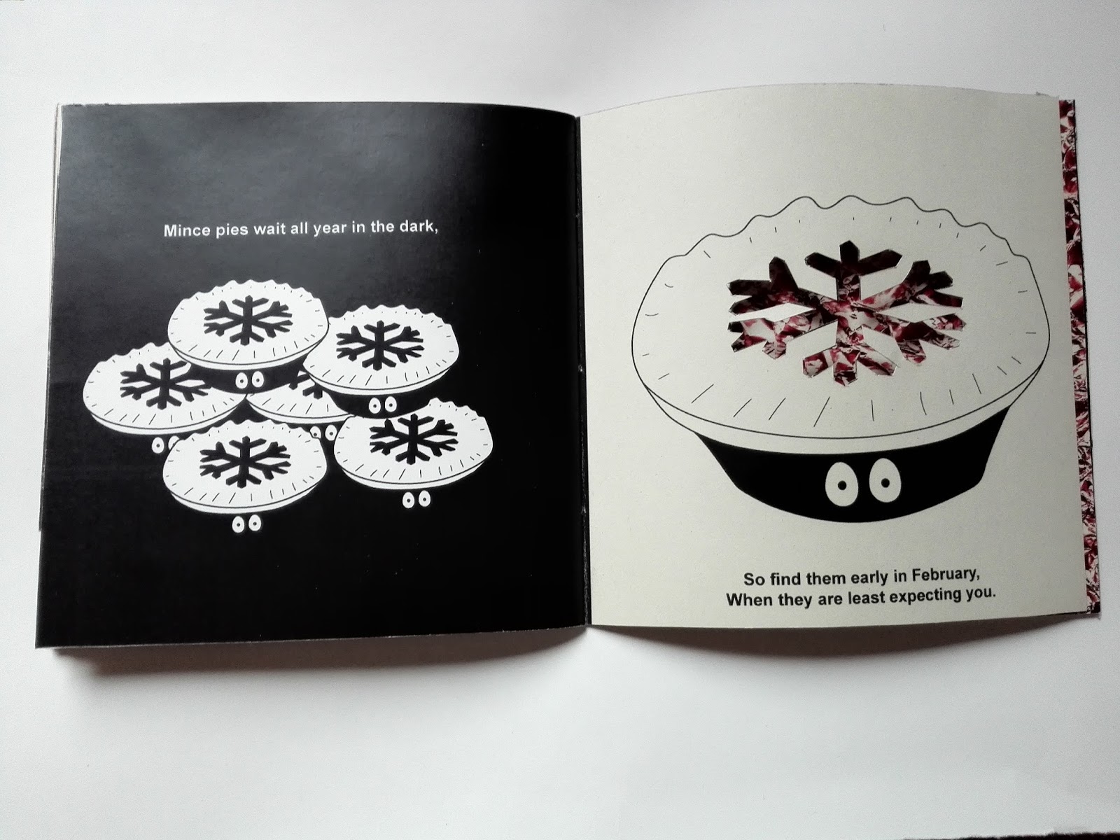
For example, one design featured a set of toilet rolls, suggesting that they should always be kept in pairs for your own well being. In recreating such a texture, pieces of toilet tissue were scanned and modified in terms of their clarity and contrast of black and white elements for use underneath this illustration so that links were made between the textures and the illustrations, as well as keeping consistency between the overall aesthetic of the guide in terms of it’s colour scheme.

Another method used to produce textures was the use of bleach sponged onto black card. This produced a rough texture as a result of the chemical reacting with the paper stock, which also made the paper change from black to white. Again such textures were scanned and modified to enhance their clarity. In keeping elements of red within the colour scheme, some of these textures were digitally modified in terms of their hue and saturation, using methods learnt through another brief in this module. These were used to recreate a similar red hue, which was used to accompany an illustration of hair dye/bleach.


OUGD406 - Studio Brief 04 - Layout
It was decided to produce this guide in a square format of 150mm x 150mm, taking inspiration from the aesthetics of the social media site, Instagram. This was thought to make the format of the guide subtly more relatable to an audience of students, as well as keeping the original links to children’s book formats. The size also enables the guide to be pocket sized so that students can carry it around with them if they ever need a bit of humorous advice when shopping to make the experience slightly less stressful, as well as enabling the guide to be produced fairly cost-effectively.
The layout features a consistent order of illustration then texture, as well as an order of black then white, alternating on each page. This was done in order to allow us to cut away elements of each illustration and for the appropriate texture to be displayed underneath, avoiding problems in accidentally eliminating elements of other designs.


The layout features a consistent order of illustration then texture, as well as an order of black then white, alternating on each page. This was done in order to allow us to cut away elements of each illustration and for the appropriate texture to be displayed underneath, avoiding problems in accidentally eliminating elements of other designs.


OUGD406 - Studio Brief 04 - Type Considerations
The type used for the front and back covers of this final produced book used the typeface Arial, which was used to keep consistency with the use of type within the book. This typeface was chosen for it's simplicity and clarity, which we felt enhanced the minimal aesthetics of the book. It was decided for the title, however, that this should only use the outlines of the letterforms. As a result, this distinguishes the title from the rest of the information without being too distant from the rest of the content and design decisions. The outline also meant that the use of all caps for this title created a friendly approach and was not too impactful, which could have communicated the opposite of this friendly, humorous approach.


OUGD406 - Studio Brief 04 - Name Generation
As part of the development process, it was decided that out student guide needed a catchy and humorous name in order to go with the themes and content of the guide. It was initially decided to name it "The Very Hungry Student's Guide To Shopping" based on the children's story 'The Very Hungry Caterpillar' in order to present additional links between the 'childish' aesthetics and inspirations behind the final design of the guide. However, as designs developed, the guide became increasingly about shopping in general and not just food items. For this reason, it was felt that the word 'hungry' within this initial name was no longer relevant to all the content.

Further options were then explored, becoming particularly interested in the use of alliteration to produce a catchy title. For instance, 'sociable shopping' and 'bag buddies'. However, after deliberation it was found that not many of these options reflected the themes of the guide as well as we would have liked.
Our final name came from the idea that the advice given within this guide is based on real life experiences of current students on this course. This was linked with the illustrative style in that the shopping items within the guide were personified, and so given characteristics and personalities of humans. The name 'chums', meaning 'friends' relates to these ideas in that the personified shopping items are based on the stories of real-life people, and it is as if these people themselves are giving the advice. This one-liner meant the title remained short and punchy, also enabling room on the front cover for the tote bag design to also be personified itself through the use of googly eyes, keeping consistency with the illustrations within the guide, and making the cover slightly more engaging and interactive.


OUGD406 - Studio Brief 04 - Design Development
Based on peer feedback, it was decided to continue with the development of textures within our final designs. It was decided to use a similar aesthetic to the children's story The Very Hungry Caterpillar, placing various textures based on each illustration and the original shopping items underneath the pages which could then appear onto the previous page through gaps in the designs. This meant that the final illustrations had to be kept fairly minimal in order to not over-complicate the designs and allow us to cut away block areas to work with these textures.
The colour scheme was modified to include a limited palette of three colours; red, white and black. The use of monochromatic colours were chosen to enhance the ‘adult’ and humorous themes of the guide which makes the overall design less patronising and less like a typical children’s book, despite it’s style being based on such designs and concepts. The elements of red were then also added in order to give the guide a small element of colour which contrasts with the black and white to keep the guide engaging in its use of colour. A simple monochromatic colour scheme could have potentially limited this aspect of the design.


The colour scheme was modified to include a limited palette of three colours; red, white and black. The use of monochromatic colours were chosen to enhance the ‘adult’ and humorous themes of the guide which makes the overall design less patronising and less like a typical children’s book, despite it’s style being based on such designs and concepts. The elements of red were then also added in order to give the guide a small element of colour which contrasts with the black and white to keep the guide engaging in its use of colour. A simple monochromatic colour scheme could have potentially limited this aspect of the design.


OUGD406 - Studio Brief 04 - Concept Rationale
The brief for this project was based on the idea of reflective practice. This allowed us to reflect upon the accomplishments, difficulties and experiences on the first year of this course and produce a practical outcome which aims to give advice to new students starting next year.
Our response to the brief was to produce a book which gives humorous and useful advice to first year students on the struggles of shopping as a student, based on real life shopping experiences from current students. This guide aimed to put a humorous twist on existing student guides through the use of concepts, layout and ‘childish’ illustrations based on various children’s book designs. As part of this, the illustrations within the guide took on humanistic qualities and personalities. These were then accompanied by various textures produced in response and cut away from the illustrations. In doing so, the designs make light of what can be considered a stressful situation, which helps make the guide entertaining for new students and showing that these things happen to the best of people.
Our response to the brief was to produce a book which gives humorous and useful advice to first year students on the struggles of shopping as a student, based on real life shopping experiences from current students. This guide aimed to put a humorous twist on existing student guides through the use of concepts, layout and ‘childish’ illustrations based on various children’s book designs. As part of this, the illustrations within the guide took on humanistic qualities and personalities. These were then accompanied by various textures produced in response and cut away from the illustrations. In doing so, the designs make light of what can be considered a stressful situation, which helps make the guide entertaining for new students and showing that these things happen to the best of people.
Monday, 15 May 2017
OUGD404 - End of Module Evaluation
Throughout this module I have learnt a great deal about various design principles within Graphic Design. One of these principles is the use of grid systems. It was learnt that this is an important element within layout design to ensure consistency throughout work and publications, and allow for accuracy in the lining of elements. Different grids have different purposes. One of these was the Marber Grid, which I had no knowledge of until this module. This was a grid system produced by designer Romek Marber specifically for the use in designing Penguin Classic crime books, and was practically applied through the production of my own covers for three Penguin Classics. Although ultimately grid systems ensure consistency, it was learnt that other designers break the use of the grid, such as designer David Carson, who manipulates these to allow for subjectivity of work.
Another principle is the use of colour within design. One element within this is the difference between RGB and CMYK colour values and printing methods. It was learnt that CMYK is a subtractice colour model used within colour printing, which works by masking colours on a lighter background - ordinarily white - which is what makes the process subtractive, in that the inks reduce brightness from the white. The RGB colour model, on the other hand, is an addictive model of colour whereby red, green and blue light are added together in numerous ways to reproduce a wide range of colours. It’s main purpose and function is for representing and displaying images within electronic systems, for example computers and televisions. This principle has allowed for the appropriate use of colour within my own practical work, through printing in the correct formats to ensure colours are replicated as best as possible. These principles were enhanced through various workshops, such as pagination, which has helped developed my digital production skills in InDesign on correctly numbering pages of a booklet for specific binding methods.
In terms of colour, the attitudes and beliefs on this design principle held by various designers has also allowed my practical work to become more informed. For instance, research into Johannes Itten and Josef Albers' colour theories has shown the effects colour can have on the communication of an idea or piece of design. Such ideas will now be more considered in the development of my work, and will allow me to explain design decisions in a more informed manner.
Overall, this module has allowed me to learn about the basic principles of design in terms of colour, type, layout and format through practically applying these to my own design work. In doing so it has allowed me to think more about specific design decisions and how this can affect the communication of ideas. Such principles will continue to be developed through other modules and my own self-led briefs.
OUGD404 - Studio Brief 01 - Evaluation
Throughout this brief, I learnt a lot in terms of colour, layout and format through research and the production of three small booklets which allowed me to put these principles into practice. One thing which I felt was successful in the production of the books was their consistency in the use of type and layout. This was enhanced through splitting the research into three categories so that all information within flowed nicely. For instance, one of Josef Muller-Brockmann's classic and lead typefaces is Baskerville which was used throughout each book to ensure legibility of large passages of text. Although considered a good choice of type, one limitation of this was that the type was far too large for the scale of the book which makes it seem too prominent within the design. Therefore, in future development and production of booklets, scales will be more carefully considered.
Although consideration was taken in the use of ultramarine paper for the covers of each book, which links to the resin binder in which ultramarine pigment is suspended to produce the colour International Klein Blue, the additional paper used within could have been improved. This used standard printer paper, which could potentially have limited the quality of the images when printing. These pages were also formatted incorrectly when printing and therefore did not print double sided, which means each book has a series of blank page breaks throughout, which can be considered to disrupt the flow of content. In the future, principles learnt from the pagination workshop will be referred to in order to print such books in the correct format.
Despite this, I feel that these booklets communicate effectively what I have learnt through this module. For instance, research into the attitudes of artists Josef Albers and Johannes Itten on colour theories have been practically applied to some elements of these books, such as the colour swatches taken from a primary photograph of Leeds which uses ideas based on the contrast of saturation. These were then also replicated into similar formats of Albers' work 'Homage to the Square' which shows some of the effects colour can have on the communication of design work.
OUGD404 - Studio Brief 01 - Final Colour Publications
In response to this brief, three small final publications were produced based on research into the use of colour within Graphic Design. One focuses on the Pantone colour matching system, as well as colour in general, one focuses specifically on International Klein Blue and the other features each individual colour swatch taken from an initial photograph of Leeds. The first initial booklet featured all of these themes within one booklet. Based on this it was decided to develop three separate publications rather than one in order to keep better consistency in terms of layout, imagery and colour throughout each.
The type decisions used within these publications were based on the opinions and beliefs of designer, Josef Muller-Brockmann. In terms of type, Muller-Brockmann believed that there were nine classic and lead typefaces which should be used within all design. One of these is Baskerville, which was used for the body text of these final publications in order to ensure clarity of information throughout each.
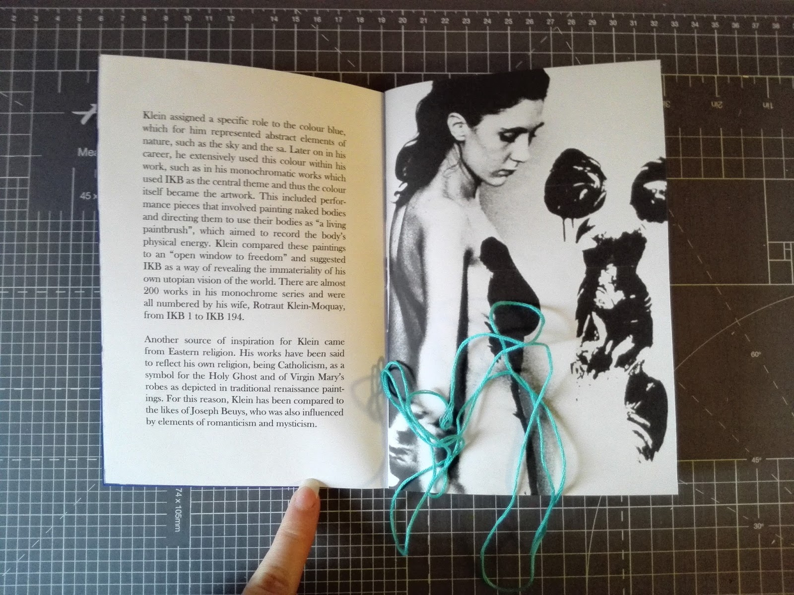
The front cover of each publication uses a stock of an ultramarine colour. This was used initially on the Klein publication alone in order to link the paper stock choices to the content within, since Klein Blue was originally produced from the synthetic resin binder which the colour ultramarine is suspended in, allowing the pigment to maintain its intensity of colour. This same paper stock was then used throughout each publication as experimentation with a thicker card did not allow for the stitches to pass through effectively. However, each was made individual in terms of the colour thread used when binding, each relating to the content within. For instance, the pantone publication uses a pink thread similar to that of 2016 pantone colour of the year.

Saddle stitch is a stitch of thread or a staple passed through the fold of a magazine or booklet. This method of bookbinding was used to format and bring all relevant information in the colour publication together. It was decided to use this method over another method since it was learnt that saddle stitch works better for smaller publications using multiples of four. The final publications were produced at a scale of A5, so it was also felt that this method of binding worked appropriately for this scale, as the stitches did not compromise any of the clarity of information, for instance in the amount of space it uses to hold the publication together.


The type decisions used within these publications were based on the opinions and beliefs of designer, Josef Muller-Brockmann. In terms of type, Muller-Brockmann believed that there were nine classic and lead typefaces which should be used within all design. One of these is Baskerville, which was used for the body text of these final publications in order to ensure clarity of information throughout each.
The front cover of each publication uses a stock of an ultramarine colour. This was used initially on the Klein publication alone in order to link the paper stock choices to the content within, since Klein Blue was originally produced from the synthetic resin binder which the colour ultramarine is suspended in, allowing the pigment to maintain its intensity of colour. This same paper stock was then used throughout each publication as experimentation with a thicker card did not allow for the stitches to pass through effectively. However, each was made individual in terms of the colour thread used when binding, each relating to the content within. For instance, the pantone publication uses a pink thread similar to that of 2016 pantone colour of the year.

Saddle stitch is a stitch of thread or a staple passed through the fold of a magazine or booklet. This method of bookbinding was used to format and bring all relevant information in the colour publication together. It was decided to use this method over another method since it was learnt that saddle stitch works better for smaller publications using multiples of four. The final publications were produced at a scale of A5, so it was also felt that this method of binding worked appropriately for this scale, as the stitches did not compromise any of the clarity of information, for instance in the amount of space it uses to hold the publication together.


Subscribe to:
Posts (Atom)