The type decisions used within these publications were based on the opinions and beliefs of designer, Josef Muller-Brockmann. In terms of type, Muller-Brockmann believed that there were nine classic and lead typefaces which should be used within all design. One of these is Baskerville, which was used for the body text of these final publications in order to ensure clarity of information throughout each.
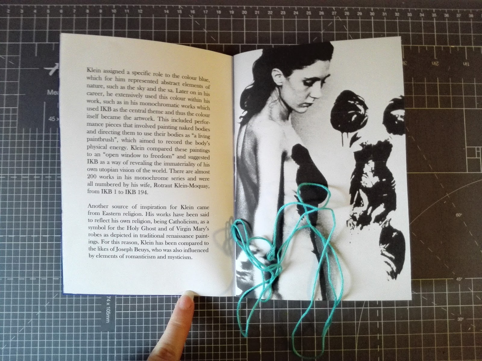
The front cover of each publication uses a stock of an ultramarine colour. This was used initially on the Klein publication alone in order to link the paper stock choices to the content within, since Klein Blue was originally produced from the synthetic resin binder which the colour ultramarine is suspended in, allowing the pigment to maintain its intensity of colour. This same paper stock was then used throughout each publication as experimentation with a thicker card did not allow for the stitches to pass through effectively. However, each was made individual in terms of the colour thread used when binding, each relating to the content within. For instance, the pantone publication uses a pink thread similar to that of 2016 pantone colour of the year.

Saddle stitch is a stitch of thread or a staple passed through the fold of a magazine or booklet. This method of bookbinding was used to format and bring all relevant information in the colour publication together. It was decided to use this method over another method since it was learnt that saddle stitch works better for smaller publications using multiples of four. The final publications were produced at a scale of A5, so it was also felt that this method of binding worked appropriately for this scale, as the stitches did not compromise any of the clarity of information, for instance in the amount of space it uses to hold the publication together.


No comments:
Post a Comment